Nieman Foundation at Harvard
When Steve Jobs unveiled the iPad last month, there were immediate debates over what kind of impact it would have on both the news habits of consumers and the bottom lines of news organizations. But one thing seemed obvious: that the iPad would be a glorious playground for user-interface designers, information architects, and others who think about how information should be found, structured, consumed, and designed. That 9.7-inch screen, combined with the iPhone’s multitouch interface, will inspire some innovative new ways to present news. At the unveiling, the only taste we got of these new ideas was The New York Times’ iPad app (above), which brought a bit of the typography and layout DNA of the print newspaper onto the device.
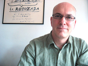 To think about these issues, I got in touch with John-Henry Barac. He spent a decade at The Guardian on the print side, as an art director and designer, then moved to the digital world. As a consultant, he designed The Guardian’s first iPhone app, which stands out as one of the more interesting within the iPhone news app world, much of which bears a certain bland sameness. (I particularly liked the small tag icon that allows the curious to quickly match other stories to the keywords of the current one.) John-Henry’s now an independent design consultant, anxious to get his hands on an iPad and to explore the new medium.
Here’s an edited version of our conversation. Among the topics we discuss:
— Will a more print-like screen push designers to build more print-like interfaces?
— How can surprise and serendipity be brought back into the reading experience?
— Will the iPad make reading longer pieces more interesting — or tolerable?
Joshua Benton: When you first saw the iPad and that screen, what were the thoughts running through your mind as a designer of news apps?
John-Henry Barac: Well, the first thing is obviously space — actually having physically a lot more space to play with. The iPhone format demanded that you strip away and keep simplifying, whereas the iPad offers the opportunity to bring back more into the page, and allow the reader to scan, select, and read an article all on the same screen. There are a few lessons to draw from the iPhone experience, in terms of keeping it simple and focused.
You mentioned [before the interview] the tag icon — when we were doing that, my specifications to the developers were that the button should be physically bigger than the tag is, so that the actual space for the finger to touch is a invisible button is a lot larger than the tag. So it’s kind of about giving visual cues, but also helping the user to use those objects and not to mis-hit and all the rest of it.
But I think the point about the tag icon was to give the ability to physically dig deeper into a story, and I think that’s what I find very exciting about the touch interface and about the iPad. You’ll be able to do that, but with physical targets which are easy to hit and which will let you delve deeper into the story.
In designing newspapers, you’re always thinking about how to offer the reader different ways into a story — so there’s the headline, there’s the standfirst and the rest of it, but there’s also other call-outs and boxes and other objects which allow the user multiple ways to access the story. And if those are used carefully and coherently, they help to build greater depth of the story that you’re trying to tell. I think the iPad begins to offer that level of complexity. It offers the reader many different ways to kind of grab hold of part of the story that might interest them, whether it’s a small snippet with a link or another way to dig into a longer article.
Josh: One thing that immediately struck me is that, when you look at the iPhone and the small screen, as a news designer it’s immediately apparent that you’re going to be dealing with a different visual grammar, a different visual language then you would be with a print newspaper. I wonder if with the iPad, which looks a lot more like a sheet of paper and like something with a print analog, whether we’re going to see the visual cues and visual language of print just be carried over to the new device. Or will it be an opportunity to build new kinds of cues, in the same way that the iPhone forced you to build new ways to design news?
John-Henry: One would want to think of new ways of doing things, absolutely. One thing that springs to mind is the ability to access news in a hierarchal way: to have a column of stories on the left, for instance, very much like Apple’s native apps. In Mail you have your list of messages, and you tap on a message and read it in the wider column. And I think that’s kind of the first obvious thing to do.
But also, for instance, the ability to be able to have a story and a related Twitter feed which is constantly updating, both of them right there with you on the page. Or the ability to have links which open up dialog boxes which enable you to access more content, which you can then put away again and continue reading the article. I think what there are many cues which you can borrow from the newspaper but then rethink in this medium.
But I think the other big difference is touch. Someone asked me the other day, “Why would you want to build an iPad app when you could just use your website?” And I think what touch gives you is such a different way of accessing information as a user. It’s physically direct. You’re much more focused — you can literally touch a fact and get more information about it. So I think therefore you do want to actually work on something new. You don’t want to just think it’s a big space which you’re gonna access the browser — you want to really think about touch, the way the user manipulates the information, the ways which you might be able to take a photograph, look at it more closely, enlarge it, put it away again, continue reading the story. I think that touch is the very exciting thing here. I think there’s room for exploring a more traditional model on the iPad as well, but I think you don’t want it to feel just like a great big PDF that you’re dragging around.
Josh: What was your reaction to The New York Times’ app as it was shown off during the iPad announcement? It’s the only example we have so far of a vision of how to develop a news application for this device. It seems to take a lot of cues from print in terms of carrying over the typography from print, carrying over the column styles, and carrying over the layout of the stories on a page.
John-Henry: It’s very much looking at the familiarity of the print model — the impression is that you’re scanning through the paper. The typography was glorious, firstly. And the ability to look at videos or galleries within your articles was immediately an enormous plus. I wouldn’t want to comment too much about it, since it was a couple weeks’ work and there’s a lot of work to be done on what their iPad app finally looks like. It seemed it could be quite easy to get lost — to not figure out where it was you came from, or else to have to kind of drag your way back. We need more thought on indexing, seeing what your journey is through the paper.
My starting point might be a little different, and the kind of early imagining that I’ve had has been more to do with different speeds of data — different speeds of content, longer and shorter reads, involving Twitter, being able to use dialog boxes to give you more information you can check out and then put away. But I think it’s very exciting to see people trying out a model closer to a newspaper.
Josh: One of the things print fans talk about is the discoverability and the serendipity of flipping through pages — coming across the story you may not have realized you’re interested in. One of the big problems with iPhone news apps is that they pretty much all have a straight list of stories to scroll through, and that’s it. You can do things around most-emailed lists and such, but it’s a very hierarchical, non-surprising presentation. It seems like the iPad might be a platform that allows more ways to present possible reading opportunities to readers.
John-Henry: Absolutely. With the Guardian iPhone app, one of the comments I saw was from users or readers saying they were able to rediscover serendipity, with the tag icon and the ability to follow a keyword or a subject. Rather than just read an article, you might follow the subject of, I don’t know, “iPad” or “Apple,” and find out what the stories are around that subject. And you might follow another keyword and end up in a different part of Technology, or in an education story, or whatever. Accessing related data, following links within stories, or dipping from an article into a gallery, then from that a photograph in that gallery into another related article — all of those things give you more ways to browse and to just discover things. I’m sure there are many, many, many other ways to bring back serendipity — but one has to get one’s hands on these devices first and try it out, really.
I think that one thing one hopes for with touch is that people will be inquisitive with the device. It really does invite you to tap around and find out what’s there. But on the other hand, I have had to tell one friend of mine, who is a veteran of digital devices — I’ve had to show him the tag icon and that he could tap on it. I’ve had to show him that you could double tap on a gallery and get a browser in your front page and not leave the front page to do it. So sometimes people aren’t quite as inquisitive as one would hope.
Josh: That brings up the matter of the familiarity of a user interface. An iPhone user who has downloaded several news apps has probably gotten used to how they all work and how similar they all are to one another. Maybe a new platform will make people be a little more adventurous and try out new kinds of interactions, because it’ll be unfamiliar.
John-Henry: Absolutely. To be honest, we’ve only seen Apple’s first presentation of the iPad. I’m sure there’s more in terms of UI that’s available that we haven’t yet seen, and there’s a lot more which can be created. There’s a lot of off-the-shelf UI which Apple offers, which is fantastic to use, and looking a little bit at the software developer kit, I can see that they are making more use of popup windows, much like we did in the Guardian app. But I’m sure that there are a lot more creative ways to use animation, to use different UI elements. If you scroll downwards, what happens? If you scroll to the left, what happens? There are so many different ways of handling the space. I’m very interested in the ability to offer readers a journey where there are surprises along the way — to get to that kind of model where you can have a templated experience which builds in interesting surprises for the reader. The ability to dig around and explore. But, you know, one has to get one’s hands on the software development kit and find out what can actually be done.
Josh: Last question. One of the concerns of a lot of journalists is that the move to digital media, they argue, has reduced people’s willingness to read long stories. This form factor is a lot closer to the one electronic device that is associated with long-form reading, the Kindle. Do you think that the form factor may encourage more people to read longer?
John-Henry: I would hope so. I would have thought so. I think there’s the other side as well, which is that as someone who’s designed special sections for the Guardian for years, that I hope it will bring a bit more craft back into the digital arena. Things like editorial illustration, careful use of photography, those sorts of things — I would hope there’d be opportunities to bring a bit more of that in. And that is very much associated with features and longer reads. There will also be different ways of approaching longer text — scrolling through or flicking over pages. With the high-resolution screen, the opportunity to do more interesting things with type. I think all of those things and the form factor offer up the opportunity to get longer reads back in.
Josh: Because for digital devices, the job of a news designer tends to be designing the templates into which an endless number of stories are going to flow. So maybe there’s an opportunity to have more individual designing of stories at the story level.
John-Henry: I would hope so. But I think that with that, there also comes the need for new models of newspaper structure. Maybe in the future there’ll be new tools. There’s no such thing as a kind of InDesign for digital in the same way. So I think there’s a lot of things that will be shaken up by the iPad and absolutely, you know, there’s a lot that newspapers are hoping for. They’re having a difficult time at the moment, but there are huge opportunities. Good newspaper apps require good design from the outset, then we need to find ways to craft stories too. iPad itself doesn’t provide the answers, the issues for designers and for newspapers as a whole require a lot of creative thinking about structure as well as investment in new areas. Touch interface and mobile devices like this provide great opportunities but there’s a lot to be done to make them work out.


