Nieman Foundation at Harvard
![]() Late last month, Google News launched a redesign of its site. The basic idea was to make the news platform — and the news itself — more easily customizable for users: Google added a “news for you” section (a personally tailored headline stream), and the ability to indicate preferred news sources “to give you more control over the news that you see.”
Late last month, Google News launched a redesign of its site. The basic idea was to make the news platform — and the news itself — more easily customizable for users: Google added a “news for you” section (a personally tailored headline stream), and the ability to indicate preferred news sources “to give you more control over the news that you see.”
In theory, the changes were useful: a way to empower users to personalize their news experience while — through the platform’s Spotlight and Top Stories sections — still preserving a bit of serendipity. In practice, though…it was a different story. At least on our site, users’ reactions to the redesign were rather negative pretty scathing. Some of the feedback we received on our post:
It sucks. I used to have customized sections, with a specific layout and number of news items in each section.
The new layout throws everything up in random order, in one very very long column, without any sections.And it forces me to read a very very very long list of Spotlight items that don’t interest me. I can’t seem to change the number of items in Spotlight, nor the location of it (very prominent on the right hand side column).
I hate the new Google News. I really really really hate it.
[…]
I hate it too. Google, please put it back the way it was!
[…]
I also do not like the new layout. I like being able to scan various topics and not have my sports, world news, tech, medical, EVERYTHING mixed in together. Sometimes I feel like looking at the top entertainment stories first, sometimes I want to look at medical news first. Everything now is just jumbled together and I am suddenly forced to read headlines that maybe I am not all that interested in this moment in time.
[…]
The new format is terrible. Where to start: Way too busy, can’t find anyting, visually unappealing.
Yuck! bring back the old one, I am already looking for alternatives![…]
I have had to find new source for my news because:
*1* The new page is a jumble of information, it’s impossible to find anything.
*2* My carefully constructed page disappeared overnight replaced by this jumble.
*3* Personalization results in stories from Los Angeles being featured even though LA is over 700 miles from where I live and has no relevance to us here at all.
*4* I could care less about sports, but the World Cup dominated the page for days.
Watch my stats, google. I’m done with your jumbled-up mess of what was the best news aggragator in the world. So, from the comments above, are many other of your loyal followers and we’re only the ones who care enough to try to stop your leap off the cliff.
There’s much more in that vein. And while our commenters, in number, don’t make for a scientific sample, it seems that those who shared reactions weren’t alone in their dislike of Google News’ new interface. Last night, in a blog post titled “Google changes reflect your feedback,” Google News product manager Chris Beckmann announced the rollout of updates in the platform’s appearance and, therefore, its usability. While pointing out that “hundreds of thousands of you have already customized your Google News homepages,” Beckmann also noted that “some of you wrote in to say you missed certain aspects of the previous design, such as the ability to see results grouped by section (U.S., Business, etc.) in two columns.”
At Google, we’re all about launching and iterating, so we’ve been making improvements to the design in response to your feedback. For example, we’re now showing the entire cluster of articles for each story, rather than expanding the cluster when you hover your mouse over it. We’ve given you the ability to hide the weather forecast from your local news section. We made the option to switch between List view and Section view more obvious. And today we’re adding a third option in “News for you”: Two-column view, which shows the three top stories from each section…
Here’s what it looks like:
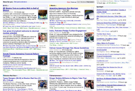
The changes, in all, are fairly minor; the average user, having not read Beckmann’s post, might not even notice the updates. (Since, when it comes to online interfaces, users tend to like things the way they’re used to, that’s a smart way to roll out changes: incrementally and, for the most part, unobtrusively.) But the subtle revamp indicates Google’s willingness — a willingness that’s part of its organizational DNA — to tweak its news platform according to the feedback it receives. Guiding users while also being receptive to them: seems a pretty good balance to me.


