Nieman Foundation at Harvard
This morning, “the biggest event in Gawker Media history” took place: Gawker’s sites have officially launched their redesigns. Go to gawker.com — or jezebel.com or deadspin.com or lifehacker.com or the other sites that make up Gawker Media at the moment — and you’ll see the new page layout that’s been on display in beta-dot form for the past couple of months, brought to life on the properties’ home URLs.
The new look, with its emphasis on images and its de-emphasis of the reverse-chronological format, moves Gawker beyond its blog-formatted past — a shift most aptly described, in a November Lifehacker post, by Nick Denton himself. And, in true blog style, the post-blogization of Gawker is something that’s been described and discussed in the blogosphere long before today’s official drop date. The utter unsurprisingness of Gawker’s new look is probably a good thing for a web property, given how indignantly resistant to design change we web users tend to be.
“It just feels inevitable,” Denton says. “We have a crying need to showcase both exclusives and visual posts. The visual posts are now at least half of our top-performing stories. And audience growth on sites like Deadspin and Gawker has been driven by our most sensational scoops.”
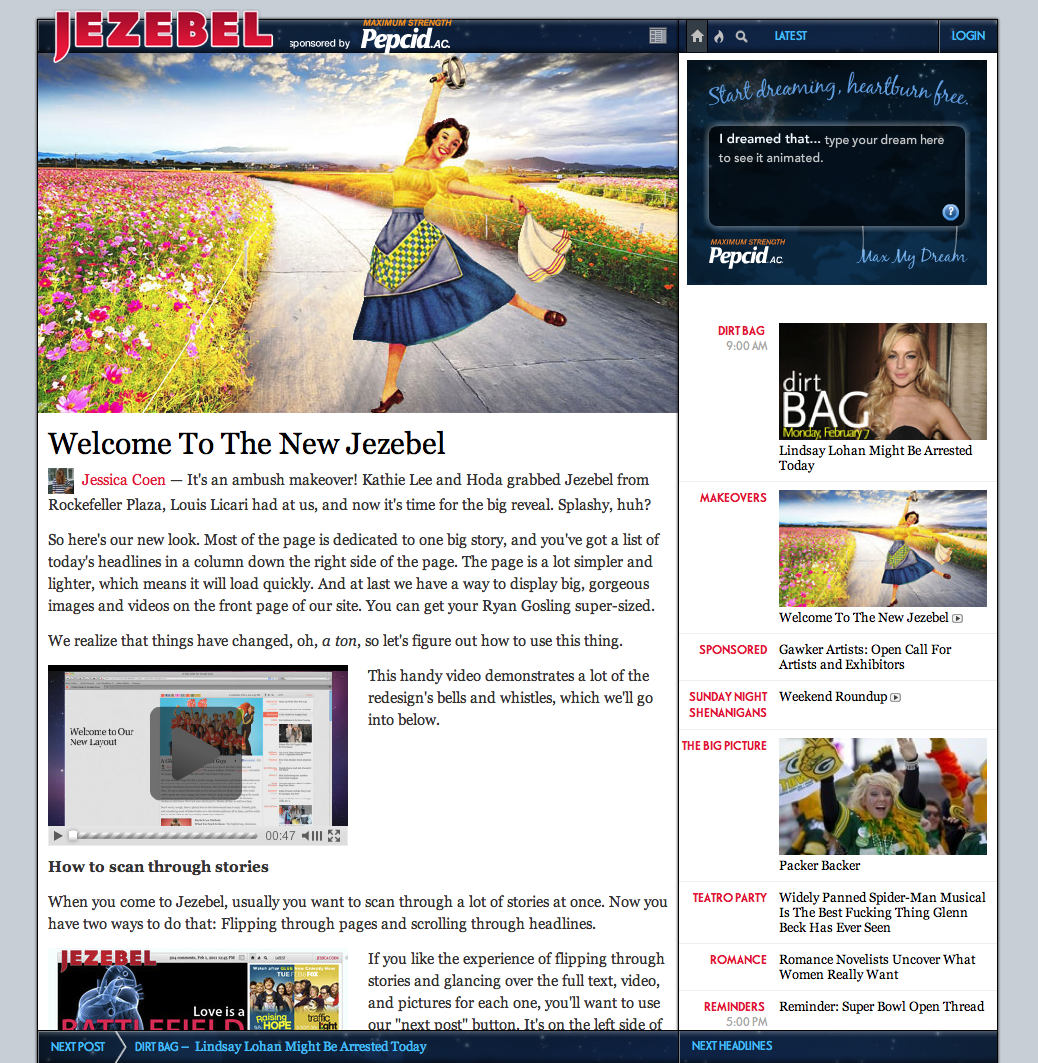
The biggest change to note is the two-panel layout, which makes for a front page that, as Gawker editor Remy Stern put it this morning, is “dominated by one big story (or a roundup of several different stories), and a list of headlines appear in a column down the right side of the page.”
For that, “the antecedents are software products, however, rather than web sites,” Denton told me over Gchat. “We’ve definitely been influenced by two-pane email and news reading apps.” One of the keys to the redesign is the new emphasis on visuals — most strikingly embodied in the huge image slot leading the page. As Denton noted in his Lifehacker post, “This visual slot will be 640×360 pixels in size — that’s 64 percent larger than in the current design — and be in the most prominent location on every page, above even the headline itself. Viewers will be able to toggle to a high-definition 960×540 version — a full 3.7 times larger than the current video standard.” (Gizmodo, notably, has been investing in bigger and better visuals as a way to make stories stand out.)
The redesign is a kind of convergence in action: blog, magazine, and television, all collapsing into each other. “Outside observers will note that this layout represents some convergence of blog, magazine and television,” Denton notes — yup — and though “that’s true in the abstract but it’s more of a description than an argument” — fair enough — when it comes to marketing, the redesign is a kind of argument. Online, increasingly, the ad-sales choice boils down to two general strategies: build ad revenues directly, or build audience (which in turn accrues to revenue).
The new layout is a double-down on the latter. With the design’s increased emphasis on engagement/the lean-back experience/etc., Gawker properties will ostensibly beef up their time-on-site stats while — for the short term, at least — taking a cut on pageviews as readers engage with and lean back into their content. It’s an app-like approach being realized, intriguingly, on the open web. And, in it, Gawker’s taking a TV-like attitude toward ad sales: one that’s more about nebulous mass consumption — zeitgeist, if you will — than about simple CPMs. Essentially, as Felix Salmon has noted: Gawker is selling time, not space. It’s not selling reader eyeballs so much as reader attention.
And that’s an idea that’s been in the works for a while. Last spring, Gawker’s head of marketing and advertising operations, Erin Pettigrew, wrote a post about Gawker’s new emphasis on branded traffic via an attempt to measure “recurring reader affection.” I chatted with her about that post; here’s what she told me at the time:
First, for so long we concerned ourselves with reach and becoming a significant enough web population such that advertisers would move us into their consideration set for marketing spend. Now that we have attained a certain level of reach and that spend consideration, we’re looking for additional ways to differentiate ourselves against other publisher populations. So branded traffic helps to illuminate our readership’s quality over its quantity, a nuanced benefit over many of the more broadly reaching sites on the web.
Secondly, there’s a myth, especially in advertising, that frequency of visitation is wasteful to ad spend. As far as premium content sites and brand marketers go, however, that myth is untrue. So, the ‘branded traffic’ measure is part of a larger case we’re making that advertising to a core audience (who visits repeatedly) is extremely effective.
That’s a magazine model; Gawker has simply been translating it to the web. (“If you’re going to working with the most storied brands,” Denton puts it, “the appeal has to go beyond the numbers. Conde Nast — at its peak — sold the magic.”) And Gawker certainly hasn’t been alone in doing that: See Slate, Salon, and their peer group, who go out of their way to emphasize the smartness (more cynically: the affluence) of their readers to advertisers. And yet Gawker seems to have reached a critical mass (or, to use the language of a writer from one of those Conde Nast titles, a tipping point): It’s moved, it seems, beyond simply selling its readers to advertisers. Now, it is simply selling itself. The readers are implied. They can be, in the best sense, taken for granted.
Check out, for example, the Advertising page on Gawker. In place of a traditional media kit (replete with demographic data about readers and the like), you’ll find a slickly produced video detailing Gawker’s (literally) storied history. The thing has the feel of an Oscar clip reel, complete with a strings-heavy sidetrack; you’re compelled, almost in spite of yourself. The video presents Gawker through the prism of a kind of epic inevitability, noting, accurately, how much the site and its sisters have done to change the media world. The message is, implicitly and essentially: Gawker is the future. Be part of it.
Which doesn’t mean that Gawker isn’t also selling readers to advertisers in the traditional magazine (and, for that matter, newspaper) model; it still is, definitely. It’s just doing it in a slightly more indirect way. The advertising videos are “about the stories,” Denton says. “And the stories define the readers — and the readers define the stories.” The delivering-readers-you-want-to-reach aspect is only one part of Gawker’s marketing argument. “The pitch to advertisers is twofold,” Denton says. “One — and this is the constant — that our audience consists of the young and upscale people who have disappeared from newspapers and other traditional media. And, second, that we increasingly have the scale and production values of — say — cable television.”
It’s that second idea that the redesign is trying to capture. And it’s the resonance, and competition, with cable that will be fascinating to watch as the new Gawker layout becomes, simply, the Gawker layout. (Readers have the option of continuing with the blog format, if they prefer, which won’t serve the 640×360 ads; see the cola-nostalgic Deadspin Classic, for instance. But “I doubt it will represent any more than 10 percent of impressions, anyway,” Denton notes.) Denton sees his competition, he told me, not only as sites like TMZ, Deadline Hollywood, and Perez Hilton, but also — and more so — AOL. (A rivalry that, around midnight last night, suddenly got much more interesting.) “And — in the long term — we’ll compete for audiences with cable groups such as NBC Universal,” Denton says.
It’s a big experiment — and a big gamble. One that, like so many similarly grand experiments being made by the big media companies out there — the Times’ paywall will rise any day now — will be instructive for everyone else. History’s definitely on Denton’s side — he’s been right about a lot so far — but the future is up for grabs. It’s far from certain that the redesign, and the marketing logic that goes with it, will pay off.
Yesterday, after former Gawker editor Gabriel Snyder observed that, since the redesign, pageviews were down at the beta sites of Jalopnik and i09, Rex Sorgatz issued a bet: “I’m on the record that I think the redesigns will fail. And I’m now officially opening the betting pool. I think Denton is going to be forced to pull back on this. If anyone wants to wager that the redesign don’t get yanked back (or greatly modified) by, let’s say, June 1… I’ll take your bet.”
One person who took Sorgatz up on his offer: Denton himself. (“Money where your mouth is,” he told me.) The measure will be October pageviews on Quantcast. The market’s at 510 million pageviews at the moment — so “for every million over that, he pays me $10,” Denton says. And “for every million under, I pay him.”
“I’m going to clean him out.”