Nieman Foundation at Harvard

The New York Times, troubled (but possibly reforming?) megastar Justin Bieber, electronic music producer Skrillex, and DJ/impresario Diplo recently became unlikely collaborators in a recent video feature about the making of the hit song “Where Are Ü Now.” The eight-minute video, which accompanies a 1,600-word piece by Jon Pareles, features interviews with the three artists explaining how the various sounds in the song were created and later pieced together. As the song itself plays in the background, visualizations in the form of colorful geometric shapes and lines run down the left and right sides of the screen, pulsing to the beat of the song.
How the unlikely team of @JustinBieber, @Skrillex and @Diplo made a Top 10 hit http://t.co/3bMnVHiUPW pic.twitter.com/2bb1G7j7VW
— The New York Times (@nytimes) August 26, 2015
Take a few minutes and watch the actual video at the Times. If you have time, watch it on both your phone and your desktop.
Unsurprisingly, the combination of Bieber and The Grey Lady turned some heads. But the Times’ video is interesting for another reason — it was designed from the beginning to be as compelling viewed vertically as horizontally. In a world where young people are watching more video on smartphones than on TV screens, making a video work in both aspect ratios can help it reach a broader audience.
“I knew I wanted to do a vertical version from the very start,” said Times graphics editor Graham Roberts, who worked on the video feature. “My guess is very few people really want to turn their phone sideways. So we should give them what they want: allow them to hold the phone normally and still enjoy the video.”
The traditional way to visualize music is horizontally — think of a sound wave, or the way sheet music is read — but in this case, the decision to animate the video’s graphics vertically was a practical one as well as a stylistic one, according to Roberts and Alicia DeSantis, another graphics editor who worked on the video.
“You don’t want [the visualizations] to cross over the figures — then Bieber and Skrillex and Diplo would have to be lying down for the interviews!” DeSantis said. “But one of the interesting things about the verticality is that it disorients you.” (Think about the scroll on a player piano, for instance, and the keys moving horizontally.)

“The more verticality you had in the video, the more benefit you could get out of the graphics,” Roberts said, pointing out that with this design, people watching the shapes change as they moved up the screen would actually be able to see more of the shapes’ progression.
But adjust your browser size, or switch to viewing on a tablet, and the graphic overlays still don’t impede the musician’s faces. (On the full screen version, the graphics move behind the figures.) That’s because there were three different versions of the video, according to Roberts: 16:9 ratio for the Times online video player and for YouTube, 3:4 which worked for iPad, and 9:16 for vertical view on mobile.
Roberts had floated ideas for the visualizations before any of the interviews were done, which informed how the footage was eventually shot. Pareles conducted each interview with the three musicians separately, with DeSantis accompanying him to figure out what elements of the story her team could highlight and to make sure important details like framing and spacing were taken into consideration. (Once the three had all been pinned down for interviews in July, DeSantis said, the rest of the process moved relatively quickly.)
The team then shot the videos with multiple cameras in black and white and in 6K resolution (“Let’s go show this at the IMAX!” Roberts joked to me) to allow for maximum flexibility when it came to post-production cropping, leaving plenty of extra space around the talking heads. Editing was done using Premiere and After Effects. The team also used Logic to get a sense of song patterns.
DeSantis pieced together footage in an old-fashioned way: by printing out transcripts of the interview, color-coding each artist, cutting out specific quotes, and moving the strips of paper around until the story made sense. The first cut, she said, was about 25 minutes long.
When Roberts first began to map out sections of “Where Are Ü Now” by hand to try to come up with the precise graphics to lay on top of the video, he realized “there were really only a few distinct parts, and a lot of it was loops,” making it possible to present something visually interesting that wasn’t overcomplicated.
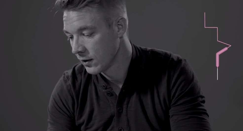
Since the video was conceived as a way to lift the veil on how this summer hit was made, the graphics team wanted to be sure Diplo and Skrillex brought their instruments (i.e., their laptops) to the interviews for on-the-spot demonstrations. For the distinct pieces in the song, the musicians played a stem, the technical term for a single, separated out track. Roberts created separate graphics layers to represent these stems: a layer for all the drums, the piano, and so forth. The much puzzled-over “dolphin flute sound” (represented visually by the lines with a peak), was revealed to be Bieber’s voice, electronically distorted.
“We wanted a person, without even thinking about it, to be able to watch the video and know intuitively what the parts of the song were, and how many parts were going on at one time,” Roberts said. “The point of doing visuals for this song to begin with was to help people understand what was going on in the music and as an aid to highlight the pieces [of the song] each artist was talking about.”
“I was chasing a lot of shapes, making sure they were a natural fit, playing it all back for colleagues,” he added. “I would show [DeSantis] things and be like, ‘It’s done!’ and she would be like, ‘No, it’s not.'”
“There was some tension to oversimplifying,” DeSantis said. “We wanted to keep some of the complexity without being too complex. We wanted it to feel like it lined up with the sound in a continually explanatory way.”


