Nieman Foundation at Harvard

There are a whole host of challenges to creating informative (and on a more basic level, legible) graphics with smaller screens in mind, but thinking about mobile as a simplified version of desktop can be limiting: “These devices are there, they have these capabilities built into them, so how do we use it in our storytelling?” Len DeGroot, director of data visualization for the Los Angeles Times, said, pointing me to a piece on L.A.-area water main leaks that immediately seeks out a reader’s location and displays nearby leaks.

“There can be rich opportunities that come with these devices: the gyroscope that senses tilt and movement, easier geolocation, the built-in camera,” Jessica Yu, global head of visuals at The Wall Street Journal, said. “All platforms have their unique opportunities.” (In the Journal’s interactive on the world at 2050, the “lenticular illustrations at the top were dreamed up as a reader ‘Easter egg’ to discover when they tilted their phones in their hands. The desktop interaction came second,” Yu told me.)
Sometimes, mobile-first thinking percolates into how graphics and interactives are ultimately presented on desktop, or dictates entirely how these teams build graphics-heavy stories.

“We’ve shaken the habit of designing for the large screen. Whatever we’re thinking, we’re thinking for mobile,” Brian Boyer, head of the NPR Visuals team, told me emphatically. “If it doesn’t work on mobile, it doesn’t work. That frequently means that for the big, expansive, swanky infographics — we won’t do it.”
When I asked designers and developers to walk me through how the mobile experience figured into how they built online interactives, all said smartphones opened them up to more creative ways of presenting stories. Many, though, also expressed similar frustrations: full-screen maps, no autoplay video for iOS, concerns about data overload, trying to accommodate both vertical and horizontal orientations. The responses below have been edited for length and clarity.
Len DeGroot, director of data visualization:
 There’s some interactivity that doesn’t work very well on the phone, and sometimes we’ll just disable it on mobile. If something is really hard to read on the phone, we completely redo the graphic or map; we have different things we can swap out for when it gets to phone size. Our stuff is built to respond automatically, but sometimes it can be more economical to not try to force something to reshape itself.
When you have something that’s really horizontal, it often doesn’t work on the phone, especially if the data is really dense: When you shrink it down, it becomes unreadable on a small screen. So what we might do is collect pieces of the information into larger buckets and simplify it, so that you can see it, and can still see a trend. Or we might change the orientation — we really don’t expect anyone to turn their phone.
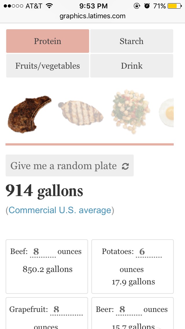
There are times where we just drop anything complex in favor of a simple table, if the visualization just doesn’t work. We do what we have to do for the phone, and that can mean that sometimes we kill the complex graphic.
Our graphic showing how much water certain plates of food required is one where, as you get down into the mobile size, we switched from a visualization [with circles showing water footprint for different foods], to just a simple table list. The desktop visualization just doesn’t work here.
 We had another piece on discovering the Mars Gale Crater, which we wanted to do in VR, but wanted to make it work normally in browsers. On the phone, you can move around and take a guided tour of the space. We wanted to help people understand the terrain and use any size of device to explore the environment.
We’re big users of D3. The Mars Gale Crater piece was done in Three.js. But sometimes just nice HTML will do. We’re fans of low-tech, too. A lot of our efforts are focused on keeping page weight down. We try to keep file sizes down, regardless. The Mars piece works best on a wifi connection.
 We’re still searching for better answers for maps on phones. The water project was our first ambitious stab at something that was natively phone built. But, like everyone else, we’re still really looking for the best way to show complex information in a very small space on a map.
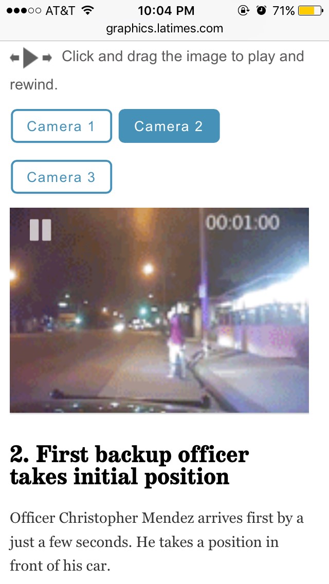
We have many little tricks to help things along. Loading video, as you know, is problematic, especially when you’re doing things for iPhone, which won’t let you autoplay. In our Gardena police shooting piece, where you can drag across the different camera view videos to rewind or move forward, we got around that by essentially creating a GIF and making it substantially smaller, then increasing it in an HTML canvas element.
Julius Tröger, head of interactives:
There were two things we thought about. One, what is the news here? In Berlin, you rarely meet a Berliner who is born here! And two, how do we engage our readers? We always have a rule that any interactive has to work from the far and from the near. From the first image readers need to be able to see: Hey, that’s interesting, that’s news for me.
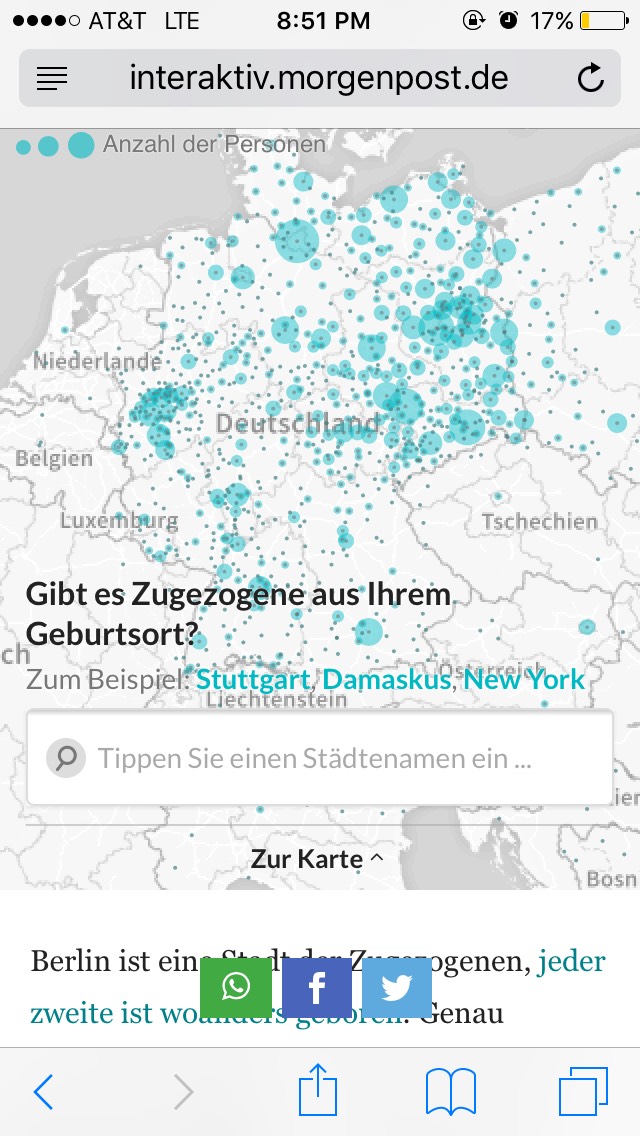 For our Zugezogenen Atlas interactive, which shows where Berliners who now live in Berlin actually were born, it was very important to have the near, so that people could zoom in on their address, their city, see what applies to them.
We put this interactive map up front, which centers on Germany, but you can zoom out to the whole world if you want the bigger picture. We also let you find your specific home city, get the numbers, and share it. We had tens of thousands of Facebook shares — it was really a lot for us, as we’re a local newspaper. We added a Top 100 cities list for comparison, and then our video editor went out on the street in Berlin and asked people who were not born in Berlin and why they were in Berlin.
It’s not that easy to navigate maps on mobile. On desktops you can hover, but you can’t do that on mobile devices — you have to tap, and then you don’t have enough space to see the tooltip. But here we made something that I think worked — or at least, nobody complained — where you type in the address you’re interested in and zoom in right away. So the users are more focused on typing addresses, not just panning and zooming around accidentally.
We always think mobile and desktop at the same time. After we have a basic idea, with text and other elements, of what we want to present, our designer picks up. Our designer had two mockups for us, for desktop and mobile. Then our developers started to build it. We don’t have a rigid process; we just keep iterating, using Slack and Trello, sending mockups around of what we like, what we don’t. We deploy our interactives online privately so that we can test out the link on our own devices, say, when we’re down in the metro.
 We always have a problem with video, which you can’t autoplay on iOS devices. You have to click on the video to start it, it becomes fullscreen, so you are kicked out of the story, but that’s Apple policy. For our changing skyline interactive, which was very complex on desktop and as you scroll through the text, the map visualization zooms in to the places described. This had to work on mobile, too. We’ve been able to use a hack by a colleague of mine who works at The New York Times, called canvid, which he published open source. It takes different frames of the video and makes JPGs from them, and then it packs them together in one shot. So you can can view the Berlin skyline piece on your iPhone.
The workaround we have here was fine because it was mostly graphics, and not a huge amount of data. It was a big effort to make it work on mobile, so I was happy when normal readers, not just data journalists and technologists, wrote us and told us it was well-done on mobile.
Yue Qiu, news apps developer:
 I think about desktop and mobile quite differently. Designing for mobile is not just trimming the bells and whistles; it’s editing the content itself for mobile users. The screen size is not the only big difference: it’s also the limited attention the user is going to give to your interactive. There are other different mobile user habits.
There are a lot of challenges to this, which are probably similar for a lot of people. The tapping and clicking motions from desktop can be easily integrated as swiping, which is a very native mobile gesture. But what is troubling most of the time is the hovering: on the desktop you can explore the interactive when you mouse over something and see information presented, but you can’t really do this on mobile. I don’t think it’s always interesting to present an explorative interactive for mobile users. It may not be what people want to do on a mobile device.
If I do have an explorative data visualization for desktop, I try to make different steps for the mobile user to go through, so they don’t have to wander around to click through or swipe through. You can often capture the information you need in static images, so that people have an easier experience on their phones but also get the key information.
 Maps are a big issue on mobile, especially when you have a horizontal orientation and it takes over the whole screen. So sometimes you pick the most interesting spots and make them into static images, and show those static images on mobile. That’s fine. For mobile, you can create a more limited number of choices for readers — it’s impossible to expect them to be able to click on every little point.
When we have time-series data, we tend to do small modules on the desktop. There can still be a very straightforward way to tell the story on the glance. To play timed stories for readers on mobile, I can loop a GIF, for instance — other ways that allow users to see the change right in front of them.
In terms of helpful tools of the trade, I use a Javascript library called Modernizr, which helps detect if a screen is a touchscreen, and which can also help detect the size of the screen — basically pinpointing if a user is coming to you from a mobile device. There aren’t that many out-of-the-box tools to make visualizations work for mobile, so for me it has to be case by case.
Jessica Yu, global head of visuals:
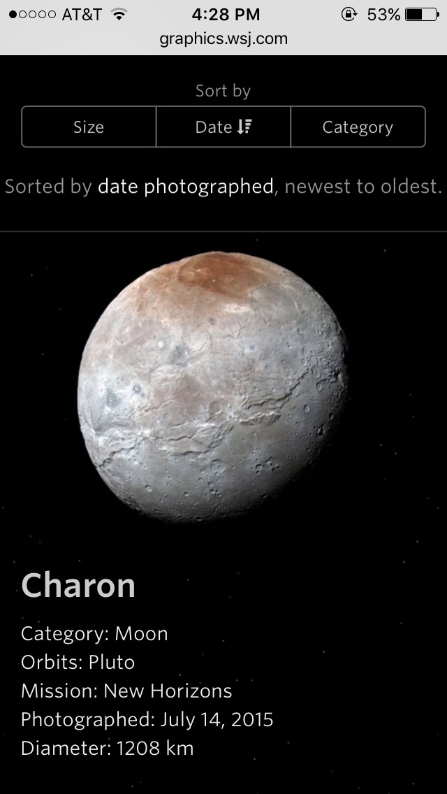
 There are basic differences in the UI patterns between desktop and mobile: Desktop allows for mouseovers and precise click interactions, whereas mobile lets you swipe, tilt, and pan in a more physically intuitive manner. On mobile, you might decide to choose the path for the reader by presenting the information in a logical order via scroll or swipe: From Pluto to the Sun presented desktop users with, literally, the universe. Users could very freely click around any planet of their choice in any order of their choice. On mobile, that initial view wasn’t possible given the limited visual real estate, so we used a vertical scroll and displayed the information cards (which would have required a click to open on desktop) that opened by default.
In general, it’s better to use imprecise, easy-to-repeat motions on mobile, especially since people are sometimes holding the device with the same hand they are using to navigate. That means scrolling and swiping are preferable to tapping, when possible, and because horizontal swiping can activate browser back/forward, vertical sometimes works better than horizontal.
For certain data-heavy graphics, there are times when we choose to hide additional deeper-dive interaction possibilities that would be presented on desktop. But if we have an inkling that the reader might feel “cheated” if they found there was a much richer dataset on desktop, or if the story isn’t served by the simpler solution, then we keep on brainstorming. There’s usually a way.
 We mock things up using whatever tool people are comfortable in, whether that’s code, Illustrator, Sketch, or classic paper and pencil — always accounting for our breakpoints from the start. Given our entirely responsive website, our template has predefined gridded breakpoints for mobile, tablet, and desktop viewports, which help us think modularly to begin with. We also think of the social and homepage promos for these projects as an additional breakpoint.
To house our interactives, we created custom Bootstrap-based HTML templates that map to our grid’s breakpoints and reference our stylesheets, thus covering basic responsiveness and type hierarchy. Bespoke customization inevitably gets layered on top of that as needed. In addition to our interactive container template, we’ve built a suite of in-house responsive storytelling tools for the newsroom to populate, and the mobile experience is part of that output without any additional custom work by an editor.
A few hacks/tips:
Brian Boyer, head of the NPR Visuals team:
It’s sort of a set of starting templates we use. It started out with bar charts and has slowly grown to a little library of frequently used graphic types that you can just copy and start working on it. If you look at NPR graphics, our shit isn’t the fanciest shit in the world, and we’re not winning design competitions for our charts, but that’s because often people are still thinking about this the way they think about print magazines. Our elections website, for example, was designed mobile-first. If you take a look at it for desktop, it’s just our mobile version stretched out.
 Election maps are shown in a standard projection and give disproportionate weight to states that are physically large. We were trying to figure out how to show actual electoral power; the thing we made ended up looking a little like a Tetris screen.
You have these vertical columns, with blocks for each state with electoral votes, and over the night they filled in. When the box filled threshold, someone won the election. That was beautiful enough for us, and it worked, and it worked on the phone.
Maps are tough but, honestly, we don’t do a lot of national maps, and when we do, unless physical geography is really important — the path of a river, size of a mountain range, the migratory patterns of birds. We do thematic maps. The fashion of late seems to be people designing cartograms where each state is a square. But we didn’t want that, because we’re contrary! We think hexagons actually do a better job of getting closer to actual geography.
 We skew against too much interactivity. Don’t make me interact to read something! Lots of interactives have stuff like hover states, and that shit doesn’t work on mobile. We don’t have that in our kit. The most interactive things we build these days are usually steppers, where you tap and something progresses, to see change over time.
One of my favorite graphics was a set of maps about Walmart taking over cities. On desktop it was this triptych, with each of the years. But on mobile we made an animated GIF and rotated through those three maps.
We have a few tricks up our sleeves. There’s this tool we designed called MapTurner, sort of a code-based command line way to generate locator-based vector maps — although we obviously use the Arc tools for that point in the process. One thing we don’t do much anymore is use MapBox. The maps are gorgeous but tough on mobile.
There’s this other thing we built into our Daily Graphics system called Pym.js, after Dr. Hank Pym, a.k.a. Ant-Man. It’s a responsive iframe library. How Pym works is, the graphic can actually tell the page that holds it how big it needs to be: the size of the graphic can change horizontally but also vertically.
Blacki Migliozzi, Mira Rojanasakul, and Alex Tribou, Bloomberg graphics team:
But it’s the content that leads you to opportunities for what the design might look like and what the interaction might be, and so there are certain graphics that really shine as these big desktop experiences and others that can do just as well consumed in a smaller mobile format.
Migliozzi: Speaking about this more as a web developer, we mostly try to follow adaptive design. Sometimes it’s responsive, sometimes we just show alternate pieces (an image of the chart, for instance). We always consider all the possible formats for every graphic, then decide what’s best.
Sometimes an animation might just slow down the page, and we want to respect that, so you just compromise and put it in a static form — but it’s still something that the reader can understand on a smaller device.
Tribou: Ultimately you want the reader to come to a distinct conclusion, whether they’re viewing it on the mobile device or on desktop. The interactions that might get them to that understanding of that story are not the same on every platform.
Rojanasakul: Here’s another example of a format that worked well for us: this budget quiz. We’re always considering clickthrough while building the product — minimizing the friction that a reader might go through to finish something is a really important part of the piece.
 We used to build a few more stepper-type graphics, but we’ve moved away from that in favor of scrolling experiences, for example, in part because follow-through is higher in those cases.
Tribou: We do a lot with scrolling experiences, as opposed to clicking through. It’s easier for a user to move around in a story if they don’t have to find new pages.
The content helps dictate these design decisions. You might be working on a story and find that an animation helps tell the story and helps the reader understand it better. That helps to dictate what we want to try.
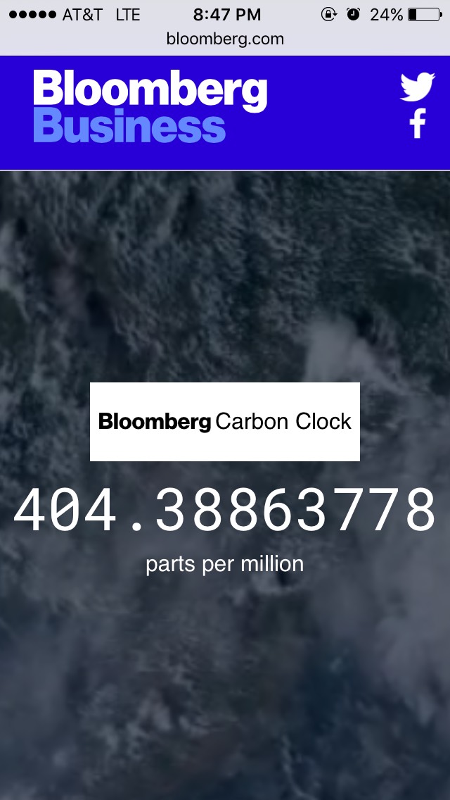 Migliozzi: A simple graphic that ended up doing really well was our What’s Warming the World graph. It didn’t take an enormous amount of time to make, it didn’t really have a hard news peg to it, and it did incredibly well. Compare that to our Carbon Clock, which was months in the making — we created a model in-house that forecasted atmospheric CO2, and most of the work was validating the model, making sure it was accurate. We’d never done anything like that before.
The graphic itself is clean and very simple. We knew the Carbon Clock would be an evergreen piece, so we were okay with spending all that time building out a model. Sometimes something you built in a week ends up being evergreen as well; it’s hard to tell.
We’ve been given a lot of liberty to try new forms. We’re basically always evolving with what we think works at the time. Even a year makes a difference: I look back at old visual data stuff and it looks dated. But it wasn’t. We still pull from those older graphics in our work, but we’re always changing and tweaking stuff.


