Nieman Foundation at Harvard
Editor’s note: Our friend Alberto Cairo is one of the world’s true experts on data visualization in journalism. He’s got a new book out, The Truthful Art: Data, Charts, and Maps for Communication (a followup to his earlier The Functional Art), in which he “explains in clear terms how to work with data, discover the stories hidden within, and share those stories with the world in the form of charts, maps, and infographics.”
It’s not just about visualization — it’s also about the critical thinking and analytical mindset necessary before you launch that graphics app.
Here’s an excerpt from the book’s introduction; you can download the entire introduction here.
It’s a fact of life that kids put their parents to the test with their boundless and unpredictable curiosity. I have three small children, ages 4, 8, and 10. Here are some of the questions that I got from them while writing these lines, followed by my thoughts and the actual answers I gave them.
My answer: “No idea, kiddo. I don’t even know how to play Minecraft. Why don’t you watch The Lord of the Rings movies again? I will be happy to watch them with you.”
Answer: “No, sweetie. Only mommies can carry babies in their tummies. Daddy just has big muscles.”
Answer: “Why don’t you Google it, honey?” (Just kidding, although I believe that many parents in my position would go for that one.)
My actual answer: “Can you give me a few hours? Then I’ll be able to explain it to you.”
My daughter’s question forced me to take my fingers off the keyboard and think for a minute. My memory of Newtonian physics was a bit rusty, but I was sure that the fact that planets keep rotating is related to the laws of motion. I dusted a couple of popular science books from my shelves and also looked for some articles on the Internet. Then I grabbed a pencil, a pen, and some crayons: I think more clearly when I draw. I ended up with a series of sketches that I’m going to call an “infographic,” a graphical display intended to convey information.
Here’s the story I told my daughter.
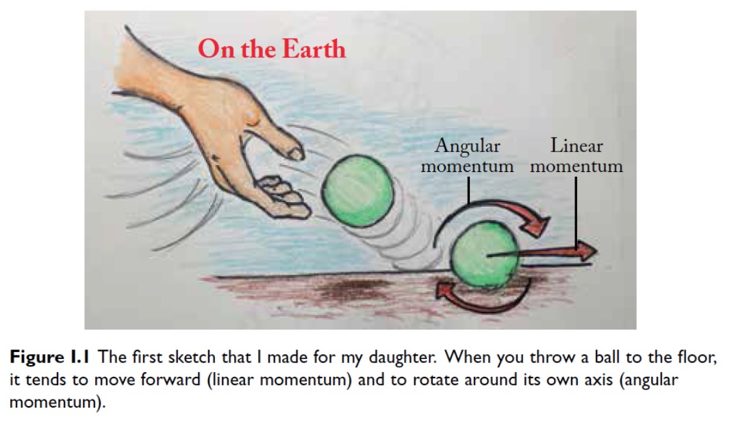
Let’s begin here, on planet Earth. When you throw a ball (Figure I.1), it tends to move forward and spin around its own center. The faster we throw the ball and the heavier it is, the more momentum, or impetus, it carries. There are two kinds of momentum in this case: linear (forward motion) and angular (spinning.)
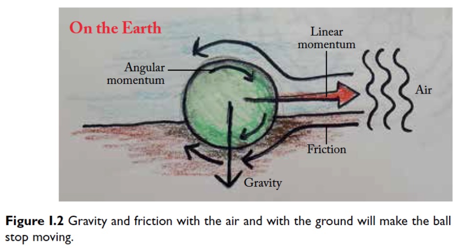
It is obvious that the ball will not move forever. Eventually, it will stop. Why? First of all, the ground, as well as the air, provides friction (Figure I.2). Air is a fluid, like water. Imagine that you jump into a swimming pool. When you enter the water, your speed decreases, right? That’s friction at work. Friction is a word we use to describe an interesting phenomenon: the air and the ground absorb the momentum that the ball carries.
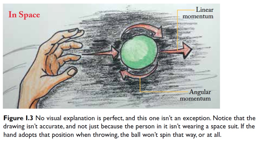
Now, imagine that you’re an astronaut floating in deep space (Figure I.3). (My daughter pointed out that this illustration is inaccurate; the person in it should be wearing a spacesuit! Extra credit for her.) There’s no air in space. Therefore, there’s almost no friction. If we throw our imaginary green ball, it is likely that it will take millions and millions of years to stop moving forward. It won’t stop spinning until then either. We call this conservation of momentum: if there’s nothing to interfere with the ball, it won’t stop moving.
Next, let’s go back in time zillions of years, to the era when none of the planets in the solar system existed. Just the sun was there, surrounded by large clouds of dust particles. These clouds spun at a very, veeeery slow speed. The particles were held together and bound to the sun by gravity (Figure I.4).

Something interesting happened then: little by little, gravity made these little particles move closer and closer to each other. And the closer they were, the faster they spun. The reason why that happened is a bit complicated to explain, but it isn’t crucial for now, so let’s leave it for another day.
 The last step is the easiest to understand. The particles in the clouds moved so close to each other that they ended up merging. Earth and the other planets were born from collapsing dust clouds (Figure I.5), and they keep spinning, at least for now, because there’s very little in space to stop them from doing so.
I must confess that my daughter didn’t get all this at first. It was just a bit too much information to digest. So I went over the entire sequence of drawings with her again. While doing it, I realized that this exercise embodied a few points that I make in all my courses, namely:
Quite good for such a simple exercise, right? And there’s more.
I got another insight from this tale about spinning planets. After I finished the explanation for the second time, my daughter remained silent for a few seconds. Then she asked, “OK, I get it. But Earth spins very fast. Why aren’t we thrown into space, then?”
Understanding never quenches the thirst for more understanding, does it? Quite the contrary is true: the more we learn, the more aware we become of the gaps in our knowledge. As physicist Marcelo Gleiser wrote, “The knowledge that we have defines the knowledge that we can have… As knowledge shifts, we ask new kinds of questions that we couldn’t have anticipated.”
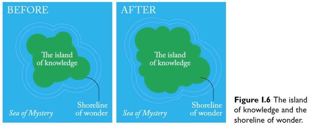
Gleiser’s book is titled after the most evocative metaphor I know about the human quest for understanding: the island of knowledge. It seems that the first person to refer to it was New York Methodist pastor Ralph W. Sockman, who is believed to have said: “The larger the island of knowledge, the longer the shoreline of wonder.”
Chet Raymo expanded the metaphor beautifully:
All scientific knowledge that we have of this world, or will ever have, is as an island in the sea of mystery. We live in our partial knowledge as the Dutch live on polders claimed from the sea. We dike and fill. We dredge up soil from the bed of mystery and build ourselves room to grow.
Of course, being a visualization designer, I couldn’t resist making a little illustration of what happened inside my daughter’s brain (Figure I.6): the island of knowledge expanded for her, but so did the shoreline of wonder, draining new land out of the sea of mystery.
Finding the right answers to good questions makes us capable of posing even better and more profound ones. We can all enjoy this process. If you allow me a brief digression, this is the reason why I believe that we should teach our kids to love not knowledge per se, but learning. They should be encouraged to cherish the very quests they undertake, not just their products.
Good data visualizations and explanation infographics communicate information and, as a result, they can increase our understanding. That’s their first role, and it’s what I was focusing on when I made the drawings for my daughter.
But graphics may also prompt exploration. They reveal as much as much as they lead to new questions. A graphic may tell you a compelling story, but it can also invite you to expand the shoreline of wonder in ways that its creators didn’t predict. Here’s famous visualization designer Moritz Stefaner in a manifesto titled “Worlds, not stories.”
Data visualization can help us both to understand complex issues a bit better, but also to provide images to debate about, to refer back to, and sometimes just to meditate over… I want [people] to use the visualizations I provide as starting points for their own explorations… Consequently, any serious visualization of a sufficiently complex topic should always aim at exposing the complexity, the inner contradictions, the manifold nature of the underlying phenomenon. I like to provide users with a structured way to explore a complex phenomenon on their own terms, in a sensually rich mosaic of media and facts rather than a pre-digested narrative with a surprise at the end. To me, interesting topics rarely boil down to a single story.
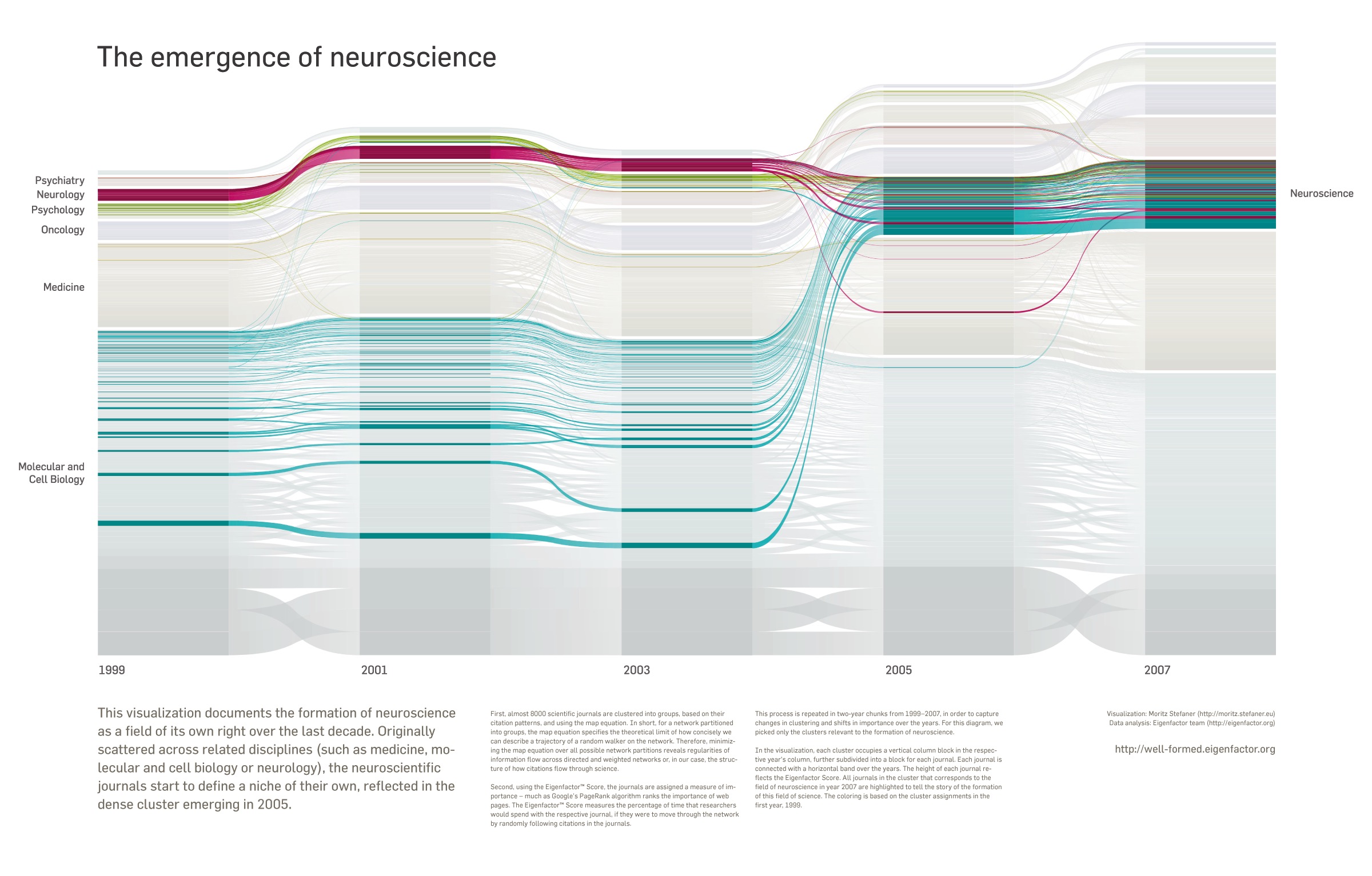

Stefaner doesn’t reject traditional linear narrative techniques outright, but he prefers to build interactive displays that enable discovery. His work embodies this approach. In 2009, he partnered up with the Bergstrom lab in the biology department at the University of Washington to create Eigenfactor, a project that visualizes citation patterns between scientific journals.
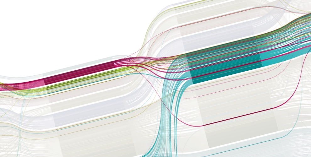
Some of those visualizations are illuminating. Take a look at Figure I.7 (on the previous pages). What do you notice? To me, besides the striking beauty of this Sankey diagram, its central message is clear: modern neuroscience is the result of the confluence of several disciplines.
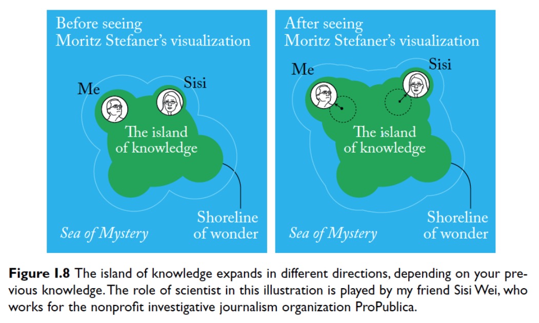
That’s the main story I extract. Yours can be different than mine. What you’ll get from this graphic depends on the knowledge that you had before facing it. As a journalist, I can be standing on a different place on the shoreline of wonder than a scientist. Stefaner’s visualization may expand the shoreline in slightly different directions for each of us (Figure I.8) and, therefore, it will lead us to stare at two increasingly disparate patches of the horizon above the sea of mystery.
A few weeks ago, I stumbled upon a graphic designed by data scientist Gilad Lotan (Figure I.9) that further illustrates how the communication and exploration dimensions of visualization design complement each other. In an article published in the Los Angeles Times and on the website Medium.com, Lotan described a particularly quirky experiment.
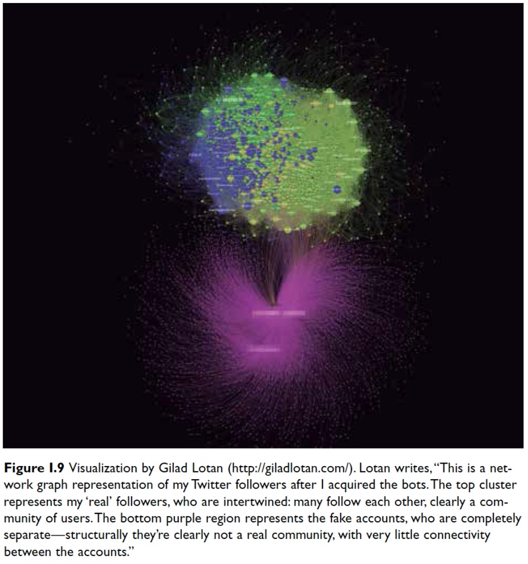
In the past few years, services that promise to increase your standing on social media are thriving. For a few bucks, you can be followed by thousands of fake Twitter accounts. Lotan wanted to answer two questions: first, does buying fake followers lead to more real followers? And second, how are fake followers connected to accounts created by actual people? The short answer to the first question is yes. To understand why, you should read Lotan’s article.
The answer to the second question is in the visualization that Lotan designed with the data he collected. The multi-colored blob on top represents his 2,600 followers before the experiment. Being part of a virtual community, the nodes are strongly connected and close to each other. The purple cloud at the bottom corresponds to the 4,000 faux followers Lotan paid for. Notice how scattered and sparsely linked they are. No community exists here. This is the main message revealed by transforming thousands of data points into a visual shape.
Many more insights could hide in this intricate display, though. To discover them, we’d need to scrutinize it attentively. Again, communication and exploration go hand in hand. We can tell stories with graphics, but we can also let people build their own stories with them.
To rephrase all this a bit, let’s say that a good visualization is:
This, in a nutshell, is what half of this book is about.
The other half is about what precedes design. There are obstacles that hinder the expansion of the island of knowledge. It’s not possible to become a professional visualization designer without learning how to overcome them.
Alberto Cairo is Knight Chair in Visual Journalism in the School of Communication at the University of Miami.


