Nieman Foundation at Harvard
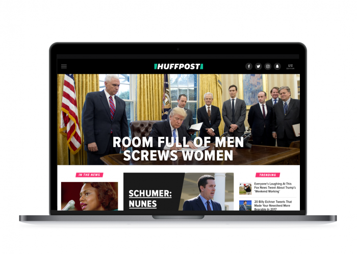
The Huffington Post has pulled no punches with its tabloid-inspired homepage splashes.
“BILLY ON THE STREET,” its Bill O’Reilly story announced.
“HE WENT TO JARED,” another proclaimed (Jared Kushner, that is).
Here’s another, on Rep. Devin Nunes:
This @HuffingtonPost splash was made for me. pic.twitter.com/qCcd5GgO2G
— Hillary Frey (@hilella) March 29, 2017


“I thought this was an opportunity to change our look and feel, and signal that we’re going to continue to do big, bold things in this space,” Julia Beizer, HuffPost’s head of product, told me. “When we sat down to think about what we wanted the site to look like, we did all the things we usually do — looked at user data, analyzed traffic patterns. But we also asked ourselves, what do we think makes us who we are? The answer was: our splash.”
Design director Alison Zack suggested introducing that splash image into everything, according to Beizer. People have been consistently sharing images of the splashes on social anyway. Now, when readers share a big HuffPost story or come across one on search, they’ll get the quippy headline and image (it’s going in the og:image field).
 “The splash is really the best of our editorial voice. It’s funny, immediate, bold, of the moment,” Beizer said. “In thinking about who we are, this is the best reflection of it from a product perspective.”
On some days, HuffPost gets as much as a quarter of its traffic directly from its homepage, Beizer told me (she was also quick to emphasize that the site’s still dominant on Facebook). The readers accessing HuffPost from its homepage, unsurprisingly, are the most engaged readers, clicking into six to seven pages per visit. But anecdotal feedback and focus groups suggested that some readers consistently only wanted to read stories from specific sections, and weren’t always getting to the sections they wanted easily enough. Users who watched video from the homepage tended to watch a lot of video in general, so the redesign moves up the video boxes (and “any slot on the homepage can be filled by a video,” including the main splash).
HuffPost is also switching to a simplified, still-green but Huffington-less logo (an outside agency helped design it). A slash through the middle is meant to evoke cutting through the noise, as well as the URL slash.
The mobile app is getting the new look as well, though the updates that roll out on Tuesday will only be a “small preview of what’s to come.” Last month, for instance, the app, a hybrid where pages were webviews, moved to native pages. “You’ll see us remaking the pages to get users to more fluid content discovery,” Beizer said. While political and world news does well, there are many users, for instance, who go straight to the entertainment section in the app.
“We no longer need to have the look and feel of newspaper to have the same credibility, so we settled on a typeface that’s bolder than our current one, that mixes in the typeface of the tabloid,” Beizer said of HuffPo’s logo and font update.
In describing the new HuffPost (for which she is hiring a new top management team), Polgreen has spoken widely about her editorial vision and her desire to inject old-school tabloid passions into the redesigned publication. The redesign presented an opportunity to highlight “what you see in those great equalizing tabloids, what you think about when you think about the Chicago Sun-Times in the ’70s or the New York Daily News,” Beizer said. “We believe we’re well positioned to speak for people who don’t currently see themselves represented.”


