Nieman Foundation at Harvard
A study comparing redesigns of homepages for news organizations in the United States and Canada found that contemporary designs with more images and less text resonate more with readers — but noted that experimenting with the redesign and doing before-and-after testing can reveal some helpful insights.

“Our results show that an online experiment can pick up on many of the same signals as a full launch of a site redesign,” Emily Van Duyn, a research associate for the Engaging News Project, said in a statement. “We believe that doing an online experiment could provide news organizations with a relatively inexpensive way to test out a redesign before a full launch.”
In the case of the Canadian redesign, both pageviews and the time spent by readers on the page were higher on the new site than on the old site. Readers were able to remember articles more effectively, potentially aided by a greater number of photos. The new site also replaced a grouping of 20 picture-less sections with nine sections labeled by topic and their own pictures.
The U.S. organization’s redesign did not result in higher visit times, but the bounce rate did rise. There was no major difference in recall rates.
The researchers considered potential reasons for improved article recall on the Canada site and plausible explanations for the U.S. site’s data.
Canadian site:

(1) Pictures increase recall. Six articles were recalled more frequently on the new site than the old one. In 28 of 30 observations (6 articles across 5 different time periods), these articles were accompanied by a picture on the new site, but not on the old site.
(2) No differences in recall when articles equally prominent on the old and new sites. Three articles were recalled at a similar rate for both the old and new sites. In 12 out of 15 observations, the articles were equally prominent on both sites. The Trudeau article, for instance, appeared in the top third of the page, in the first column, and had a photo on both sites for all time periods analyzed.
(3) Column on the page affects recall. Three articles were recalled more frequently on the old site than the new one. It is more difficult to explain why these articles were recalled more frequently on the old site. The best explanation seems to be the column in which the story appeared. In nine of 15 instances, the old site had the article in the more prominent first column reading from left to right. In three instances, the story appeared in an equally prominent column. And in three instances, the pattern is the reverse, where the new site had the article in a more prominent column
U.S. site:
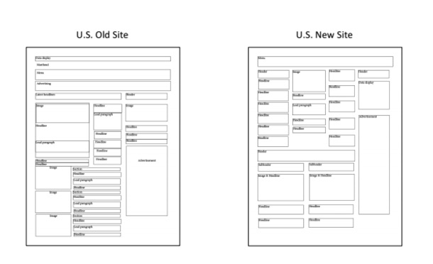
(1) Pictures affect recall. The Putin article, better recalled on the new site, appeared with an image atop both the old and new sites. On the new site, however, there were no other images in the same row as the Putin story, while there was a competing image in the same row on the old site.
(2) The amount of scrolling matters. The Yellen article, better recalled on the new site, was featured at the top of the page on the new site, but was farther down the page on the old site. The rich banker, Indian overpass, and Syria stories required less scrolling on the old site compared to the new site. They also were better recalled on the old site.
(3) Column on the page affects recall. The Trump and China Xi stories, better recalled on the old site, appeared in a more left-hand column on the old site compared to the new.
(4) No differences in recall when articles equally prominent on the old and new sites. Just as we did on the Canadian site, we found on the U.S. site that the articles with no differences in recall (Trooper wounded, Megacopter) were similarly prioritized on the old and new sites.
Also, only 54 percent of participants in the Canada study knew what a hamburger menu was. (Hint: it’s the three horizontal lines that appear as a button to unleash the site’s list of section options. The question wasn’t asked on the U.S. side of the study.)