Nieman Foundation at Harvard
The fascinating, if flawed, meme-tracking study that I wrote about yesterday is full of rich data on the mechanics of American political journalism. To review: The paper analyzes commonly repeated phrases from a broad swath of media coverage in the last three months of the 2008 presidential election. Phrases like “lipstick on a pig,” “No way, no how, no McCain,” and “Hey, can I call you Joe?” (Aw, don’t you miss the campaign?) The study’s authors hoped to determine the speed, duration, and evolution of those phrases, which they refer to as memes.
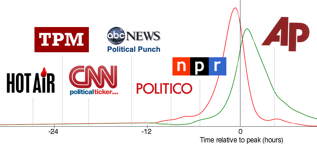
What you’re looking at above is the average time between particular news organizations first mentioning a phrase and its peak among all news sites and blogs. (Here’s a larger version.) For instance, the conservative blog Hot Air typically reported on a phrase 26.5 hours before it became a veritable meme, putting the site furthest ahead of the pack. But it’s worth noting that Hot Air only ever reported on 42 of the 100 most-popular memes, whereas The Huffington Post mentioned 73 of them and was still, on average, 18 hours ahead. The New York Times political blog The Caucus was generally 11 hours ahead — between ABC News and Politico — while reporting on 43 of the top 100 memes. (The data is on the study’s website.)
For my graphic, I’ve played with the paper’s cardinal curves, which represent the volume of mentions for your average political meme, spiking in a matter of hours and dissipating nearly as fast. Yesterday I dwelled on the difference between the red and green curves, but today it doesn’t matter. A few other caveats: The long tail at left was drawn by me and isn’t quite precise. The data for Talking Points Memo only represents TPM DC (née TPM Election Central), and The Associated Press data is from the AP feed on a site called My Way, which might not be as fast as the news service.
It’s tempting to view this chart from left to right — as in, who scooped whom — but remember that nearly all of these memes originated from public statements by the candidates, so it might be a question of which news outlets engaged in the most group think (to use Jay Rosen’s favored term for political reporting). When I spoke to Jon Kleinberg, an author of the study, he offered several interpretations, including what he described as a “two-step flow of influence.” Sites like Hot Air and TPM identify phrases of potential importance, while CNN, ABC, and Politico, in turn, transform the message into a meme. Then the AP conveys the conventional wisdom.
Another way of looking at the data is that influential blogs hanging out on the far-left tail are more likely to report on iterative developments as they happen, while mainstream news outlets feel compelled to fit memes into a broader narrative. The study lists several phrases that were first “discovered” by blogs more than a week before peaking, like when Sarah Palin quoted Ronald Reagan at the end of a debate. That immediately raised flags among bloggers who identified the quote’s origins in a 1961 Reagan speech opposing Medicare, but it didn’t gain traction until more than a week later, when Medicare briefly became an issue in the 2008 campaign.
However you view the chart, it feels like each news organization has situated itself quite intentionally along the curve, staking out a role in the political news cycle. With the meme-tracking technique demonstrated in Kleinberg’s study, news outlets could themselves keep track of where they stand and adjust their reporting strategy if they prefer another spot on the cure. They might consider, for instance, whether they add anything at all to the political discourse by reporting on a meme so close to its peak.
The study also includes a stacked plot of the 50 most-popular phrases (below), which appears to show that media coverage of the campaign tended to coalesce around memes in September 2009 more than in October. “September has this kind of rhythmic feel to it, each week something dominates,” Kleinberg told me. “And then you get to October, where it’s this strange new pattern where there are all sorts of threads with no one thing rising to the top. It was harder to break through.”
He likened the pattern to an audience clapping in rhythm and then breaking down into scattered applause. “This feels like a system that’s sort of lapsing in and out of sync,” Kleinberg said. A question for political journalists to consider is: why?


