Nieman Foundation at Harvard
Maybe it’s just the 30-something former rock critic in me, but I keep accidentally calling new gadget site The Verge The Verve instead. But whatever you call it, The Verge’s launch today is one of the most anticipated in the online news space in some time. The chance to build a new platform from the ground up, with talented editorial and tech teams attached, combined with the months of buildup at the placeholder site This Is My Next, meant a lot of people were waiting to see what they’d come up with.
And it is impressive: bold, chunky, and structured, all at the same time. The gadget/tech space has no shortage of competitors, and building a new brand against some established incumbents takes a bold move. Which of The Verge’s moves might you want to steal for your own news site? Here are three.
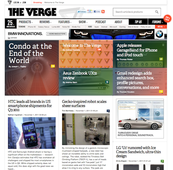
Engadget, the tech site from which most of The Verge’s core staff came, has long committed itself to having big, 600-pixel-wide-or-so art on each of its posts, be they short or long. But the Verge takes that a step further. Just look at the home page — big beautiful images with lovely CSS-driven tinting in the top promo area, then more photos attached to nearly every linked story. Because every story has all the visual fixings, they can ebb and flow as the story moves down the front page. (The movement is still blog-style reverse-chronological.)
The story pages expand the photo well even more and feature page-width headline slots with a nice slab serif, Adelle Web. (Slab serifs are all the rage these days.)
The Verge’s short, aggregation-y posts get a bigger design treatment than most news sites’ feature stories do. (They also carry over Engadget’s highly annoying habit of burying the credit links for what they aggregate in a tiny box at post bottom.) But if you really want to see the power of big visuals, look at one of the site’s feature stories, like its review of the iPhone 4S or this takeout on survivalism — photos over 1,000 pixels wide, bold headlines and decks, structured story organization, embedded galleries, columns that don’t all stick to a common template well, page-width graphics. And check out the gallery and video pages, both of which stretch out Abe Lincoln-style to fill the browser window. In all, it’s the kind of bold look that you’re unlikely to see on most daily news sites; its design DNA lies much more in magazine layout.
That bold look comes with some tradeoffs, of course. While the front-page content is still generally newest-up-top, it’s not quite as obvious what’s new if it’s your second time checking the site in a day. And the front page has far less information density than a typical news site; on my monitor, the first screenful of The New York Times homepage (to go to the opposite extreme) includes links to 32 stories, videos, or slideshows, while The Verge’s has only eight. But that’s okay — while prolific, The Verge produces a lot less content than the Times, and I suspect the appealing graphical look will encourage scrolling more than a denser site would. And each story on The Verge homepage gets a bigger sales push — between a headline, an image, a deck, and an excerpt — than all but a few newspaper stories do on their front pages.
I suspect we’re going to see more of this big, bold, tablet-ish design approach finding its way back into more traditional news sites in the next year or so; you can already see movement in that direction comparing the Times’ (redesigned) opinion front to its (almost unchanged since 2006) homepage. In a world where an increasing proportion of traffic comes from social media and search — that is, from some place other than the front door — it makes sense that the burden of a site’s homepage to link to everything might be lightened.
It’s telling that the first item in the top navigation on The Verge is “Products.” Not “Articles” or “Latest News” — “Products.” Just about every significant product in the gadget universe — from cell phones to TVs to laptops — gets its own page in the underlying Verge taxonomy. Here are all the cameras, and here are all the gaming systems, for instance, and here are some sample product pages. (Intriguingly, you can search through them by using filters including “Rumored,” “Announced,” “Available,” “Canceled,” and “Discontinued.” Did you know there were 129 different tablets out there?)
The product pages feature basic information, full tech specs, related products, and in some cases “What You Need To Know” sections. These will be good for SEO and pageviews, and they’ll likely be useful to readers; stories about a product link prominently to their related product pages. (I’m actually a little surprised the product pages don’t take the logical next step and slap “Buy Now” links next to everything, with affiliate links to the appropriate vendors.)
Topic pages are nothing new, of course, but few news sites make this sort of commitment to being a reference point outside the boundaries of the traditional news story. A newspaper may not care much about the Nokia Lumia 800, but they could build their own semantic structured web of data around city council members, professional athletes, local restaurants, businesses, neighborhoods…whatever matters to readers. Most news organizations will have something that completes the SAT analogy The Verge : gadgets :: Your News Site : _________.
Engadget has a famously active community — so much so that it had to turn off comments entirely for a stretch in 2010 when things were getting out of hand. (“What is normally a charged — but fun — environment for our users and editors has become mean, ugly, pointless, and frankly threatening in some situations…and that’s just not acceptable. Some of you out there in the world of anonymous grandstanding have gotten the impression that you run the place, but that’s simply not the case.”)
The Verge appears to be doubling down on community, though, adding topic-specific forums to the voluminous comment threads on specific entries. Forum posts get big bold presentation too. The same Josh Topolsky who wrote that rip of Engadget’s commenters above writes today that the new site is designed to let “reader voices be heard in a meaningful way…we think it’s totally cool and normal to be psyched about a product or brand and want to talk about it.” He also promises that active commenters and posters will get “special sneak previews of our newest features.”
Will it work out and generate positive, useful discussions (or at least enough pageviews to satisfy the ad sales team)? We’ll see. But it’s good to see some attention to reader forums, a form of reader interaction a number of news sites have walked away from in recent years.
What’s most promising about The Verge, though, is not any one specific element — it’s the fact that they’re giving a lot of thought to the form of their content, at a time when the basics of the blog format have congealed into a kind of design conventional wisdom. Here’s hoping other sites join that process of thinking about their tools and their structures along with their daily content.