Over the past two years, the Associated Press has nearly doubled the number of interactive graphics it produces each month, jumping from 40 in 2009 to over 70 so far in 2011. On the surface, that increase is logical almost to the point of being unsurprising: The AP, after all, makes a lot of stuff that serves a lot of clients, and the demand for interactives is growing.
But while the AP’s Interactive department is pumping out a steady amount of work, it’s what they’re creating — and how they’re creating it — that’s really interesting: from data visualizations to mash-ups of video, maps, and animation that can jump from website to phone to (soon enough) tablet. Often, they’re creating those features against the backdrop of breaking news.
Data visualization is “going through a kind of renaissance in journalism,” said Shazna Nessa, director of Interactive for the AP. What’s really behind the news collective’s uptick in graphics, she told me, is a kind of evolutionary change in journalism — one that’s reflected in the Interactive unit itself. Once a repository of charts and maps, the department is now creating what Nessa described as “comprehensive interactive stories,” and we can expect to see a lot more of them.
When most people think of the AP, they think of the global army of correspondents reporting stories that appear in papers and websites. More and more, though, the AP brand is also coming to represent interactive features that convey the news. And though the Interactive department has undergone a dramatic shift in recent years to be able to produce interactive graphics, it’s still providing the qualities newspapers have relied on the AP for for years, Nessa noted: speed, accuracy, and a vast network of resources.
The trick in being able to roll out these features so quickly (and likely another reason the department has increased its output) is the usage of templates, Nessa said. That basic form allows the artists, programmers, and others on staff to publish graphics quickly — and to continuously update them as more information comes in from reporters. That’s why when events like Japan’s earthquake and subsequent tsunami hit, you could find not only breaking reports from the AP, in text, but also incredible photography and interactive graphics that harnessed reporting from correspondents as well as accounts and images from on-the-ground witnesses.
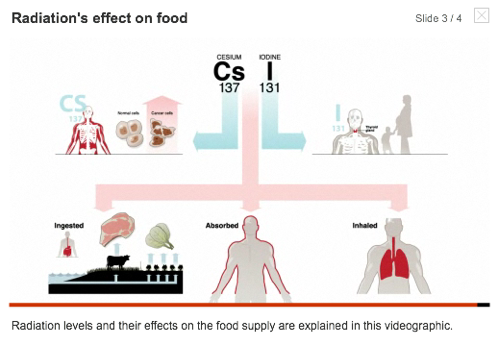
After the department’s first Japan feature was published, its staff began creating regular interactive updates to the story, including timelines and damage reports from the effected prefectures around Sendai, as well as information from reporters tweeting from the field. All wrapped together, they produced robust features covering the earthquake, the tsunami, and then the unfolding nuclear problems — features that combined animation, video, and a mix of contributor and staff photography.
In the case of the earthquake in Japan, the team’s first interactive feature was up in around four hours, Nessa said — and that was largely thanks to using templates. “It creates structure and helps organize the storytelling,” she noted. Building some uniformity into the production process, “we can scale more and faster than we have in the past.”
And that is possible, in turn, Nessa said, because of a reorganization of the Interactive department that’s taken place over the last several years. The team moved away from simply being “the infographics guys,” adding the multimedia and GraphicsBank (AP visuals for TV) departments to become an uber-graphics house. Even so, though, there was still a hole, Nessa said. The unit needed people handy with Actionscript, Ruby on Rails, and Flash to complete the team. (People like, say, Lab contributor Jonathan Stray, now the AP’s Interactive Technology editor.) The change was clearly meant to align with the ways people are consuming news online.
“It’s integral to everything we do,” Nessa said of the team’s reliance on programmers. “In my opinion it was the missing piece for a while. We’ve been able to really grow since filling that missing piece.”
As Nessa described it, the team needed to be both technically and journalistically proficient. When building a package to explain cadmium contamination risks in drinking glasses, for example, you have to combine an eye for code with a reporter’s sense for the nut graf. It’s about knowing what information is important and the right structure to use to convey it. “We wanted a department more specialized in visual storytelling and things that add value to sites and devices of customers,” Nessa said.
But there’s another value in having a staff that walks in the worlds of both journalism and programming: the ability to see things in news stories that others may have missed. So much news now starts with documents and information, not just catastrophes and events, and it’s necessary to have people who can stare through a block of data and see the story on the other end. That’s one of the reasons the AP applied for a Knight News Challenge grant to create Overview, a tool that would help reporters examine large data sets.
New devices and new platforms are the next step for the interactive graphics team, Nessa said. Readers have a need and expectation for new ways to experience news, whether it’s through smartphones or tablets, and the AP’s clients want to respond to that expectation. Nessa said the AP is moving away from Flash graphics and experimenting with HTML5 to make content that works across different devices. And while the bulk of her staff is focusing on day-to-day graphics needs, she said they also make time to explore different ways of displaying the news. That may mean HTML5, video, or even — yes — animated gifs.
“The possibilities are different depending on the format,” she said. “The layering of information is now about depth rather than the space it takes up in a newspaper.”