Nieman Foundation at Harvard
Editor’s note: Back in May, I noted this Quora discussion on how Quartz creates visualizations — charts, mostly — of data so quickly off the news cycle. The answer involved an in-house tool that made it relatively simple to turn a data set into a chart that fit Quartz’ visual aesthetic.
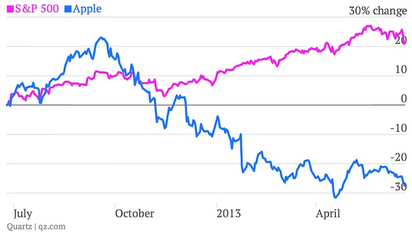
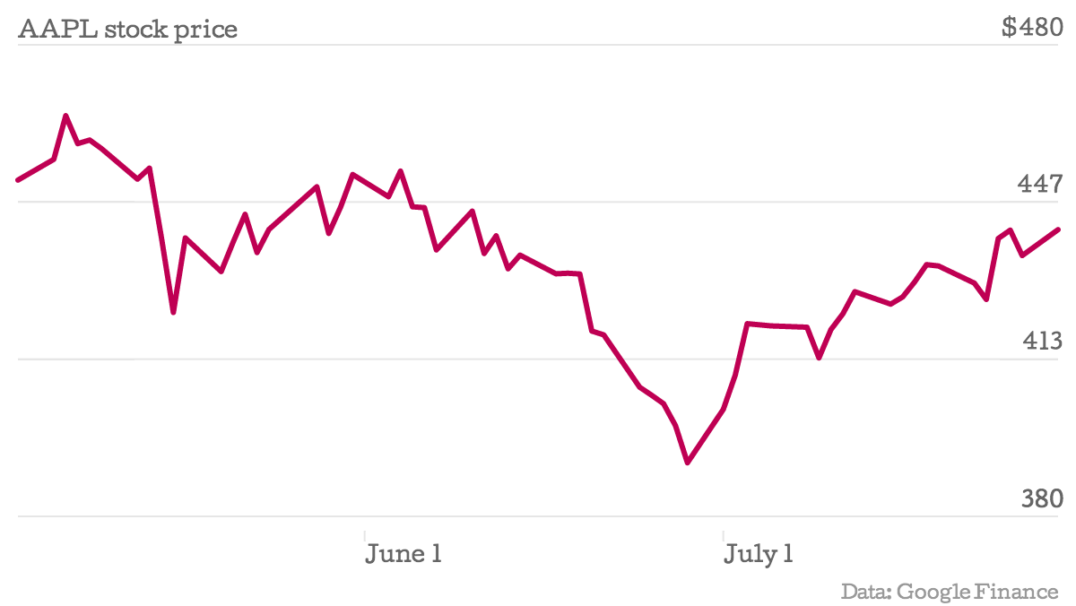
I was very happy, when tweeting with that tool’s creator, David Yanofsky, to learn that Quartz planned on open-sourcing the tool. It’s built on the amazing D3.js — built by The New York Times’ Mike Bostock — which is immensely powerful but also features a learning curve that’s proven a bit too steep for me. Today, that tool, Chartbuilder, is available for your use. (Here’s a chart of Apple’s stock price since May 3 that I made in about three minutes.)
Today Quartz is open-sourcing the code behind Chartbuilder, the application we use to make most of our charts. Along with the underlying charting library — called Gneisschart — the tool has given everyone in our worldwide newsroom 24-hour access to simple charts at graphics-desk quality. It has helped all of our reporters and editors become more responsible for their own content and less dependent on others with specialized graphics skills.
The project started as a tool for myself. Dismayed by some of the ugly, poorly cropped, off-brand, and illegible charts showing up on Quartz and frustrated by the amount of my own time it was taking to produce even the simplest charts in our style, I set out to make a tool that would allow me to support the charting needs of the newsroom without consuming all of my time. It quickly turned into an application for the entire newsroom.
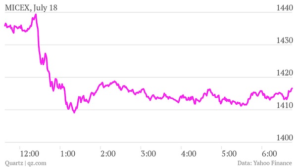
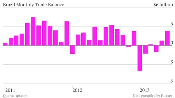
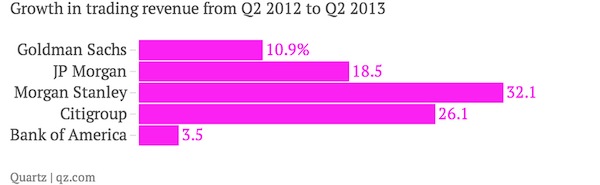
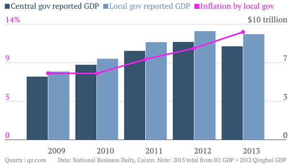
Here are some charts that were made by our reporters with the tool:
Chartbuilder is a completely front-end application: no specialized servers required. Gneisschart, the part of the software that actually draws the charts (instead of controlling them), utilizes the all-but-industry-standard visualization library D3.js.
Creating a method for charting in the newsroom is not a new problem. Paul Krugman lamented his own chart workflow in 2009. And we’ve all worked in newsrooms where the graphics desk is overloaded with small requests.
Quartz does not have a graphics desk. We have the Things team. As an establishing principle, this team of multidisciplinary and multiplatform journalists is no more a service to our newsroom than our well-sourced reporters. The Things team is just as responsible for reporting news and originating content as everyone else. Making other people’s charts slows us down. But given the right tool, helping out a colleague is a trivial exercise.
Chartbuilder has allowed us to scale the Things Team’s capacity exponentially, allowing our site to benefit immeasurably. Visually, now, all of our content shines, not just the bits that fit neatly into our CMS. Chartbuilder helped our digital newsroom reclaim some of the design consistency that remains a staple of print publications.
Of course, getting our staff onboard and using Chartbuilder was not an overnight process. But with the aid of our most chart-reliant reporters, we quickly got everyone trained and using Chartbuilder with a 30-minute demonstration followed by one-on-one troubleshooting as problems arose.
Chart builder was created to lower the barrier for non-technical and less-designerly journalists to create charts. With that in mind, the tool is built around these organizing principles:
Immediate visual feedback is one of the biggest reasons Chartbuilder has been successful internally. A reporter who isn’t quite sure they’re doing it right can feel around with the tool, and know whether she made the right change — not after clicking an update button, not after a momentary delay. They’ll see it as soon as they lift up the key they pressed.
News moves fast. If a tool is slow, reporters wont use it. This principle is only slightly about the speed at which the actual code runs and primarily about the time it takes a user to show up at the tool, make a chart, and leave. With proper data, this should take less than 30 seconds.
Charts made with Chartbuilder, because they’re built through D3.js and styled with CSS, are easy to customize. At Quartz, we’ve loaded in our extended color palette, set the default order in which those colors should be used (bright pink first!), loaded in our fonts, and made the type and stroke weights large enough so that they’re still reasonably legible when viewed on mobile devices.
A reporter’s understanding of an image file is exponentially higher than a reporter’s understanding of an iframe embed code snippet. Content management systems’ understanding of an image file is exponentially higher than a CMS’s understanding of an iframe embed.
With reporters around the world and many often on the road, the ability to use Chartbuilder without an internet connection can be quite useful. If you download the source code from GitHub, you can use the tool offline. Enhancements will be made to take advantage of newer HTML technologies and preempt the requirement to download.
The day-to-day use of Chartbuilder can enhance your stories where previous limitations prevented it. No longer do you need to wait for a production team to create your content. Your charts will look professional and will blend into the aesthetic of the rest of your site. Of course, you’ll need to set up the styles of Chartbuilder to match your publication’s, so you might need some help.
Chartbuilder will make you sane again. You can stop copying and pasting charts into Illustrator from Excel and taking five minutes to resize and restyle it. After dumping the data into Chartbuilder, you can export as an SVG, open that in Illustrator, and edit away. If you’re not up on CSS, ask your web-comfortable friends to help you get the style to match your publication’s guide.
Not only will Chartbuilder get the web editors off your back about building a charting tool into the CMS, but it also requires very little work to set up. You don’t need to stand up a back-end that renders chart images or stores arbitrary amounts and formats of data. Download the source, get a designer to update the styles, and host it on some internal web server.
Chartbuilder and Gneisschart are now available on Github. We look forward to charting the way forward with you.


