Nieman Foundation at Harvard
Today marks the launch of a big new project from our friends a couple blocks away at the Berkman Center. It’s called Media Cloud, and its aim is to allow researchers and individuals to use data to observe how stories unfold, both in the mainstream media and in the blogs.
Media Cloud is a massive data set of news — compiled from newspapers, other established news organizations, and blogs — and a set of tools for analyzing those data. Some of the kinds of questions Media Cloud could eventually help answer:
— How do specific stories evolve over time? What path do they take when they travel among blogs, newspapers, cable TV, or other sources?
— What specific story topics won’t you hear about in [News Source X], at least compared to its competitors?
— When [News Source Y] writes about Sarah Palin [or Pakistan, or school vouchers], what’s the context of their discussion? What are the words and phrases they surround that topic with?
As Berkman Fellow Ethan Zuckerman put it, it’s an attempt to move media criticism and media analysis beyond the realm of the anecdote — to gather concrete data to back or contradict our suspicions.
Here’s a concrete example true to my Louisiana roots. These are the top 10 phrases used by The New York Times, the BBC, and Fox News around the word “Katrina” in the past six months:
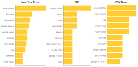
This is obviously a rough analysis, but notice that Fox was more likely to include Katrina in stories that also talked about Iraq and Dick Cheney — suggesting “what went wrong with the Bush presidency” stories and a primarily political view of the story. The Times gave more prominence to the geographical names of Louisiana, Mississippi, and New Orleans, suggesting more on-the-ground reporting. And the BBC talked about it within the context of Burma, China, earthquakes, and floods — indicating it saw Katrina through the lens of other natural disasters.
Are those lists of terms open to different interpretations? Of course. But the strength of Media Cloud’s analytical powers will grow over time, as more programmers and researchers use it and build on it.
I got a sneak peak at Media Cloud Tuesday from Ethan; he (along with Stephen Shultze, Hal Roberts, and David Larochelle) is one of the people behind the project. Here’s a video of our conversation; he outlines what’s available now on the site, what some researchers are hoping to do with it, and what kinds of tools for this kind of analysis will be available to the public. (And apologies again for the audio sync issues; it’s a problem that our video provider is working on.) Full transcript after the jump.
Josh: All right, we’re here today with the illustrious Ethan Zuckerman, who is going to talk a bit about a product that will be launching on Wednesday of this week.
Ethan: Tomorrow, I think.
Josh: Tomorrow. [This video] won’t be posted until tomorrow, so…you know.
Ethan: Well, that’s fine. Launching today is good as well.
Josh: Exactly. Tell us about it. What is it that you have launched, and what was the impetus behind it?
Ethan: Well, let’s start with the impetus behind it, then we’ll get to where we actually are. We’re here at the Berkman Center today, and one of the arguments that often happens at the Berkman Center is about the relationship between mainstream media and citizen media.
Do we think that citizen media is derivative of mainstream media? Do we think citizen media is leading mainstream media, the stories that they would never find? Do we worry that citizen media is an echo chamber, where all we talk about is American political stories? These are really tough questions to answer, in part because the way that we tend to argue about them is that we have dueling anecdotes.
I come up with my favorite anecdotes to make my point. You come up with your five. We go back and forth. Maybe we regroup and find another five. No one’s found a really good way to answer these questions quantitatively yet. And that’s what we’re trying to move towards with Media Cloud. So with Media Cloud, which we’re releasing today, is located at mediacloud.org. It is a very large set of data, as well as some simple tools for playing with it, obtained by subscribing to and processing hundreds of American blogs and a couple hundred newspapers in English from around the world.
The idea behind this is that we subscribe to the RSS feeds of these newspapers and these blogs. We grab every single story that they publish. We then pull the story text out of the HTML, which is an interesting hack. We throw the story text into a bunch of different tools that help us determine what the stories are about. So we’re able to get topic information. We’re able to get information on people mentioned in the stories — what’s called named entities.
And then we file this all off in a database. So if you then want to find out what the stories were on Fox News for a given week, we can tell you what their top-10 topics were. We can also go levels further and say: When a news source reported on a topic, what other topics were most closely associated with it?
We can track these things over time. We can track them between different sets of media: How did the blogs cover something differently from newspapers? The key on all of this is that we’re building both the tools and the data to be an open platform for research. So we wanted it to settle the arguments we have around here, but what we really want to do is make it possible for anyone who’s studying media to do so in a rigorous quantitative way without doing any of the scutwork of actually collecting these huge sets of data, cleaning them up, and doing the topic classification.
Josh: So you’re making lives infinitely easier for a lot of journalism researchers, as well as a lot of citizen’s who’d like to have answers to some of these questions.
Ethan: I think at the moment, we’re making life marginally easier for those, because we’re really early on in the project. The tools that we’re releasing on the website are pretty basic. But they are really fun.
And they’ll let you see the sorts of questions you might ask about this. In the long term, the goal is for this to be an open research platform where not only the tools, which we’re releasing today under the GPL, but also the data is fully accessible. And we want to make it accessible via an API, so the people can play with it.
At this point, you can access the data through the site. We’re also working one-on-one with a lot of scholars out there to give them access to the data.
Josh: OK. Well let’s take a look at what we’re going to see on the site if we go there now.
Ethan: Absolutely. So let’s make it a little bigger. So what we’ve got on the front page is sort of an image of what we call a pivot table. So we’re looking at the term “Pakistan” within Fox News. What’s most closely associate with Pakistan? The United States, Afghanistan, India, Al Qaeda, Taliban, Mumbai. Al Qaeda is sort of an interesting term there.
What we might do is compare: How is Fox News looking at Pakistan versus how some other media sources are looking at it? Just looking at a couple of things that we’ve gone through, this is just a top-ten chart — what are the top ten topics coming up on the BBC, on Fox News, on The New York Times? Pretty similar actually, the first couple of them between Fox News and the New York Times: An obsession with the U.S., with Barack Obama. Very, very much centered on Washington, Fox News. More geographically centered here: California comes up very high, Europe comes up very high, Chicago, Florida for The New York Times.
BBC is almost entirely different, some of which are explicable, some of which aren’t. NHS, the National Health Service, comes up there. Wales. Christmas — I have no idea whether that’s an artifact or whether there’s in fact a story about Christmas.
Josh: Christmas Island was once a British colony, right?
Ethan: Well, but what we would probably do is we’d drill down on that and try to sort of figure it out. One of the things for me that’s very useful is that we’ve built tools to do world mapping. And this is something that I’ve done a lot of in the past. This is how the world has been looking for the last week to the BBC. And you can see the very dark countries are where they’re focusing: the U.K., obviously, the U.S., Iraq, but also India, China. You can see that despite the fact that the BBC has got a great reputation for Africa reporting, it’s still comparatively light. Latin America’s very light.
Josh: A hole in the Congo area.
Ethan: Yeah, we see that Congo hole almost all over the place. But let’s scroll down and do some comparisons. New York Times has that same hole. Actually not all that different a distribution between those two. Fox News ends up with the U.S. even darker. Sort of lighter here within China. Significantly less China coverage than The New York Times. Significantly less Europe coverage. That to me, just glancing at that map, ends up looking like a much more parochial news source.
And these are the sorts of questions that we’re trying to ask. We might do things like say: How do you compare these two maps to the two? What’s a difference map between the two? But even more than that, what we want to do is open up that data and let other people ask the questions about how the two are similar, how they’re different.
Josh: So at launch, what are the things that — you’ve shown a couple things, the top-ten lists and the maps. What other things will be available to play with at launch?
Ethan: Well, these are all available to play with at launch. So you can go in, draw your own maps. You can draw them for the 1,500 sources we have in there, so you can get some basic comparisons. You can also do term pivots, which we haven’t really looked at yet but we described.
If we pivot around a term what we’re doing is saying: How do different sources report on Zimbabwe, for instance. And I’ve got the BBC, Fox News, and The New York Times here. Just for the heck of it, I’m going to try something a little different and try Daily Kos — Daily Kos: State of the Nation, submit query. It’s going to take a little while because this is now churning through thousands of media sources, looking for every mention of Zimbabwe and then trying to figure out what Zimbabwe was most closely associated with.
And what it spits out at the end of it is — the BBC most closely associates Zimbabwe with cholera, followed by the United Kingdom, United Nations, United States. Over here, Fox News — Robert Mugabe as the first thing. So, which is an interesting example of sort of playing the man rather than playing the story. Daily Kos, this is sort of interesting: United States, Afghanistan, Iraq, Washington, China, Pakistan. My guess is that Daily Kos almost has no Zimbabwe-dedicated reporting. It’s sort of general commentary on Obama’s foreign policy.
These generally aren’t sort of definitive tools. These are exploratory tools. You use these as a way of sort of jumping into the data. Let me show you something that we haven’t opened up yet, mostly because it’s expensive for us to run. We’re calling this the Topic Explorer. So this is looking at pivoting on Iran. So basically stories that have mentioned Iran. How often is Iran mentioned? How often are associated terms mentioned? That red line there is Obama mentioned in the context of Iran. The green line is Iran. We see Israel mentioned; Iraq, America, Bush, Iranian, Muslim, and nuclear. We can see that the frequency of all of those.
We can drill down onto these and see how they change over time. We can also drill in and see how different media have covered these over time. So we can go into Power Line and see Iran stories in the Power Line, a conservative blog, what’s most closely associated with it: Israel, Kadima, Netanyahu, Obama.
We can also look at comparisons. What words appear in Power Line that don’t appear in most other blogs? “Pearl,” “Kantar.” I’d want to drill down on this. “Legitimate.” That sounds like a really interesting question about who is legitimate in this. What appears more often in Power Line than in newspapers? Again Pearl, Kantar — for all I know there’s an author on Power Line named Pearl Kantar. That may be what you find out of this.
But this ends up being a tool that gives you some of the peculiarities of what’s going on in different media sources and ways to ask these big quantitative questions very quickly. And then, what we’re thinking about really is having scholars drill into this and then do much more detailed studies to try to sort of explain these disparities or comparisons.
Josh: Because you’ve written in the past about your desire to have some sort of nutritional labeling on news sites — to talk about how much foreign news you’re getting from your source, etc. This seems to be a step in that direction.
Ethan: This is absolutely a step in this direction. We don’t have it quite set up this way. But in some ways, one of our proximate targets is a site out there that we love, journalism.org [the Pew Research Center’s Project for Excellence in Journalism]. They’ve got their weekly lead stories, right? Their news coverage index. And the way they’re able to generate this news coverage index — saying stock-market reaction, the stimulus, housing, unemployment, and so on and so forth — is by literally having dozen of coders sit down and look at an enormous wealth of media and figure out what stories are hot, what stories are not, based on hand coding each of these stories.
What we’re doing is much, much less exact. Much, much sloppier. We have a much higher error rate. But instead of looking at a couple dozen sources, we’re looking at hundreds. And we hope to be looking at thousands. And then we’re also opening up that raw data so that people can open that up mix it in whatever way they want to.
So we think this is a great question to ask: What’s the coverage? How does it differ between different media? We want to have this for a much larger set of data. We want it done automatically so we don’t have to have a dozen people hand coding. And we want to release all that information so that people can ask a whole lot of questions around it.
My deep sincere hope is that we can somehow move the world of media criticism from the snappy anecdote to the quantitative. And you’d really like to be able to answer the question: Is the US blogosphere more or less internationalist than a paper like The New York Times? That’s a question that we should be able to answer with a high degree of confidence very, very early on in this project.
Josh: It doesn’t just shift it from anecdote to quantitative. It also shifts it from the level of the individual story or individual post, which is where most of the criticism goes on, to trends over time and coverage patterns and that sort of thing.
Ethan: These are the generalizations that people most often trip over. “Daily Kos is only about U.S. politics.” Well, is that true? We should be able to look at Daily Kos and look at what the top-ten topics are on it. My guess is if we actually drill down and do it, we’ll find out that, yeah, pretty much. But it would be interesting to look at. So let’s go in, let’s look for the top ten on Daily Kos. Let’s try a Power Line — there we go. Thank you. And RedState. There we go.
Josh: So, one liberal, two conservative blogs, for the non-blog reader.
Ethan: Arbitrarily selected. So Daily Kos: United States, Obama, America, Congress, Senate, Republican Party, Iraq — that’s the first international term — White House, Washington, California. Power Line: John Hinderaker —
Josh: He’s one of their writers, right?
Ethan: So we’re going to get that bias there. So we’re going to get their three top writers — followed by Obama, United States, Minnesota…Israel. That’s interesting — Israel appearing higher than…and then Iraq comes down. RedState: Obama, United States, Congress, Republican Party, Senate, America, Washington, White House, Obama Administration, and Iraq.
So for the internationalists out there, this is a pretty convincing argument that these guys at least are probably not our window on international news. It’s a bit of a stacked deck, right? There are certainly bloggers who are more likely to do this. But these are three of the most prominent blogs in the U.S. And it’s a nice way of understanding that, while these guys have become extremely important commentators and sometimes breaking news within this field, they’re not at this point a replacement for a general-interest daily newspaper.
One of the questions that we’d like to open up as we get to look at a broader space of things: I think it’s possible that there are stories, for instance like Darfur, that probably are more carefully covered in blogs than they are in mainstream newspapers. But again, we should be able to see that, we should be able to pull that out of the data over time.
Josh: And you could also — for those of us who come from a newspaper background — do something interesting: You’d be able to look at comparing newspapers, say, newspapers within the state of Texas, about the kinds of things that they cover, or newspapers in the state of California, and whether the L.A. Daily News covers things differently than The L.A. Times.
Ethan: So one of the big things that we want to do is, if you think about this, these top-10 lists that we’re doing here — first of all, we’re only showing you the top 10; we’re calculating the top 1,000. That top 1,000, essentially, is a fingerprint of a publication. The topics that a publication spends its time on end up looking very much like sort of a unique signature of that piece of media.
How similar or how different are these things? Is Power Line more similar to RedState or more similar to Daily Kos? That actually turns out to be a question that you can answer mathematically. You get into linear algebra, you do a dot product within the vector-space multiplication — at the end of it you can give a similarity index of all this.
What we would love to be able to tell you at the end of this is: If you were going to read five sources in a week, which five would give you the broadest range of topics, for instance? Or, you know, what newspaper can you throw out? If it turns out that The New York Times and The Boston Globe have 90% percent overlap? Are you really getting anything out of reading these same things?
This is one of my great worries — that I think the Internet has opened up so many choices to us that we sometimes realize that we’re essentially choosing the same thing over and over and over again. If you’re reading 10 Democratic political blogs, are you really getting very much if they’ve got 90-percent overlap? Wouldn’t you be better off reading two Democratic political blogs, two right-wing blogs, and Global Voices to get some international coverage in there as well?
Josh: There you go. I see the Calais icon on your screen. They are providing the data-analysis level, of the separating out of the named entities and things?
Ethan: Calais is doing something very important for us, though it’s sort of one part of what we’re doing. Calais is now part of Reuters. They are a really interesting automated tool that looks at a chunk of text, does entity extraction — which is to say, says here are the individuals, here are the places named — and topic. So we are using Calais, along with some other systems, to determine, automatically, the topics of these stories, the countries mentioned, and the people mentioned in them.
Calais is one of a couple of different strategies we use for this. Another one, which is a very naive strategy, is we run the stories against the full list of New York Times Topics. So there are 5,000 or 10,000 people who have been in the news over the last couple of years. And depending on different applications, we can use different ones within these visualizations — you sometimes get different terms.
The Calais system works awfully well. Within news content, it’s at at least an 80-percent success rate of getting your stuff. So when I compare it to Pew’s work at journalism.org, we’re nowhere near at their level of accuracy. But we’re dealing with this vast set of data. And the way that we’re able to deal with this vast set of data is the fact that we’re subscribing to the RSS, we’re feeding to Calais as well as to some other homemade engines to do the topic tagging. And then ultimately, we’re not even running any machines to do this — we’ve outsourced all the tech to Amazon. So this is a pure cloud…
Josh: It’s in the cloud.
Ethan: …computing project. We have terabytes of storage, and terabytes of database, living somewhere in the cloud, somewhere.
Josh: Perhaps Seattle, perhaps elsewhere.
Ethan: And when we want to do something complicated, like, you know, generate these pretty charts on Iran, we essentially just buy more time from Amazon.
So one of the things that came about to this, we started doing this work, I started doing this work in 2004 here at the Center — doing very simple, very primitive maps as something called the Global Attentions Profile project. We realized about a year ago, when we revisited that research, that there had been all these technical innovations that made it possible to something this ambitious. RSS was a key one, Calais and this ability to do automatic tagging was a key one, the ability to do it in a cloud rather than do it locally.
So rather than sort of approach this by saying, “Let’s get a really comprehensive picture of 5 blogs, 10 blogs, 5 newspapers,” we said, “What the heck, let’s go for broke?” And so at this point, there’s 1,500 media sources in this, the architecture is designed so that we think it will scale in a relatively uncomplicated fashion, about 10x of that. Once we’re up at about 15,000 media sources, things do get pretty hairy, but that the direction that we’re trying to go with it. It’s to do inexact measurements of really big data sets to be able to make those assessments of general trends.
Josh: As opposed to expensive measurements of smaller data sets?
Ethan: That’s right — just because in some ways expensive measurements of small data sets are another form of anecdote. Whereas once you’re sort of generalizing on a couple hundred blogs versus a couple hundred newspapers — you’ve still got a bias. We’re biased in the set that, for the most part, these are blogs focused on U.S. politics, so it’s not fair to ask my internationalist questions with them. I’m going to do it anyway. But at least that’s significantly broader than sort of saying, “Well, I read the Daily Kos this week and no one mentions Zimbabwe, bloggers don’t talk about international issues.”
We can look at the 800 to 900 blogs in the system and say: What is it that gets U.S. political bloggers to talk about international issues? What brings it to the fore? Are they bringing it to the fore? Are they picking it up because it showed up in other media, and then they’re commenting on it? These are the sorts of research questions that we want to drill down on.
Josh: When I first heard about this project, the thing that immediately jumped out to me was the tracking of memes from blogs to newspapers to newspapers to blogs, etc. How close are you to having a public-facing ability to do that sort of analysis — is that a long term project?
Ethan: That’s a long project. I mean, just to give you an example of how we’re trying to get there: A couple of our colleagues at Harvard at looking at the question of bailout versus…let’s see. One of the things you’ll see — this is our internal interface looking at some of the prettier stuff we have been playing with. One of the things we have been very interested in is “bailout” versus “stimulus.” How do those terms change over time? And you can see, you know, certain peaks within this — that “Henry Paulson” and “Treasury” ends up sort of peaking at the end of September there. There’s another graph that we have been sort of playing with, where you see mentions of bailout suddenly spike up and then mentions of stimulus go down. And then somewhere, where those lines cross, there’s an inflection point, right? Where one meme took over from the other.
We want to study that and then go back and drill down and figure out, from that case study, how did that emerge. Can we find the DNA of that meme? And then based on doing sort of close analysis of 10, 20, 50 of those, can we start seeing a pattern — and then can we start seeing what memes are likely to emerge?
One of our big research questions is not that sort of question of how do stimulus and bailout crossover? Because we know that that became a big story. How do you find the memes that never take off? You know, what happens if I start a meme that says, “You know, Bobby Jindal and Sarah Palin are going to form a new third party.” That’s unlikely to ever take off as a meme. But if you want to know about the relationship between blogs and mainstream media, you want to see your failures, as well as your successes. You can’t just study those anecdotes of success, all the Dan Rather stories. You have to study all the cases where bloggers manage not to influence the mainstream media.
So, our goal is to have tools that are broad enough and ambitious enough to do that. We probably won’t get there. We not good enough computer scientists. We are hackers gluing together some really cool existing tools in, I think, some neat ways. Some of these problems require some real breakthroughs in computer science. The good news is that anyone who wants to work on that problem now has 6 months’ and many terabytes of data to start working on. Rather than starting that experiment by starting from scratch and building all of this stuff. So, to the extent that we can build an infrastructure for other researchers to use, as well as answering some of our own questions, then we’re having fun.
Josh: All right, well what’s the url again?
Ethan: Mediacloud.org. Give it a shot and leave some comments and — one of the things on the main site, we actually ask people to give us ideas for research. So, you know, share your research ideas. We’re going to be posting some experiments we’ve been running. Most of the visualization tools we’ve just looked at are available under “Visualize the data.” Please take it for a spin. It’s live now.


