Nieman Foundation at Harvard
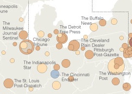 Sometimes the graphic is better than the story. The New York Times today features a rehash of the financial crisis facing American newspapers, but the awesome map that accompanies the story is something to ponder and bookmark. It illustrates the circulation trends at medium-sized and large newspapers, nearly all of which have lost print readers over the past three years.
But a few dots of blue on the map point to papers that have bucked the trend and increased circulation, including the Cincinnati Enquirer (buoyed by the Post’s demise), the Las Vegas Review-Journal (in the nation’s fastest-growing state), and the Deseret News (which has shifted its focus specifically to Mormon readers).
Can anyone explain the other blue spots, which appear to be in Lincoln, Neb., Fargo, N.D., and Corpus Christi, Tex.? [Thanks to Leonard Witt for noting this graphic.]


