Data nerds from government and academia gathered Friday at Northeastern University to show off the latest version of Weave, an open-source, web-based platform designed to visualize “any available data by anyone for any purpose.” The software has a lot of potential for journalists.
Weave is supported by the Open Indicators Consortium, an unusual partnership of planning agencies and universities who wanted better tools to inform public policy and community decision-making. The groups organized and agreed to share data and code in 2008, well before Gov 2.0 was hot.
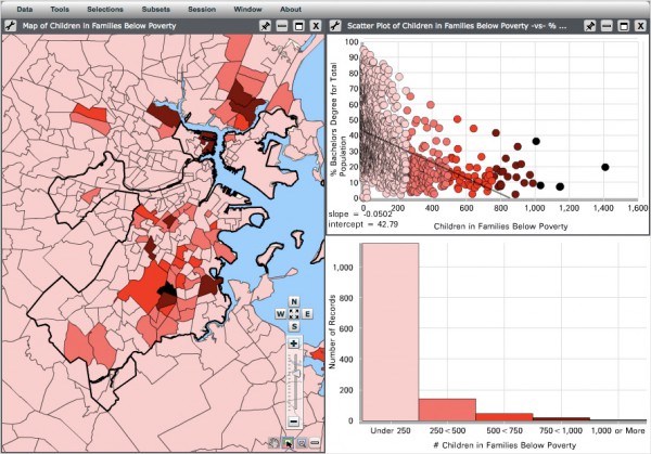
Think of Weave as more programming language than app. It powers websites such as the Connecticut Data Collaborative and Rhode Island’s RI DataHUB. The newly relaunched MetroBoston DataCommon, a project of eastern Massachusetts’ regional planning agency, really shows off the software’s power. There, users can upload their own datasets (Weave claims to be able to handle virtually any format) or browse sample visualizations (e.g., Children in Families Below Poverty).
Data is linked, which means you can view the same datapoint from many angles. Drag your cursor across a few dozen cities and towns and watch as those data are simultaneously illuminated on a histogram and a scatter plot. Add another datapoint to find correlations or trim the data to create subsets. The software keeps track of state, which means you would be able to visually undo and redo changes and save that series of steps as an animation. The end result, powered by Flash, is easily embeddable into a web page.
The software reminds me of SPSS, from my college poli sci days. But unlike SPSS, Weave is free (as in beer and in speech), and it’s web-native. Weave’s creators want to liberate data. It’s not that data isn’t already out there. (You can browse thousands of datasets on Data.gov.) It’s that data is not easy to parse and consume. Spreadsheets and PDFs are nothing if you don’t know how to read them, and tools are useless if you can’t afford to buy them.
Georges Grinstein, a professor of computer science at UMass Lowell, develops Weave with a team of some 20 students. He hopes journalists can use the software to build better visualizations.
“The whole purpose of making a newspaper’s visualization highly interactive is you could look at that data and say, ‘Yeah, but‘,” he said. If a reporter presents a conclusion from data, a reader should be able explore more data to challenge that conclusion, he said. Sure, news organizations publish interactive infographics, but they are interactive only insofar as they were designed. With Weave, a single visualization lives in a bigger, more collaborative and connected universe of data.
The Boston Foundation, a major funder of the DataCommon website, will begin offering Weave training for Boston-area journalists in the coming months. Journalists are encouraged to file bug reports and feature requests to help improve the software.