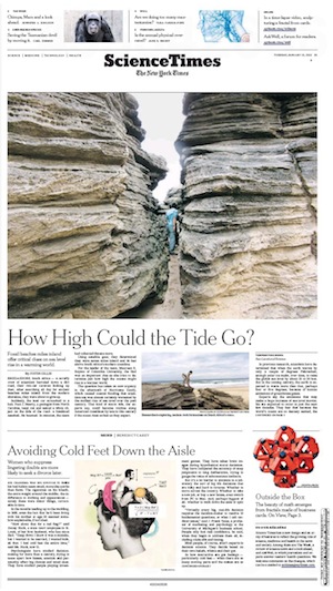
If you picked up a print copy of The New York Times today — you do remember print, right? where newspapers still make most of their money? — you would have seen a little note from the editor on the first page of the Science Times section:
Science Times has a new design and an array of features to reflect the growing role of science, medicine and health in the news and society. Among them are The Week, a review of science news and a look ahead; and AskWell, in which journalists and experts answer readers’ health questions. We welcome comments on the changes, which can be e-mailed to scitimes@nytimes.com.
 It’s part of a larger, subtle print redesign for the Times’ features pages, with newly designed sections being rolled out each day from now until Sunday. The sections were created in the 1970s under Abe Rosenthal and haven’t undergone a full redesign since then. But unlike with some newsprint reboots, the Times wouldn’t mind if you didn’t notice the change.
“It’s not meant to shake anybody up or be dramatically different,” design director Tom Bodkin told me. “I think it’s just a little tighter and smarter. If you look closely, there are a lot of differences, but it doesn’t jump out at you. I didn’t want it to not look like The New York Times anymore.”
He’d probably be happy, then, that the mere handful of Twitter mentions about the new section as of this writing come from people who work for the Times. Science editor Jennifer Kingson linked to her new column, which is a buffet of science-news briefs meant to “highlight the week’s developments in health and science news and glance at what’s ahead.”
It’s a print feature that feels webby in this curation-heavy era of retweeting and reblogging, but it’s also true that aggregation has deep roots in print. For his part, Bodkin’s most excited about a new grid-design infrastructure that will anchor content and help balance the tension between continuity and variety. The grid — four equal columns and one narrow one that can be used to separate elements — will mean that design differences among features sections are deliberate rather than arbitrary, something that hasn’t always been the case as the feature sections have evolved in recent decades.
“It very elegantly does two things that in some ways could seem contradictory but they’re not at all,” Bodkin said. “I think there’s a big brand benefit and a strength you achieve from all of these sections having this same foundation. At the same time, you want the sections to have their own individual identities. That should grow out of the content of each section, not from arbitrarily applied differences.”
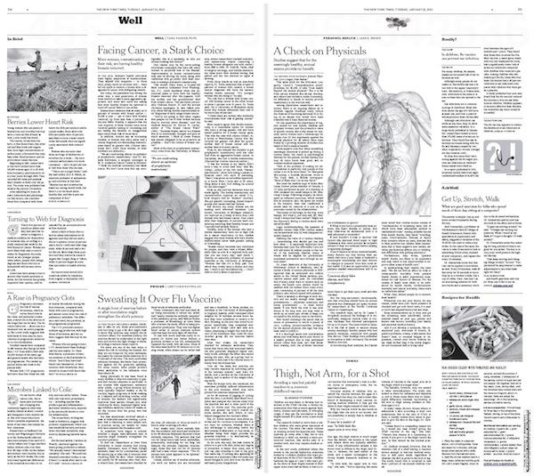
The grid design is like “a rhythm with an offbeat,” Bodkin says, a way to separate different kinds of storytelling. That includes bringing to print more content that’s native to the web. Well, once strictly a NYTimes.com blog, is now a self-contained pull-out spread dedicated to personal health. Vows has also been retooled as a standalone package for Sunday Styles.

“Certainly we have begun, even before the redesign, to do some reverse publishing of material that’s on the website that we think would be of interest to everyone,” Bodkin said. “The redesign certainly allows for that and to some degree accentuates that, in that we’ve created tools to kind of better separate straight narrative from other non-narrative forms, which we have always used but use more of now. Those other forms of storytelling appear quite a bit online. In that sense, it maybe reflects trends that are not just online, but looking for varied ways to tell stories.”
Because Bodkin heads up the entire New York Times art department — that includes print and digital — a print redesign is inherently wrapped up in the paper’s ongoing online redesign process. That’s evident in matching typography online and in print, but it’s also true from a development sense. “The two products are constantly speaking to each other and we want them to reflect each other,” Bodkin says. It’s also clear he sees the print redesign as serving a distinct audience of readers.
“People that are reading the newspaper are reading the newspaper and — particularly the subscribers who are paying a significant amount of money for this newspaper — have made a choice,” he said. “They want to continue reading the newspaper and certainly not switch to digital only.”
(I promised Bodkin I’d include a shout-out to his team: “The design was executed primarily by Kelly Doe with the assistance of Cathy Gilmore-Barnes and Matt Tanzer.“)