The New York Times has unveiled a new feature, Times Wire, which streams every last bit of content produced by the newspaper as it hits the website, from a 6,000-word investigation to the bridge column. It’s a fascinating, if not exactly useful, way to read the news and a testament to the copious material that emerges from the Times every hour — some hours more than others.
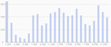
Using an RSS feed similar to Times Wire that was quietly released last year, I can graph the newspaper’s hourly publishing schedule on Google Reader. (Josh explained how to do this last year.) As you can see below, the Times is most active at midnight, when the dregs of tomorrow’s paper are finally posted online, but there are also spikes in the 7 a.m., noon, 4 p.m., and 9 p.m. hours. This is a topic I’d like to return to, but for now, what do you see in this chart?

Zachary M. Seward | May 11, 2009 | 11:42 p.m.
Tags: Google Reader, New York Times, post timing, print, RSS, Times Wire


I’ve also found that blog posts get posted at the most unusual hours, making it really a 24 hour experience and not just when you’d expect it.
Yeah, it’s worth noting that I’m not 100% sure the RSS feed I used for this visualization catches all of the Times’ blog posts. I know it catches many of them, though. And it includes a little wire copy, but not enough to skew the results. —Zach
That makes sense though, Michael. I would assume The Times writes for the world as much as it writes for those in its own time zone.
So do the numbers on the left represent individual posts? If so, that’s a huge number of articles per day.
Yeah, the y-axis is the number of items — articles, briefs, blog items, etc. — that are posted each hour. —Zach
It’s possibly an interesting conversation starter with the Times. Do the 7am/4pm/9pm spikes represent times when there’s staff turnover for the day? If that’s the case, are reporters ever miffed when some stories go up on the site faster than others?