Nieman Foundation at Harvard
“Everyone’s talking about data right now,” says Jer Thorp. The term “information overload” has shifted from a narrow concern of neuroscience to a common-to-the-point-of-cliche preoccupation in our culture; increasingly, we’re aware of the phenomenon that is The Web’s Effect on Our Brains…and intent on re-focusing ourselves. Data viz is one way to do that — to tame the tides of the river of news, one carefully rendered data point at a time. “I come from a design background,” Thorp notes, “and all these designers are getting briefs from their directors: ‘Can you make this look more like data visualization?'”
For Thorp, that’s — pretty much — a good thing. As an artist whose medium is data, Thorp is the creator of the striking visualizations you may recall from Zach’s posts on them last year. Using The New York Times’ then-newly-released article APIs, which contain archival information from 1981 onward, Thorp rendered data sets from the paper of record as swirls and strands and bursts of information — images that not only accomplish data viz’s basic goal of elegant comprehensiveness, but that also pack an aesthetic punch.
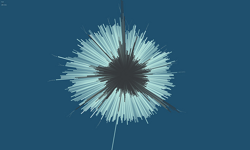
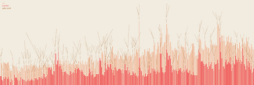
Take Thorp’s tracking of the frequency of the words “hope” and “crisis” in The New York Times from 1981 to 2009 (shown in blue and gray, respectively, above). Or, below, his tracking of the frequency of “sex” (beige) and “scandal” (pink):
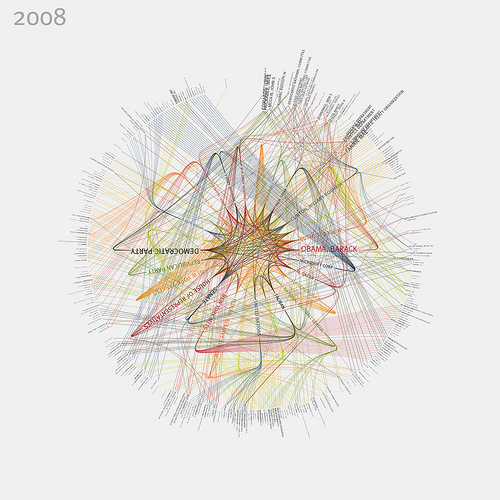
Or his charting of the relationships among the most frequently mentioned people and organizations in the Times in 2008:
At a talk at IBM’s Center for Social Software yesterday afternoon, Thorp (in town from his home base of Vancouver) discussed how he goes about creating those renderings — how he leverages, essentially, an algorithmic approach to art. “I come from a generative art practice,” Thorp told the crowd (comprised largely of software designers and information architects, from IBM and the broader community*, and of a few stragglers like me); for him, creation requires the systematization of the algorithm. Thorp works mostly in a program called Processing, which allows not only for quick and relatively simple data renderings, but also for quick adjustments to those renderings. (A contributing editor to Wired’s UK edition, he often has to make such updates for his contributions to InfoPorn, the infographical spread that — nerdily/cheekily/charmingly — comprises the centerfold of the magazine’s print edition.)
Thorp also works, of course, with the APIs news organizations like The New York Times and The Guardian have made available — “it’s a really beautiful piece of software,” he says of the Times’ version — to create new views of the vast quantities of information their archives have stored. (Fun fact: The Times’ API currently spans the years from 1981 to the present; the years from 1851 to 1944 require hand-entry — the Times is currently working with reCAPTCHA in that huge endeavor — and the years between 1944 and 1981 are owned jointly by the Times and the New York Public Library. Given that murky ownership structure, the mid-century info is currently in open-data limbo.)
The visual-rendering process isn’t easy, per se — there are always considerations of how much data to include, how to present it, etc. — but the computerized aspect to Thorp’s work also means that artistic changes can be made relatively easily. (During his presentation, Thorp toggled between the graphical and the spherical representations of various data sets — the same information, visually transformed in a millisecond.) In fact, “the art itself is the software,” Thorp said — “not the charts that come out of these things, but the actual programs that I distribute into the world.”
Thorp is insulated, somewhat, by the fact that he is — and represents himself as — an artist, rather than, say, a pure programmer or a journalist. “As an artist, I’m really lucky, because I can push things to the limits,” he says. The conceptual framework frees him: “I’m not necessarily as interested in data visualization as I am in the aesthetics of data representation.” In many of his renderings, in fact, his goal hasn’t been to simplify the news, making it comprehensible and accessible, in the manner of the typical visual journalist. On the contrary: It’s been “to reveal some of the confusion that’s inherent in our media.”
*I’d originally said that the talk’s audience was comprised mostly of IBM-ers; as talk organizer Merry Morse pointed out, though (see the comments section, below), the IBM employees accounted for less than 50% of the overall audience. I’ve updated the post to reflect that. –Megan


