The annual Computer Assisted Reporting conference, known colloquially as NICAR, wrapped Sunday. Of all the journalism conferences held throughout the year, this is the only one to specifically focuses on the needs and interests of reporters and editors who work in investigative news and data journalism. It’s a tremendous three and a half days of classes, panels and camaraderie. Attendees come to learn, share, and solve some of the most pressing issues currently facing the industry.
For the last three years, I’ve been collecting NICAR presentations, tutorials, tools, and work samples, because learning and looking through everything presented takes time. This year’s sessions were wide-ranging (including a brand new session on how to host high-traffic news apps), but there were still a few notable themes running through it all.
Many attendees are in the “people should learn to code” camp, and for good reason: With budgets gettings squeezed (at the start of one hands-on tutorial, an urgent question launched from the back: “Is it free?”), fee structures changing, and the growing desire to customize the look and interaction of published work, journalists’ need to literally and figuratively own what they make is more important than ever.

This year, there was much heavier emphasis on learning JavaScript, Python, R, and Ruby. Jeremy Bowers (NPR) and Serdar Tumgoren (Washington Post) posted their Fundamentals of Programming in Python materials to GitHub and created a Google Group for class members. Ron Campbell (The Orange County Register) and Christopher Schnaars (USA Today) offered Programming for the Rest of Us to those who wanted to code but were worried about the learning curve. (Though not specifically taught this year, there are also a number of excellent d3.js tutorials, which I’ve collected in the references section of my list.)
That said, lots of data still comes in Excel spreadsheets, and Krista Kjellman Schmidt (ProPublica), Linda Johnson (Lexington Herald-Leader), Denise Malan (Corpus Christi Caller-Times) and MaryJo Webster (St. Paul Pioneer Press) all gave terrific presentations on how to do it.
Sometimes it’s hard to tell when “best practices” are coming from experts or pretenders. In the case of NICAR, it’s a pretty safe bet that you’re getting advice from people who’ve tried, tested, and refined their methods.

Dave Cole (Mapbox), John Keefe (WNYC), and Matt Stiles (NPR) shared what what works well for mapping. Tasneem Raja (Mother Jones) and Sisi Wei (ProPublica) showed how to make interactives fun. Steve Myers (The Lens) explained workflows for social media discovery, verification, and publication, particularly during breaking news.

The oft-cited Venn diagram from data scientist Drew Conway describes data science as the melding of hacking skills, math and statistics knowledge, and substantive expertise. It’s the hot term for the combination of skills that more and more industries need.
With that in mind, IRE and the Center for Investigative Reporting data journalism team created a Kaggle competition that asked data scientists to look at campaign finance records. More than a dozen new ways of looking at the data came back, and with it, some insights into how journalists could learn from the various approaches. Chase Davis, who led the CIR team, talked about the results and provided his own code, slides and tipsheets from his four talks on GitHub.
One of the key tools for statistical analysis is R, and two of its most popular ambassadors gave hands-on demonstrations of how to use it. New York Times graphics editor Amanda Cox’s session showed attendees R’s power to generate maps from data that she had painstakingly (and considerately) cleaned beforehand. A sample of her more recent work can be found at NYTimes.com.
Hadley Wickham, statistician and author of several popular R libraries including ggplot2 and plyr, held a daylong workshop that delved into ways to visualize, clean, transform, and model data with R. For many in the course, it was an eye-opening introduction into how to use the tool, but more importantly, how to understand, doubt, and test datasets. Hadley has shared his detailed slides and code and Sisi Wei shared her class notes.

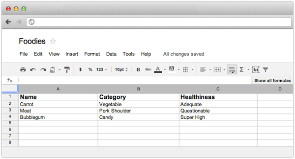
There was much discussion of tweaking workflows to make the reporting process more data-journalism friendly. Last year, Balance Media and WNYC introduced Tabletop.js, which allows Google Spreadsheet data to power web interactives. This year, the Chicago Tribune news apps team introduced Tarbell, a Google Docs-driven CMS. Journalists Heather Billings (Chicago Tribune), Jacob Harris (The New York Times), and Al Shaw (ProPublica) spoke about this and other ways of getting news apps and the CMS to live together in their talk Infect the CMS.
Since 2010, NICAR has hosted a lightning talks session. Attendees get to pitch a five-minute talk, and the 10 most popular are presented. After last year’s “Cats Cats Cats” stunt by Aron Pilhofer of The New York Times, it was no wonder this year’s session was packed. This year’s standout moment was Ben Welsh’s five-minute rant (and yes, there’s some cursing) about the five ways coding like a web developer can make you a better investigative developer. The best part? Ben tells coders the five things need to learn from reporters. Even as the methods and tools change, tried and true reporting skills still matter.
Be excited and keep learning. Visit the complete roundup of NICAR13 tools, slides, and links and dig in.
Cartoon via xkcd.