Nieman Foundation at Harvard


Since its creation last April, The New York Times’ News Analytics team has been working closely with editors and reporters to introduce audience insights into our journalistic decision-making — one of the key newsroom initiatives the Times has identified as being critical to our success.
The questions our team is asked are usually focused on numbers: “How many visits did my article get?” is one of the most popular. But we’ve found the more interesting questions are the implicit ones, embodied in the assumptions and habits of the newsroom. Questioning the thinking behind statements like “we do this because this is how we’ve always done it” has been the best starting point to uncovering interesting and useful insights about our audience.
One example has been in our coverage of big news events, which we tend to blanket with all of the tools at our disposal: articles (both newsy and analytical) as well as a flurry of liveblogs, slideshows, interactive features, and video. But we can’t assume that readers will actually consume everything we produce. In fact, when we looked at how many readers actually visited more than a single page of related content during breaking news the numbers were much lower than we’d anticipated. Most visitors read only one thing.
So we decided to take a closer look at how readers consume news packages by building a tool that we call Package Mapper. Pulling up-to-date data directly from raw web logs, it’s a network diagram that shows editors exactly how readers are navigating through a package of related content — and helps make our coverage a better experience for our readers.
The package map below is one of the early prototypes we built last year, showing how users navigated through our coverage of the Golden Globe Awards. Each URL tagged “Golden Globes” is represented here as a circle, connected by directional arrows that show the relative number of clicks between them. The size of the circle represents the number of visitors to the respective URL, and the color represents the desk or section that published it.

One thing that’s immediately evident is that there’s no single starting point or path through the package. In fact, every URL is a potential starting point for readers, depending not just on what we choose to promote on our homepage but also what goes viral in social media or is promoted on Google News.
We also saw that we could classify some URLs based on particular characteristics. “Givers” are URLs that draw a lot of traffic from outside the package, and redirect that traffic to other URLs within the package. “Dead ends” are the opposite; they draw lots of traffic from within the package, but redirect very little back to related URLs (although they may be driving traffic elsewhere on NYTimes.com.) “Wallflowers” are URLs that prefer not to join the dance — they neither get a lot of traffic from the package nor drive much traffic within it.
 One early application of this tool has been to detect and eliminate dead ends within a given package. In the Golden Globes example, there was one glaring problem: many readers were stopping after viewing the red carpet slideshow published by the Arts desk (in green, center). Even worse, we had two Style articles about red carpet fashion (in blue, bottom right) that would have likely interested those readers — but those articles weren’t linked to the slideshow (or vice versa).
Why not? As it turns out, our CMS does a great job of suggesting related articles within a given section, but not within a particular topic — those promos must be hand-coded by producers. And unfortunately, the producers for these pieces were working on different desks, with little coordination between them.
We quickly realized that editors need this information in real time — not only to know that problems exist, but also to see whether their efforts to fix them were successful. This was confirmed during the Sochi Olympics, when we piloted an up-to-the-minute version of Package Mapper for the first time.
An example of what we built for the Olympics is below. Most of the Sochi stories came from the sports desk (represented in the graphic below by blue circles) with a few foreign stories mixed in (green circles). But on the afternoon of February 5th we noticed a large red blob emerge (lower left) — a story about Russia’s decision to block a shipment of Chobani yogurt from reaching American athletes.
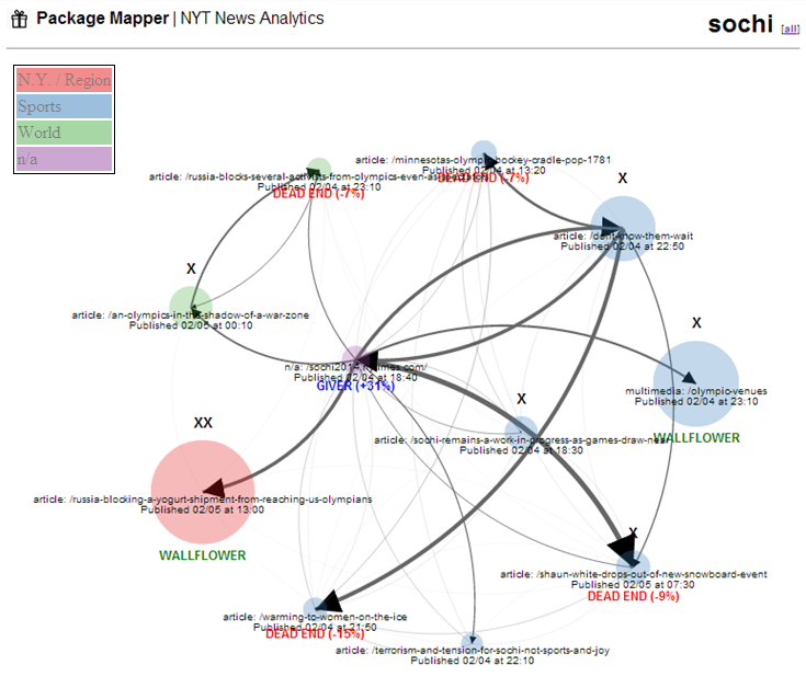
Driven by a wave of Twitter buzz, the Chobani article was drawing heavy interest from social media. But many of those readers (new visitors, not generally Times loyalists) bounced away after reading the piece. Why? The article was scooped by a Metro reporter and published by the Metro desk; which meant, unfortunately, that the default links on the page pointed to Metro content, rather than to other Olympic articles.
Luckily, having seen what was happening, our editors could fix it: a quick call from the news desk prompted the Metro producer to create a special Olympics promo on the page. Traffic began to flow from the Chobani story to other Olympic articles.

Having proved its worth, Package Mapper continues to evolve beyond these early prototypes. It now automatically creates package maps for every topic on NYTimes.com with three or more related URLs, updating the data every 10 minutes. With a simple browser bookmarklet, editors can pull up an instant map for any of several hundred news packages on demand without having to interact with the news analytics team at all.
That being said, the interfaces we’ve built to date are very much analysts’ tools. We realize that for some newsroom staff, they are about as informative as a Kandinsky painting. But ideally, those editors would never have to interact with these types of interfaces at all. Instead, we’re thinking about better ways to automatically communicate these insights and recommendations in contexts that editors are already familiar with, such as email alerts, instant messenger chat bots, or perhaps something built directly into our CMS.
The more important implication of this package-based approach is that has already inspired us to think more deeply about how we tell stories across assets. After all, it’s not enough to just link these stories together: they should fit together seamlessly. With this tool and a little imagination, our newsroom can develop a clear vision about which paths best tell the stories we are covering, helping our readers experience the full breadth of our coverage — whatever their starting point.
James G. Robinson is director of news analytics at The New York Times.


