Nieman Foundation at Harvard

One of the more challenging things to represent in journalism is uncertainty. Walter Cronkite ended his newscasts with “That’s the way it is,” not “That is certainly one possible outcome, given a wide-ranging set of externalities, the unknowable nature of even the nearest future, and the very real chance that Rasmussen’s numbers are wrong.”
Of the many, many criticisms made of press coverage of the 2016 presidential election, one that’s stuck is the idea that news organization’s polling models helped create the false sense that Hillary Clinton would be the no-doubt, slam-dunk winner. On election night, The Huffington Post put her chance of winning at 98 percent. The New York Times gave Clinton an 85 percent chance of winning, FiveThirtyEight 71 percent. (The Princeton Election Consortium took last price, giving her a 99 percent chance of victory, an overstatement that led to its leader eating a bug on cable news.) The Washington Post’s Margaret Sullivan presented doing better here as one of the core challenges for the press in 2020.
One of the worst failures of the last cycle was the way Clinton was presented as the inevitable winner. Aggregations of polls that measured the probability of her winning at 80 percent, for example, didn’t adequately explain what that meant, or emphasize that — even at 20 percent — Trump still had a decent chance of becoming president. It was unintentionally misleading and probably had the effect of depressing voter turnout. That kind of thing shouldn’t happen again.
But what’s the best way to present that context?
(My own pet proposal, which anyone is free to steal: Compare the uncertainty of the election to the uncertainty of sports, something most Americans already have a grip on. If your model gives Joe Biden a 82.1 percent chance of beating Donald Trump, say: “In 2008, in Super Bowl XLII, the betting line gave the New England Patriots an 82.1 percent chance of beating the New York Giants. They did not.”)
While FiveThirtyEight was the most uncertainty-embracing of the major 2016 aggregators, It’s also the outlet most connected to poll analysis in the public’s mind, so it’s important for them to get it right. Senior visual journalist Anna Wiederkehr discussed how FiveThirtyEight was trying to communicate uncertainty in a Twitter thread.
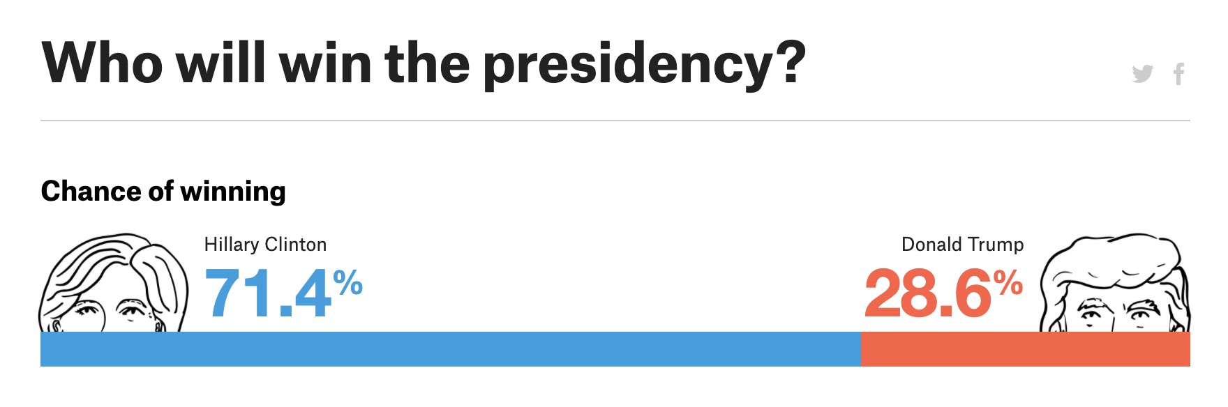
This, remember is how it presented Clinton and Trump’s odds in 2016:
It’s a very binary way to present the data. Which at some level makes sense: Elections have binary results! But the same sort of two-option visualization also gets used in cases where the data reflects reality rather than predict it. (Think of how a representation of the partisan makeup of a congress or parliament often uses a similar motif to show parties’ share of seats, not the predicted chance each party has of winning a majority.)
There’s also evidence that many people who see the odds broken down in that way — “Clinton 71.4%, Trump 28.6%” — don’t perceive them as each candidate’s chance of winning but instead as their projected vote share. In other words, they see those two numbers and think: “Huh, Hillary’s ahead by more than 40 points! She’s got this.”
Which again makes a certain kind of sense: All the other polling data the average citizen has seen in the months leading up to the race has been showing vote share, as in “Clinton 48.2%, Trump 46.1%.” For more on that confusion, check this paper by Sean J. Westwood, Solomon Messing, and Yphtach Lelkes:
We use experiments to show that forecasting increases certainty about an election’s outcome, confuses many, and decreases turnout. Furthermore, we show that election forecasting has become prominent in the media, particularly in outlets with liberal audiences, and show that such coverage tends to more strongly affect the candidate who is ahead — raising questions about whether they contributed to Trump’s victory over Clinton in 2016. We bring empirical evidence to this question, using ANES data to show that Democrats and Independents expressed unusual confidence in a decisive 2016 election outcome — and that the same measure of confidence is associated with lower reported turnout.
After the 2016 criticism, this is how FiveThirtyEight presented its next big opportunity for poll aggregation: the race for control of the House of Representatives in the 2018 midterms. Wiederkehr notes that “some could say we overcorrected in 2018” by adding too much complexity back into the presentation.

I think this did a better job of communicating uncertainty — though, of course, “Who will win a majority of these 435 local elections?” is a different communication challenge than “Which one of these two people will win the presidency?”
Read through Wiederkehr’s thread below to see the various iterations FiveThirtyEight considered for presenting Biden vs. Trump in 2020. But this seems to be where they ended up:

(For any concerned Biden supporters: This chart and all the other 2020 ones in the thread use fake data. Your man’s going just fine, right now, at least.)
Using the Monte Carlo simulations and representing them as discrete dots does a more explicit job communicating the wide range of potential outcomes than that 2016 bar.
FiveThirtyEight also plans to use something similar with maps — showing multiple electoral results as distinct possibilities and letting the share-of-maps illustrate the overall odds. (I confess this is a little much for me, though its value will depend a lot on the final context it’s put in on the site.)

(Again: Democrats, these aren’t real numbers. Donald Trump would, for once, be correct to call these “Fake Polls!”)
There’s still a robust debate to be had about the overall value of this sort of poll aggregation. Is a reader better informed about the election knowing that one candidate’s chances are 58 percent or 67 percent or 84 percent? Is the added information outweighed by the chance a busy Democrat in Wisconsin might have seen “98 percent chance of victory!” on HuffPost and decided, “Cool, I don’t have to wait in line for four hours”? Your mileage may vary. But I think this evolution in presentation does improve over four years ago.
Here’s the full thread.
2016 is past, right? Bc what we made perhaps oversimplified what we're showing in the forecast odds. 2016 topline is what allows ppl to heckle me in bars when I say I work for FTE (didn't you guys f up 2016?)
Anyway, some could say we overcorrected in 2018 w this complexity: pic.twitter.com/VqbIUeB3p3— anna wiederkehr (@wiederkehra) July 27, 2020
Combining 2016 (bar chart lead) and 2018 (histogram lead) was an obvious first step. We tried some ✨creative web design ✨ to split the page to show viz + editorial context or to have a sticky bar so odds follow you wherever you go!
Still, uncertainty was missing. 🤔 pic.twitter.com/kOT5fpUILj
— anna wiederkehr (@wiederkehra) July 27, 2020
We iterated topline into oblivion (bc lol, remember 2016?) and eventually we landed on what we affectionally call Ballswarm™ 🔴🐝🔵.
But there was still a rumbling for maps in the group.
👏There👏must👏be👏maps!!!!!👏 pic.twitter.com/jE5Me1YZN4— anna wiederkehr (@wiederkehra) July 27, 2020
The desire for maps was unquenchable.
We pondered philosophically: what if we created a ☄️universe of maps?💫(BTW these maps each showed a forecasted electoral college outcome. By showing many maps, we might be able to convey how many possibilities there are!) pic.twitter.com/nFfqeilE15
— anna wiederkehr (@wiederkehra) July 27, 2020
Further attempts of UniverseSwarm™ mashup until maps were imprinted on the inside of my eyelids. 👀
Until we finally thought: maybe we can't kill two birds with one stone? We can't show odds drowning readers in seas of universes of maps. 🏄♀️ pic.twitter.com/1Oh4OYntNs
— anna wiederkehr (@wiederkehra) July 27, 2020
Wellllllll, sort of.
When we launch soon (!) you'll still be inundated with maps. 👯 You'll also see Ballswarm. 🐝♥️And hopefully, you'll check that there are a hell of a lot of ways November can shake out. Check back soon! 👋
(🚨 FAKE DATA throughout this thread!) pic.twitter.com/zNvq5eUGn7
— anna wiederkehr (@wiederkehra) July 27, 2020


