Nieman Foundation at Harvard
Tech news site The Verge debuted a radically redesigned website this week. One of the first things editor-in-chief Nilay Patel remembers telling the designers when they started the process back in 2020? “We just want to be able to tweet onto our own website.”
“Dieter [Bohn, former executive editor of The Verge] and I were routinely frustrated that we weren’t on our own homepage enough. We’re both busy. We were running the site, we’re making podcasts, we were off shooting videos,” Patel explained in an episode of The Vergecast. “The barrier to entry to our own homepage was a 500-word article. It was too high. We weren’t publishing enough and we were driving ourselves crazy — and we found ourselves using Twitter, which is someone else’s platform.”
He added, “I’m looking at the gigantic website we run and saying, ‘Why am I finding it easier to publish on someone else’s platform instead of my own?'”
The Verge was founded in 2011, making the Vox-owned publication something of an elder among tech news sites. The site launched with an adventurous homepage design and has made bold overhauls in the years since, but the redesign debuted on Tuesday “represents the biggest reinvention of The Verge since we started the whole thing,” Patel said.
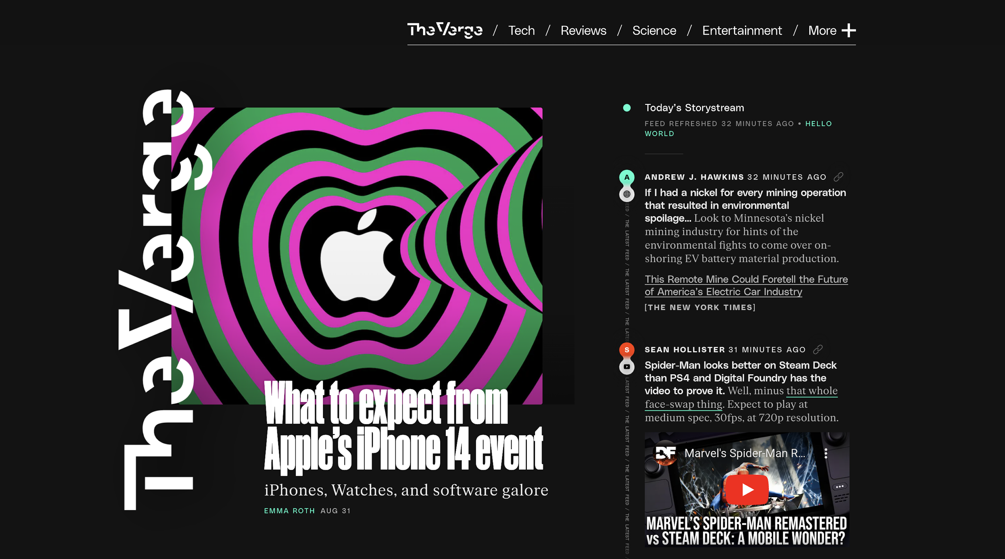
The most consequential change isn’t the new typefaces or color palette (featuring “Blurple,” “Pernod,” and “Hot Brick”), but transforming The Verge’s homepage into what the site is calling the Storystream. Vox Media has played with the phrase StoryStream — and the idea of giving its journalists an outlet to post short content — in the past, but that was typically to group similar stories together from its own content. This Storystream pulls together full Verge articles with original reporting, tweets, external links (to press releases and other news orgs), YouTube links, quick voicey blurbs, TikToks, and more into one newsy feed.
Mentioned this in the post but @backlon and I really did make one of the first prototypes of our feed in Google Docs last year. We just had fun blogging into a doc for most of an afternoon, to figure out what we needed.
Sometimes you have to just start, somewhere. Anywhere. pic.twitter.com/gKrZdPpW00
— nilay patel (@reckless) September 13, 2022
Six years ago, The Verge had revamped the site to create distinctive design elements — think: neon pink pull quotes and “laser lines” in videos — so that the site’s content would be recognizable even “as the media unbundled itself into article pages individually distributed by social media and search algorithms,” Patel wrote in a blog post on Tuesday.
“But,” Patel continued, “publishing across other people’s platforms can only take you so far. And the more we lived with that decision, the more we felt strongly that our own platform should be an antidote to algorithmic news feeds, an editorial product made by actual people with intent and expertise.”
The new site looks a lot more like Twitter than a front page. And that’s kind of the point. Patel has said The Verge’s competition is not Wired or The New York Times but Twitter “and other aggregators of audience.” As other news outlets shift resources toward building communities where readers are already spending lots of time — YouTube, Reddit, TikTok, Instagram, Discord, etc. — The Verge wanted to be sure it was investing closer to home, too. Ultimately, the “big hope” is that The Verge homepage reads like “a better, cooler, funner feed than social media feeds.”
The redesign was built first for mobile — 90% of The Verge’s audience visits on their phones — and the team has acknowledged the desktop version is something of an afterthought. With the addition of several widgets, the reading experience can be a bit chaotic and some are questioning how accessible the new site is. Others really hate the white-on-black text, which many people find hard to read.
The idea, though, is to bring the most important and interesting tech news — including the many conversations, reporting, and bite-sized tidbits found elsewhere on the internet — to one place. As Patel explained in the post:
Our plan is to bring the best of old-school blogging to a modern news feed experience and to have our editors and senior reporters constantly updating the site with the best of tech and science news from around the entire internet. If that means linking out to Wired or Bloomberg or some other news source, that’s great — we’re happy to send people to excellent work elsewhere, and we trust that our feed will be useful enough to have you come back later. If that means we just need to embed the viral TikTok or wacky CEO tweet and move on, so be it — we can do that. We can embed anything, actually: I’m particularly excited that we can directly point people to interesting threads on Reddit and other forums.
The Storystream also appears at the end of article pages, though it’s unclear how often readers will reach it there. (After article text, readers are confronted with a large ad, a link to the comments section, a “featured video” ad, related links section, another large ad, a sponsored content banner, and then the Storystream.) Overall, the redesign is a major investment in The Verge’s homepage, already the single most popular page at Vox Media, said publisher Helen Havlak.
“With the new site, we are making a big bet that we can grow our direct, loyal audience by curating the best tech and science destination on the web,” Havlak said. She also told Axios, “If I can just get people…to refresh our site one more time a day, that is a huge lift to my business.”
The new format will free up editorial bandwidth by eliminating aggregation posts and debates over whether “one dude’s tweets” deserve an entire story, Patel said. He estimated the changes will save the newsroom 20 hours per day and said the extra time will be redirected toward publishing more original reporting and analysis.
About a dozen times a day, the Verge newsroom will vet a story that doesn’t quite hit our bar for a full news post. In the past that was the end of it, but what’s fun with the new site is that we can now cover them in super short Quick Posts (aka “Quipis”) https://t.co/3OM2WGyeWw
— jon.porter (@JonPorty) September 14, 2022
The Verge also announced that it’s moving to the commenting platform Coral, with the intention of fostering more quality conversations on its site. (The Verge was one of many news outlets that turned off comments on some or all articles in recent years.) Under the new protocol, chief of moderation Eric Berggren will oversee community contributions, though any Verge reporter can choose to “feature” a worthwhile comment.
“We also hope to spotlight our best comments in the new Storystream newsfeed on our homepage and create a positive feedback loop that way,” publisher Havlak added.
On the Vergecast episode, Patel also revealed a somewhat unusual goal for a news organization: how much traffic it can send to other outlets. He said he thinks The Verge can “very quickly” send publishers more traffic than Twitter, for example.
“One of my biggest goals — the big number that I’m looking at — is how much traffic we send out. I think we will be a huge success if we are sending a meaningful amount of traffic to other people,” Patel said. “Because that relationship between publishers and platforms has gotten totally out of whack.”
“If we can just get back in the game where we’re like, hey, you can build your own communities, on your own platforms, once again, in a format that feels both very modern — because it’s a news feed — but inherits the best parts of what people loved about blogging, and you’re a good citizen of the internet because you’re sharing the wealth,” Patel added, “I think that lets you reset that whole relationship and then potentially build whatever the next things are, without constantly scrambling against whatever algorithm update, whatever a platform is going to roll out to up- or down-rank content.”
(Some of you will want to listen to the second half of the episode, where editor-at-large David Pierce goes nitty gritty on the site redesign with senior product manager Tara Kalmanson and senior engineer Matt Crider. They discuss why TikTok embeds are so terrible and how they balanced speed, content, and design in the redesign.)
The Verge said the typical number of visitors to its homepage doubled on the day the redesign debuted. Here’s what some of those visitors thought:
My general rule is to be skeptical of tech site redesigns. Most of the time they are born out of a need for better page view and engagement metrics.
The Verge’s redesign is more of a business model shift with an accompanying (rough) redesign. pic.twitter.com/imQiZGrewy
— Neil Cybart (@neilcybart) September 13, 2022
Check out the storystream on this site. This is all after the article and honestly a much more engaging experience than being pulled in another random article. pic.twitter.com/b86NBITgRM
— Ernie Smith (@ShortFormErnie) September 13, 2022
It is doing some interesting things, but it’s a chaotic accessibility mess, half the top nav space is unusable, and the comments in purple is gonna bleed retinas. Over-designing a site people want to read for an extended period is…not great.
— Mark Ziemer (@sylvisual) September 13, 2022
The new verge redesign is very 2019 quartz app complete with 3rd party linkinghttps://t.co/DAIUQ8KgdQ pic.twitter.com/DFPqFClDSM
— Max Lockie (@staphwriter) September 13, 2022
the homepage isn’t coming back :(
— brian feldman (@bafeldman) September 13, 2022


