Nieman Foundation at Harvard
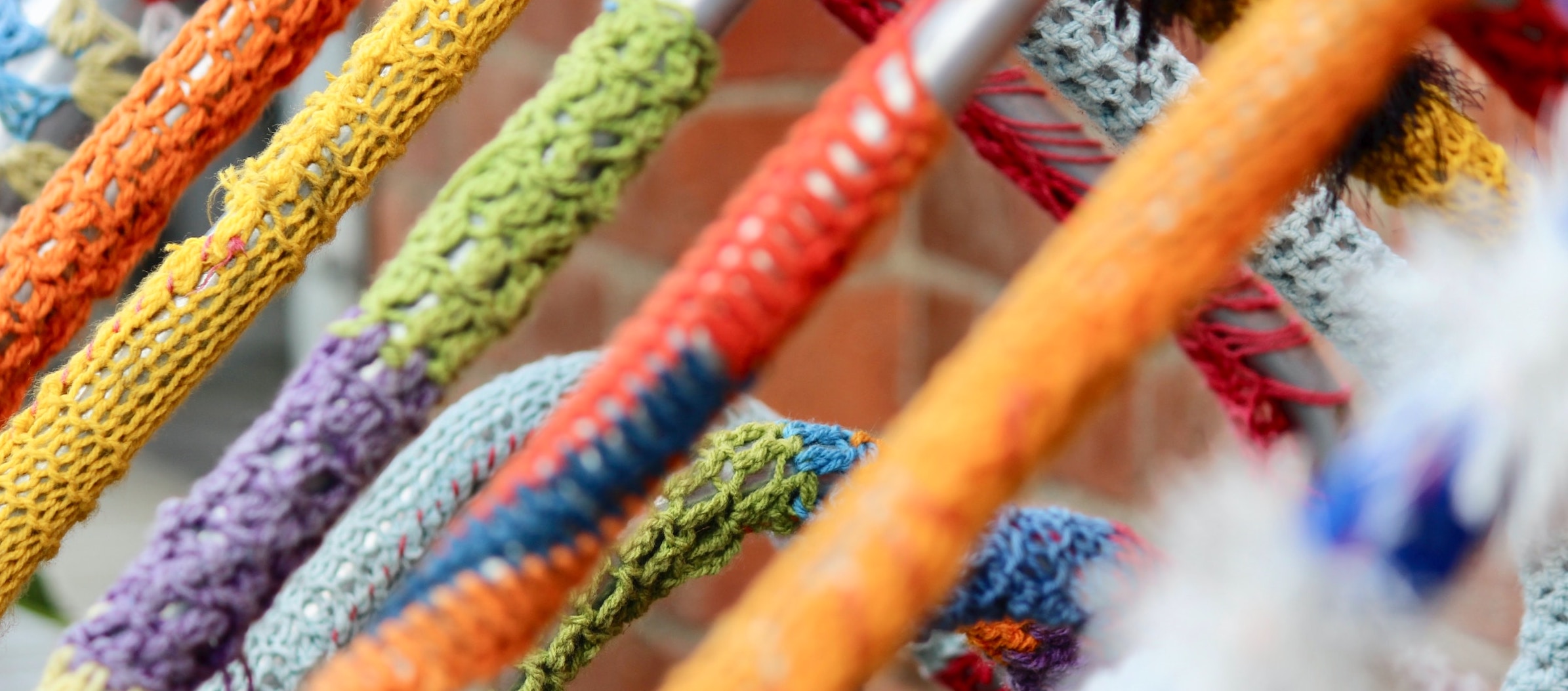
There’s more than one way to hook a reader. Some journalists are picking up yarn and crochet hooks to create tactile works of data visualization.
If you’ve only seen one crochet data viz project, you’ve probably seen a temperature blanket, where each row is color-coded to reflect the highs and lows for a year. Can this be used for other data? Sure. Some use the technique to visualize their mental health and this TikTok account recently went viral for cataloging her, um, digestive regularity. Yarn has also been used to visualize train delays in Munich, infant sleep patterns, Russian population growth, and daily news feeds.

Andrew Hahn supports data investigations and interactive databases as newsroom developer for the Milwaukee Journal Sentinel. He recently made a three-dimensional map of Lake Mendota in Madison, Wisconsin in crochet. (Bathymetry is the underwater equivalent of topography and reflects the depth of oceans, rivers, streams, and lakes.)
Been a little obsessed lately with mapping in crochet. Here’s bathymetry for Lake Mendota in worsted weight wool and acrylic. Each stitch roughly equals 300 sq meters, and each layer represents a depth change of 10 meters. #gischat pic.twitter.com/MXBG5W2Zdg
— Andrew Hahn (@ndrewhahn) May 8, 2023
Hahn said his mom first introduced him to knitting when he was 11 years old. When casting around for a new hobby after college, he turned to crochet for its relative speed and portability. His Lake Mendota map uses a technique similar to mosaic or overlay crochet, which allows him to create patterns without changing yarn colors.
For guidance and inspiration, Hahn pointed to pattern designer Tinna Thorudottir Thorvaldar’s tutorials and stitch dictionaries, which have made him think about what stitch textures could represent. (“Wavy stitches might make really interesting water,” he explained as an example, “and bumpy stitches could look like a dense canopy of trees.”)
I asked Hahn about the intersection of fiber art and data viz. It must take longer to crochet a map than to code one, but were there other pros and cons? What drew him to the medium when he’s got so much digital dexterity as a developer?
“Crochet and other yarn and thread arts are perfect for data visualization because they involve creating material one pixel at a time,” Hahn said. “I combine crochet techniques to make maps, where each stitch represents a latitude and longitude. I’m really interested in these beautiful, touchable representations of data that use texture to encode information in a way that our screens cannot reproduce.”
As for drawbacks, “The cost of this method of representation is primarily time,” Hahn confirmed. “Even small maps take a really long time to crochet, and crocheting is just the last step of the process. Each map I’ve made starts as a dataset that has to be cleaned, resampled, visualized, and transformed into a crochet pattern. The time a project takes to make is directly related to the resolution of the map. More than once, I have begun a map at a scale that would be stunning to see, but unrealistic in terms of the time it would take.”
“Finally, the process of turning an idealized, computer-generated pattern into a real-life textile product is not perfect,” Hahn added. “Crochet stitches are never exact square pixels, and yarn tension, different dye batches, and irregular fiber thickness can all have a dramatic effect on the finished product. No matter how detailed the pattern, there’s a fair amount of improvisation that goes into any crocheted item, maps especially.”
Over 160 hours of sewing in this 18-inch aerial embroidery – ‘ A peaceful place (somewhere out there)’, 2022. I miss it sometimes! A lot of patience went into all those knots and stitches 💚 but I have another 18-inch planned now :D #landscape #handmade #art #artist pic.twitter.com/O7V6TeQ8LS
— Victoria Rose Richards (@Aerial_stitches) July 25, 2023
Outside of crochet, Hahn said he’s been inspired by quilted visualizations used by a professor in his gradate program and the work of Victoria Rose Richards, who recreates aerial imagery in embroidery. He’s paying attention to some interesting cross-pollination between digital and analog representations, too. Cartographer John Nelson, for example, has used digital techniques to make maps look like they’ve been made with yarn.
“Beyond just fibers and textiles, touchable maps of all kinds are fun and fascinating,” Hahn told me. He cited some experiments to make touchable maps for people with visual impairments and the possibility of introducing “map literacy to children by creating blankets and objects with real geographies on them.”
Alyssa Fowers, graphics reporter at The Washington Post, had her first crochet chart published last month.
The day I got into data visualization, I promised myself that someday, someone would pay me to crochet a chart.
That day is today.https://t.co/izaInFK42L pic.twitter.com/o2dqnSBQm4
— Alyssa Fowers (@alyssafowers) July 20, 2023
Fowers learned to crochet when her aunt taught her to make doilies. (“Doilies are super complex and unforgiving,” Fowers said, “so everything else I made afterwards felt very easy.”)
The seasonality chart published in the Post — which shows the yarn projects most likely to fail by season and type — took her three attempts.
“For the bar chart, I got the values for how long each ‘bar’ should be, then converted it into a pattern. (Very simple — two rows per month, one single crochet stitch per 1,000 projects),” Fowers said in an email. “For the scatter plot, I made one little circle. The photographer, Matt McClain, took pictures of them both; I used Photoshop and Illustrator to isolate the images of the yarn and add axis lines, captions, etc. For the scatterplot, I just copy/pasted the one image of the crochet circle over the ggplot-created points on the digital scatterplot.”
For the Post, Fowers focuses on data visualization and analysis. She’s been inspired by data journalist Mona Chalabi’s illustrated charts and Couple In Data, which uses physical objects.
View this post on Instagram
For Hannah Wise, assistant managing editor for engagement and experimentation at The Kansas City Star, a love for fiber arts came out of her need to recharge and reset following the 2016 Dallas police shooting. (Wise’s timeline of the ambush — “Eight Hours of Terror” — was part of coverage in The Dallas Morning News named a 2017 Pulitzer Prize finalist for breaking news reporting.)
Wise started by embroidering some of the, uh, memorable comments left by Morning News readers and posting the finished work on her Instagram @sewmanycomments. When she moved to New York City to take a job at The New York Times, she started to crochet while her embroidery hoops were still in moving boxes.
“It is detail oriented, repetitive and meditative,” explained Wise, who picked up crafting skills from her mother, grandmother, and local yarn shops. “There’s something beautiful about creating an entire garment out of a hook and yarn. Challenging myself to learn new skills and techniques outside of the newsroom is essential for my mental health and well-being.”
When Wise moved newsrooms again in 2021, she started documenting her new life in Kansas City by crocheting two rows of a scarf per day: one for the historical average high temperature in the city and another representing the actual high temperature. (“Ultimately ‘scarf’ became very inaccurate because the finished piece is 13 feet long, so it is now a wall hanging in the textile studio in my house,” Wise said.)
View this post on Instagram
Unlike other fiber arts, crochet often has to be unravelled — stitch by stitch — to fix mistakes. (This not-so-fun task has the very-fun-to-say name “frogging.”) Wise has taught other journalists to unwind with crochet, and she sees her practice mostly taking place outside the newsroom — especially if there’s a time crunch.
“Honestly I would turn to embroidery, mixed media sewing, quilting or felting probably before crochet if I were hired to make a data visualization on deadline,” Wise said.
This year, Stanford University debuted a new course in textile data visualization in its Textile Makerspace. Crochet has proven especially popular with students, said Stanford’s Quinn Dombrowski, who supports digital humanities scholarship as staff alongside teaching.
The Textile Makerspace itself is a “reimagining” of the Digital Humanities Lab which, when Dombrowski encountered it in 2018, was “full of with dead and dying computers and equipment for digitizing legacy media.” Those have been replaced with equipment like crochet hooks, spinners, looms, as well as machines for knitting, embroidery, sewing, etc. Maybe more importantly, Dombrowski told me, the Makerspace has student staffers who can welcome newbies who show up with an unformed data visualization idea or just a desire to make something.
Dombrowski, a prolific sewer in their own right, said they could see how the fast pace of newsmaking could be at odds with textile-based projects. Still, Dombrowski said, the challenges and constraints could yield interesting results for news organizations.
“If you need a bar chart by tomorrow, you should absolutely use some software,” Dombrowski said. “An hour or less with a little iteration and you’ll have something that does the job. But textiles give you more properties to work with: there’s color, size, shape (like with software) but also thickness, texture, fiber choices, stitch type, the list goes on.”
“Doing visualizations in textiles is inherently slower than doing it with software,” Dombrowski added. “At the same time, if there’s no hard constraint at play, maybe the slowness would lend itself well to certain kinds of stories, or things that involve community participation or engagement.”


