Nieman Foundation at Harvard

So we don’t have to guess about what news apps on the iPad will look like any more. With Saturday’s debut of the device — which is, oh by the way, amazing — we now know how about a dozen major news organizations have chosen to present themselves on Apple’s new platform. I think it’s fair to say that we’ve seen no revolutionary apps to this point — solid, competent, but not revolutionary — but that doesn’t mean there aren’t already some important lessons to be learned from what’s already out there. After a weekend of playing around with all the news apps I could find, here are three design choices that I think are worth taking a closer look at.
Story-to-story navigation
Web-analytics types push time-on-site and pageviews-per-visit as measurements of a reader’s engagement. It’s fine to have someone following an occasional link in Twitter, but the real money, some argue, is in dedicated readers who spend lots of time with your content. And to that end, a number of sites have been working on their internal website navigation to push users from story to story, rather than asking them to head back to a list of headlines first.
On news iPad apps, that story-to-story navigation has become the norm. The Wall Street Journal, BBC, Associated Press, USA Today, NPR, Reuters — their apps all allow (and in some cases emphasize) swiping or tapping from story to story rather than Back and Forward, web browser-style. (The New York Times’ app is an interesting exception.) I suspect that’ll lead to more stories consumed per session — and I wouldn’t be surprised if you didn’t see more news companies taking that lesson back to their websites.
Diving right in
Similarly, just about every news website created in the past 15 years has pushed users down a similar path: show them a whole bunch of headlines, arrayed into a variety of design styles, then expect the user to choose one of them and begin what the site hopes will be a lengthy run of clicking on stories. It’s a decision tree: Here are your options, now make a choice.
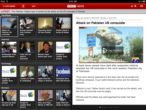
The very attractive BBC app takes a key step away from that pattern. When you launch the app, you’re not confronted just with a bunch of headlines — you’re also thrown immediately into the text of the app’s top story, without so much as a click. And once you’re reading one story, the act of flicking to another one seems closer to a default act than when you’ve just selected from a menu of options.
It’s a model that makes perfect sense from a broadcasting background; a BBC radio or TV show doesn’t wait to ask which story the listener wants first. It just dives right in. Considering how many news website users never get past that list of initial headlines, dumping the reader directly into a story might be a way to push browsers into readers. The BBC may not rely on in-app advertising to pay the bills, but for sites that do, it’s a model worth watching.
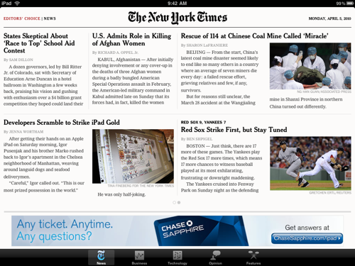
The Times’ cyberclaustrophobia
There’s been a hearty debate among a certain breed of techie over whether the iPad’s existence as a closed ecosystem of apps makes it somehow evil. I think that argument’s more than a little overblown, but using The New York Times’ Editors’ Choice app, I was surprised at my own reaction to the closed universe of Times news it presents.
The free Editors’ Choice app includes a limited sampling of Times stories; presumably, that’s because the full New York Times experience is being held back for a subscription-only app to come later. But the experience of using the app is markedly different from going to nytimes.com, because it has an endpoint. Give yourself two minutes and you can easily read every headline, with five swipes and four taps. Not too much longer and you can read all the stories you’re interested in reading.
On one hand, I’ve heard print-centric people complain that one reason they prefer newspapers over their websites is that, with a newspaper, you know when you’re finished. Turn that last page and you know your news-collection job is complete. With a news website of any size, there’s always one more place to click, always one more link to follow, always one bit of breaking news that dribbled in since you started reading. Maybe an approach like the Editors’ Choice app’s can give a jolt of emotional satisfaction to those users.
But for me, the Editors’ Choice app just gave me a weird case of cyberclaustrophobia. It’s like swimming in the river of news only to find it ends not at a lake but in a parking lot. It’s like reaching the end of the Internet.
I can’t knock the Times, or pretend my reaction is logical. They are giving away around 50 stories at any given time, nytimes.com is still a click away in the iPad’s web browser, and I’m glad to see them (and others) experimenting with paid-content strategies. But at a gut level, reaching the end of a Times digital project still feels wrong after more than a decade of training.


