Nieman Foundation at Harvard

There’s a predictable cycle that takes place whenever a media company — or, for that matter, any technology company — launches a significant redesign: shock, outrage, bargaining, and acceptance.
This was expected at The Globe and Mail, which debuted a new version of its iPhone and iPad app in May. It was no minor update; the new app reframed the news-reading experience through limited, curated editions of the day’s news, updated three times a day.
The company worked with design firm Code and Theory for months on the project, moving up the launch to spring from fall in order to get the app out as soon as possible. Newspaper apps are often criticized for hewing too closely to the print product, but that’s not something you could say about this one. The strategy was to push the app further to meet the needs of mobile readers, building new features based off data on the habits of mobile users. It was a shift that emphasized minimalist design and a finite look at the news. Rather than the full spread of daily headlines, readers got a selected number of stories under three sections — “Home,” “Report on Business,” and “Sports & Culture” — and those thrice-daily editions.
“The philosophy behind the product was: Here’s what you need to know about the day, and here’s some unexpected great content from the Globe,” said Matt Frehner, the senior editor for mobile and interactive news at The Globe and Mail. Or, as the original product brief put it: “Offer insightful, informative, personally relevant journalism for the Canadian business decision maker within a well-designed, and finite, reading experience.”
Counting down the hours… pic.twitter.com/Jnu3j6Hq2r
— Craig Saila (@saila) May 20, 2015
Minutes away… pic.twitter.com/Uv9QJXMABD
— Craig Saila (@saila) May 21, 2015
In the first noon edition of the new @globeandmail app — an illustrated tour of CFS Alert: http://t.co/xQD04NUYbp pic.twitter.com/0coj76N8i3
— Matt Frehner (@mattfrehner) May 21, 2015
The first weekend edition of the new @globeandmail app. Design by @jasonachiu pic.twitter.com/uFXN8LYb7N
— Matt Frehner (@mattfrehner) May 23, 2015
Unfortunately, readers didn’t much like it.
Of course, reader complaints are part of the territory with newspapers. Anyone who has worked at a daily knows how upset readers can get when you make changes to the TV book or move Family Circus. But with the Globe, more than any bugs or glitches in the app, what users pointed to most was what was missing — that “finite” quality:
@mattfrehner @globeandmail How about a link to ALL the news?
— Todd (@toddintune) May 29, 2015
From the comments on the launch story:
This app is so BAD. I pay more so you can give me less? This is supposed to be a newspaper not some utopian vision of some website designer. You have the unmitigated gall to to call it an upgrade! Give your head a shake or I am pulling my subscription!
It’s the worst app update ever. Hard to find articles and sections that I normally like to read.
Please bring back the old app! This new app is absolutely terrible. I want to be able to see and pick articles to read from the headlines myself from sections I’m interested in. Not what you ‘curate’ for me.
I’m open to the new design of the new app, but quite disappointed that it has less content. Curated sections are fine, but for subscribers there should also still be the functionality to browse all articles by section so the user can decide what else might be of interest to them (rather than having that choice removed and taken over by the curators). Being able to search for articles isn’t really helpful when you don’t already know what to search (e.g. random interest/non-breaking news pieces in Life, Style, Health, Technology, etc.). Also, limiting content is unhelpful to those of us who primarily read on mobile, and also on the subway or while travelling (i.e. off-grid). Keeping the curated sections is fine for those who want a quick hit, but adding back the old app functionality of browsing all sections, and pre-loading chosen sections for offline reading would be much more helpful to those of us who read primarily on mobile and offline, and would let us choose what we like to read. That part of the old app’s functionality made havnig a subscription worthwhile. With only curated content available for browsing, it’s nice for the first few minutes but after that you have no idea what news or articles you might be missing and can’t find many of the types of articles you like read.
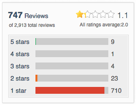 In Apple’s App Store, the new version of the app earned 9 five-star reviews, 1 four-star review, 4 three-star reviews, 22 two-star reviews…and 710 one-star reviews.
Within a week, the Globe began rolling out updates to app to help clear up navigation issues. Editor David Walmsley wrote an open letter to readers to explain the changes and calm fears:
The app showcases the best of our journalism…It is vital we design our platforms to ensure we offer the right home to quality journalism, and that that journalism is highlighted against the otherwise infinite words and pictures published around the world.
The stories featured in each edition of the app are, as ever, selected by a team of editors. And, as with the newspaper, the new iOS app is designed to be a finite reading experience. You can get to the end of it. To that end, the app is curated.
We realize the state-of-the-art app design takes some getting used to, but already 400,000 have updated to the new iOS app and we plan on continued development and improvements across all the platforms on which readers consume Globe content, from desktop to mobile web to wearable devices.
Over the last few weeks the company has released several updates to the app, with small and large changes introduced to provide more headlines, story recommendations, and draw clearer lines for navigating through the app. The three streamlined categories for news have been replaced with more sections that resemble a traditional news app.
To that end, @globeandmail's iPhone app now features a new section with the latest news from the main web sections pic.twitter.com/L9lAzaa6Pa
— Craig Saila (@saila) May 26, 2015
And yet, many readers remain unsatisfied. The commenter “Westerly” writes:
While I acknowledge the attempt to make this app better, the fact is the Globe has taken a very simple concept and severely over-complicated it. I am a Globe Unlimited subscriber — all I want is the news, in a simple format that allows me to access the articles that I pay for. Look at your mobile website or the New York Times app for what I mean. With all due respect, this app is a mess and it is unbelievably frustrating to use. My subscription is definitely at risk unless this changes drastically — I’ve waiting over a month…not sure how much longer I can wait. Quality journalism is meaningless if your paying customers can’t access it easily.
The challenge the Globe is facing is a familiar one to many media companies. As readers continue to spend more time on mobile, publishers are trying to find ways to better orient their products, workflows, and advertising to a new model. For some, like The New York Times, that means spinning off multiple mobile apps, with a main app that promises an inclusive daily news report, and others like NYT Now, that value editorial selectivity and aggregation.
The Globe, which has a national audience across Canada, wanted to make a fundamental change in the way it delivered news to readers, one that seemingly would meet the audience in the same direction they were heading. The problem, at least partially, is not all readers appear to be on board.
“People had a strong reaction to the idea of curation, which is interesting,” Kevin Siu, editorial head of digital, said. “The very nature of our website, the nature of the paper, when you’re listening to the radio — everything’s curated to a degree.”
Readers develop familiar patterns with apps, which is why some people are upset about the changes, Siu said. “What they’re responding to was the idea that information was being withheld from them,” he said. It turns out that “all the news that’s fit to print” has a meaning that carries over to digital.
That’s only slightly ironic since the new app was the Globe’s way of responding to the signals provided by users. According to Frehner, in the old app the mobile readership spiked in the early morning hours, with people reading on phones and tablets before they arrive at work. That trend picks up in the evening during the commute back home.
The “editions” in the new app are informed by that, presenting different layouts and content for breakfast, lunch, and dinner. Frehner describes it as “high density” in the morning, with a business briefing and other “need to know” news, followed by a lower density mix of stories in the afternoon, and more features in the evening.
Craig Saila, director of reader experience for The Globe and Mail, said the idea was to make the app something natural for people to spend time with, whether it was a few minutes in the morning or longer reading in the evening. They wanted the app to have the feel similar to the experience of flipping through a magazine, taking advantage of scrolling and swiping to move users through stories and onto other content. (To get deeper insight on the redesign, here’s a presentation from Saila from SNDDC, with accompanying loose transcript.)
Saila said the decision to move up the launch of the app — to align it to a larger marketing effort — changed the course of development. That change meant the aim became something more like a minimum viable product — the idea, popular in the startup world, that you should launch a product as quickly as practical, even in a feature-limited state, in order to learn more quickly from your users. So features like a recommendation engine, more flexible ad formats, and more intuitive navigation all had to be introduced in later updates, Saila said.
Launching with an MVP is not an idea newspapers — or their readers — are accustomed to. Readers become accustom to the type of reporting the Globe does, but also their pathways to accessing it, Saila said. This same cycle all happened before when the previous app was introduced, and readers slowly overcame their resistance to appreciate it over time, Saila said. “They became comfortable with it, became experts with it, and that is an important feature,” he said.
“The Globe is a popular, well loved brand,” he said. “The product we put out we knew was going to be iterative, that was part of the plan from the outset. The previous mobile design people liked for a long time, they didn’t initially.”
As the Globe shifts its focus to digital, and more of its revenue is reliant on readers, Saila said the company has to find more ways to engage with the audience. “This [app] is meant to improve with feedback, watch how they use it, see how they respond, and build and improve,” Saila said.


The Star is working with Quebec’s La Presse, makers of the LaPresse+ tablet app, which the company claims has very enviable engagement: La Press+ claims a weekly tablet readership of over, 450,000, with time on site numbers of 73 minutes on Saturdays.
The Globe launched its paywall, including the all-access Globe Unlimited plan, in fall 2012. Last fall, the company reported around 120,000 subscribers to Globe Unlimited, with about 50,000 of those digital-only readers.
Redesigning the iOS app was part of the company’s strategy to keep pushing into digital, and it provided a catalyst to make changes within the Globe, Siu told me. Like other papers, the Globe has altered its daily schedule of editorial meetings to be more aligned with the pace of digital publishing. They also reorganized the paper’s central editing desk, moving away from a system that prioritized preparing the next day’s paper in favor of continuous editing — and assigning — throughout the day, Siu said.
Siu said the structural changes added some urgency to cultural shifts inside the paper; it provided motivation to produce high quality journalism throughout the day, as well as getting a new app out the door. “Newspapers have a habit of being perfectionists to a fault, holding on to something until it’s absolutely ready, or it’s deadline,” Siu said.
Siu, like Frehner and Saila, said the app was meant to be iterative from the start, and that the changes that come in the resulting weeks are informed by a plan as well as reader feedback. Still, Siu said the response from users has been informative, a reality check as the paper maps out its mobile future. “We realized that readers come to us for different reasons and those reasons will change over the course of the day, whether they’re sitting down and reading or if they’re quickly checking something during lunch or on their way home during the commute,” he said.
What’s important, Siu said, is balancing the needs of readers with the Globe’s desire to experiment on new platforms. “It isn’t going to be one big change to the app, but a bunch of changes that result in an app months from now that will be quite different from the one we initially launched,” Siu said.


