Nieman Foundation at Harvard
Quartz editor Kevin Delaney estimates his journalists created close to 4,000 charts last year in the service of stories about the global economy. That is a not-insignificant number of charts.
Charts are a subgenre of one of the most powerful forms of currency on the web: images. They quickly convey facts as well as authority, because numbers and lines on a grid have a way of saying look at this important thing right now. But they’re also kind of, well, flat. “The way they travel into the world is as static image files,” Delaney told me. “While people react to them enthusiastically on social media, it ends with a .jpeg file, basically.”
Now Quartz is pushing further into graphic territory with Atlas, a new platform for sharing and creating charts. Atlas is a clearinghouse for all the charts produced by Quartz, giving readers options to embed or download versions of the image file itself as well as the underlying dataset.
“We’re creating a platform for data and charting that minimizes friction for use elsewhere on the web that spreads on social media,” Delaney says.
What that means is anyone looking for a quick way to illustrate a point through data — a reporter, an academic, an analyst — can go to atlas.qz.com and search for what they need. So rather than take a screenshot from a report on media consumption, I can pull up something like this from Atlas.
The company is also hoping to monetize Atlas by offering something they’re calling “sponsored charts,” a spinoff from Quartz success with other native advertising. Publisher Jay Lauf said sponsored charts could offer a way to reach readers across social channels beyond qz.com.
“If we can steer marketers towards providing real value to the users, they’re going to get better engagement and better amplification,” he said. “They’re gonna get all the things they want and get more positive impact.”
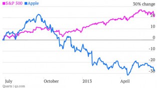
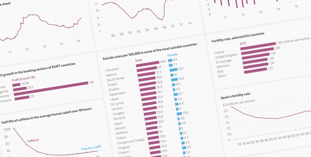
As a unit for news, charts might fall at on the left end of the “Quartz Curve” for predicting the success of online content: quickly scannable and information-dense. In the short time since Quartz’ arrival, the site has quickly made charts a staple of its reporting. This is a site that proudly declares a winner for Quartz Chart of the Year. It’s a quick method of delivery for illustrating something like the difference in market value between Walmart and Facebook or the rate of gun deaths in the U.S. (One could draw some comparisons between Atlas and The Washington Post’s slightly broader Know More, both of which aim to use a visuals-heavy approach to draw attention to stories.)
“It was pretty clear people often consider the charts to be their own pieces of content,” said Zach Seward, Quartz executive editor and vice president of product (and a former Nieman Lab staffer). Seward estimates that almost half of all stories produced by Quartz have charts, which is why they’ve invested in building tools to make it easier for anyone to make visualizations, regardless of their experience.
Each chart on Atlas gets its own page, with social tools, context, and tags, making it easier to share or dig deeper into topics. “It’s silly to throw away all the data away, or lock it away, or keep it from our readers. We have the data, so we might as well let people download it and use it as they wish,” Seward said.
Chartbuilder is already popular with media companies, with places like NPR, The Wall Street Journal, FiveThirtyEight, and The New Yorker taking advantage of the open source app. Eventually they would like to make Atlas available to other users as well, providing a home for other companies to upload and share their charts. “The broader aspiration for Atlas is to open it up entirely, to make it an open platform for chart creation,” he said.
As for the name? In a parallel universe, it’s possible the global business site from Atlantic Media would have been called Atlas. Seward said the name was one of the final contenders they considered before landing on Quartz. But the name also allows them to brand Atlas as its own product that can fly solo instead of being known as “Quartz Chartz.”
Lauf said once Atlas becomes its own platform, they expect outside users will help improve it, as has happened with the code for Chartbuilder. “The more people that use it and embed it and contribute to it, eventually over time, the better that is for the growth of the platform,” he said.


Delaney said their focus is not just on the news, but on developing new technology around journalism. That’s stemmed from looking at their own needs in the newsroom and seeing how that could serve wider audiences. “We built Quartz to be a new kind of news organization,” Delaney said. “And part of that is delivering on a rapid cycle of experimentation and new products.”


