Nieman Foundation at Harvard

There was a bit of a battle last week in the tech-writing world about specs — meaning specifications, or the concrete data points that can be used to describe any piece of tech. You know what I mean — as in, this Dell XPS 14z has an Intel Core i7-2640M processor running at 2.8 GHz, 8GB of dual channel DDR3 SDRAM running at 1333MHz, a GeForce GT 520M 1GB graphics card from Nvidia, an 8x CD/DVD burner, a 5x turbotoaster, 12 tripaflops of lobster thermidor, and so on.
Steve Jobs liked to call them “speeds and feeds,” and he never liked them much. Here he is talking in 1997, just after his return to Apple, about how the company’s marketing needed to change. (This was the introduction of the famous Think Different campaign.)
To me, marketing is about values. This is a very complicated world, it’s a very noisy world. And we’re not gonna get a chance to get people to remember much about us. No company is. And so we have to be really clear about what we want them to know about us…
The way to do that is not to talk about speeds and feeds. It’s not to talk about MIPS and megahertz.
(Jobs’ disdain for speeds and feeds was arrived at honestly — although it didn’t hurt that for years Macs had fallen behind Windows PCs in many of those key numbers.)
The battle I’m talking about is a tension around the right way to review or evaluate a new piece of technology. If you’re comparing two products, the fact that one has a clock speed of 2.4 GHz and the other only 2.2 GHz — does that go in the “win” column for Gadget A over Gadget B? Is the fact that the iPhone 4S has 512 MB of RAM enough to make it worse than Android phones that have twice as much? Are products fairly evaluated or compared through ordered charts of numbers and data points, or is something more holistic better?
Obviously these are artificial extremes, and both the raw data and the subjective experience are important in evaluating a product — just as the feel of driving a well made sports car can’t be summed up in horsepower or foot-pounds of torque. But for those folks who are paid to tell us about technology, that tension is very real — just as it is for those who build technology, who are sometimes torn between focusing on user experience and focusing on completing a checklist of features. (“My checklist’s longer: I win!”)
I was reading Gizmodo’s review of the Kindle Fire — which leans more toward the user-experience end of the spectrum — and was surprised to see this comment: “I’m disappointed there isn’t more of a spec vs spec comparison at the bottom of this article…More spec comparisons.”
M.G. Siegler wrote about this last Monday at TechCrunch (“The Death Of The Spec”) and cited a tweet from Dustin Curtis that summed it up nicely: “The section headings for a Kindle Fire review should not be ‘battery, internals, screen;’ they should be ‘reading, surfing the web,’ etc.” Here’s M.G.:
We’re starting to see backlash against reviews of products that just do spec-by-spec rundown. Because really, who cares how the device sounds on paper? It’s how it feels that matters. Is the Kindle Fire smooth? Is the Nook Tablet fast? Is the iPad a joy to use?
The thing is, it’s easy to understand why specs are appealing. They’re objective, and as such they’re low risk. If you review a product and note the precise speed of its processor, you’re not going to be wrong. It’s right there on the press release! And specs are pleasingly defined: it’s a known fact how they compare to the competition, which has its own press releases, and they help lay down a journalistically useful, if not quite accurate, framework for comparison. (“This year’s model has twice the RAM” is an objective comparison. “This year’s model feels a little bit faster than I remember last year’s” is subjective and tied to the individual reviewer’s personal experience.)
The problems arise when there’s a disconnect between the specs and lived reality. Anyone still buying digital cameras hopefully knows about the megapixel myth by now — the fact that a camera with more megapixels could be substantially worse than one with fewer, because while higher numbers sound better in ads and reviews, they actually can reduce sensor sizes to the point that they worsen the quality of the image. Or that a device with a higher clockspeed might feel slower than one with a lower one because it has other chokepoints in the design. Or its software might be buggy. Or its interface might be terrible. That all comes out of something other than raw, chartable numbers.
The work of evaluating a subjective experience — the work of the critic — is stressful! I used to be a Professional Rock Critic, and let me tell you, that’s a job filled with the risk of humiliation. I praised albums that, in retrospect, I find embarrassing and slammed others that, a decade later, I now know were amazing. (I think I got more right than wrong, but on net I was a less than 100% trustworthy guide to indie rock in 1998.) Luckily, no one reviews records based on hard metrics like “songs per CD” or “minutes per track,” but I have no doubt some critics would flock to raw numbers if it were culturally acceptable to do so.
Jay Rosen may not realize he’s secretly been a technology-journalism critic all these years, but I think this preference for hard specs isn’t too distant from what he calls The View from Nowhere. Many journalists’ self-identities are bound up in not making a subjective call, Rosen argues — in leaving the he said, she said dialogue unresolved. Is “he” (e.g. Obama, Tea Partiers, whoever) wrong? Is “she” right? Addressing those questions requires leaving the comfortable role the journalist has carved out for himself as the neutral, above-it-all observer. When “CNN leaves it there,” they do so to remain outside the arena, which is the comfortable place to be. Just like it can be comfortable to rely on clean numbers like hardware specs and not dive into fuzzier areas like user experience, interface design, and responsiveness.
But this post isn’t about technology reporting, or Dell laptops, or Steve Jobs. It’s about Jim Romenesko.
Specifically, the remarkable saga we witnessed earlier this month in which Romenesko, the ur-media blogger, was criticized by his employer, Poynter, for “incomplete attribution” in his posts. That led Romenesko to resign and the journalism world to explode — mostly with people defending Romenesko from the charges.
What Romenesko was criticized for was sometimes taking phrases directly from the stories he was linking to and putting them into the brief story summaries he wrote, without surrounding them with quotation marks. So instead of:
The paper found that the kinds of records it wants from Emanuel are “routinely available — in many cases with a phone call or an email request — in Atlanta, Boston, Hartford, Houston, Miami, Milwaukee, Phoenix and Seattle.”
Romenesko skipped the quotes around “routinely…Seattle,” which come straight from the linked story. Poynter’s Julie Moos said: “If only for quotation marks, it would be exactly right. Without those quotation marks, it is incomplete and inconsistent with our publishing practices and standards on Poynter.org.”
Journalists erupted in his defense in part because they like Romenesko, who gives every indication of being a mensch and whose work had been a part of their web habits for about as long as they’d had web habits. We don’t care about quotation marks, they said. We knew what Jim was doing. Nobody complained. To which others responded: But they’re someone else’s words, and there weren’t quotation marks around them. That’s a rule.
In a sense, it’s the same tension between hard specs and user experience. The quotation marks are the spec: their presence or absence is hard data. It’s binary, 1 or 0; either they’re there or they’re not. The problem is, the hard data of that spec conflicted in many journalists’ minds with the feel of the situation, the user experience — which was that Romenesko was a fair-minded, generous-with-his-credit, positive contributor to the world of news. The point of getting attribution right is to avoid pretending someone else’s work is your own — and it’s hard to say that passages studded with “The paper reports…” and “Smith writes…,” with a big prominent link up top to the source, are pretending that someone else’s work is your own. Specs should be in service to the user experience, and in Romenesko’s case, the user experience was good.
This is the central problem around aggregation these days: the specs don’t line up with the user experience. You can follow the rules, as traditionally defined, and end up coming off as a jerk. Or you can flout the rules, as traditionally defined, and be seen as generous with your credit.
Here’s an example. Nouveau tech site The Verge does a lot of aggregation. But The Verge, like its spiritual predecessor Engadget, almost always avoids linking to the material it’s aggregating in the body of its one-paragraph summaries. Instead, the site pushes the crediting link to a small box at the bottom of the post, like so:
That sort of aggregation doesn’t send much traffic anyone’s way. When I complained about it in my otherwise highly laudatory post about The Verge, managing editor Nilay Patel defended it in the comments:
I will defend our decision to break out vias and sources, though — we think it’s incredibly important to consistently and canonically show people where our stories come from, where are primary sources are, and how they fit together. A reader who comes to a post on The Verge can immediately trace our steps and check our work against the primary source, since we put that information in the same place every time. It might not be the “standard” across the web, but we think it’s much cleaner and clearer for people.
To which I responded:
Re: source credits, I agree with you it’s a good idea to be consistent in how you show where you’re getting your stories from. My complaint would be that that admirable consistency is no reason to avoid also linking to the source story in the actual text of the post, which, let’s be honest, is much more valuable real estate than a 22px-high box the eye jumps right over.
I just pulled up your five most recent stories. Each of them is aggregated from another site, but none of them provide a link to the original story in the body copy. Meanwhile, they do find room to link to three other Verge stories and six Verge product pages. I just think it would be good sportsmanship if the obvious places for credit within the body copy (e.g., “GSMArena reports,” “Engadget has gotten a photo,” “according to CNET’s sources,” etc.) had links.
And, in response to a separate comment about Engadget, which does much the same thing:
As it is, just about the only time Engadget ever links to anything in the body copy of a post is when they can link to one of their own posts, so they can drive up pageviews and time on site. Just glancing at Engadget’s home page now, in the 15 full posts on it, all that body copy has a total of 46 links. And every single one of them is to another Engadget story or tag page. To me, for a site build heavily on aggregation, that just strikes me as rude.
Rude — not unethical, but rude. This isn’t a Verge problem or an Engadget problem — lots of sites do it. Talking Points Memo, a site I greatly admire in many ways, used to link out from its front page. Now the vast majority of those links go to its own staff-written summaries of the stories it used to link to directly. (Although it does link to the source from within the body copy of those summaries.)
I don’t begrudge anyone their pageviews. Aggregation performs a very real and very valuable service; summarizing other people’s work has been a part of journalism since Jonathan Swift. Just as newspapers used to have to run a lot of box scores, recipes, and fluffy features to support their investigative journalism, websites have to mix in pageview-drawing aggregation to support the original work they do.
And, to go one step further, I’m not sure I even buy the argument that the primary measure of good aggregation is its ability to pass along traffic to the story’s originators. If that’s true, traditional news outlets are far worse offenders than just about anyone online; newspaper stories are filled with other people’s work, whether in quotation marks or not, and there’s rarely a link to the originating source to be found. Links are valuable because they help the reader, not because they pass X number of pageviews down a level in the Great Traffic Pyramid.
But none of that changes the fact that some methods come off as more friendly-to-content-producers than others.
The Nieman Journalism Lab is just over three years old. In 2008 and 2009, a link from Romenesko was worth a minimum of 400-500 pageviews — more frequently, 700-1,000. That’s when headlines on Romenesko items linked directly to the source material.
Yesterday, Steve Myers was nice enough to write up the short piece I wrote about Google backtracking a hair on charging for its Maps API. Steve’s writeup was 116 words and summarized the key points I made. Now, I don’t have any problem with that at all — heck, my post was mostly summarizing a Google blog post! and I don’t have to sell ads! — but the end result was that barely anyone clicked through to my post. In all, Steve’s post generated 21 pageviews yesterday, Google Analytics tells me.
To look at it another way, here’s the total Nieman Lab traffic trend, from October 2008 to the present:
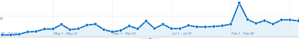
And here, over the same period of time, is the amount of traffic we’ve gotten from poynter.org. (Note the scales are different here — it’s the trend line that matters.)

Now, this is very noisy data — maybe we were just doing better work three years ago! And in the meantime, there’s been a huge change in social media that’s allowed people to put Twitter in the slot that Romenesko used to occupy in their media diet. But the result is that a link on Romenesko generated a lot less traffic to us in 2011 than it did in 2008.
Again, that’s fine. Playing Aggregation Police is incredibly tiresome, and from a reader’s point of view, saving clicks by providing fuller summaries is probably on net a good thing. But the point is that this sort of behavior can’t be simply declared good/ethical if there are quotation marks or bad/unethical if there aren’t. The totality of the user experience brings in issues of design, of code, of fair use, of promotion — it’s a lot more complicated than merely whether a box gets checked on a feature checklist.
Remember when the iPod came out, and a guy at Slashdot famously derided it because it didn’t have the specs he wanted? “No wireless. Less space than a nomad. Lame.”
Or remember when the iPhone came out and the big complaints were it didn’t have a removable battery and you couldn’t install an extra memory card?
What happened was that people actually used iPods and iPhones and found that they’re delightful little devices that are easy to understand, fun to use, and filled with pleasant little surprises. And the checklists fell away, and the human race collectively decided to buy a gajillion of them.
That’s why the journalism world blew up in defense of Romenesko. Because they knew what the Romensko user experience, at its best, was like, and once you know that, the checklist falls away.