Nieman Foundation at Harvard
HOME
          
LATEST STORY
What journalists and independent creators can learn from each other
ABOUT                    SUBSCRIBE
Jan. 11, 2012, 9:45 a.m.

Responsive design from another angle: Gizmodo goes widescreen

Gawker Media’s new HD view makes a play for big monitors and a grander stage for video and photos.

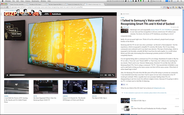
Gizmodo, the popular gadget site and pageview king of Gawker Media, debuted a new look last night that they’re calling HD view, and it’s big. Not big in the grand scheme of things — big in the number of pixels it takes up. Whereas most websites top out at around 1000 pixels in width, Gizmodo HD stretches like Plastic Man, with photos and videos stretching wider and wider as the browser window does too. On my 1900-pixel-wide monitor, pages like this one (photo-dominant) and this one (video-dominant) both resize all the way to blowout width. Call it the doublewide approach.

(The screenshot above is obviously less than full size; to see its full, 1920-by-1200-pixel glory, click here.)

This is the flip side of responsive design, the web-design idea that BostonGlobe.com’s recent launch brought to the attention of lots of news execs. In the case of the Globe (and in most other responsive efforts), the primary appeal is the ability to get small — to build a website that can look good both on your laptop and on your smartphone without having to build a separate mobile site. (The Globe’s website expands up to 1230 pixels, but not beyond that.) But responsive design works in the other direction too, and Gizmodo’s new look is an attempt to play with that — to give more space to the big photos and big videos that Gawker Media’s been trying to push over the past year.

At this point, HD view is very much a beta (it won’t work in all browsers, for instance, and there’s no place for comments), and seems more like a parlor trick than a feature. But why might a news organization be interested in a doublewide view? What might be the use cases for an HD view?

  • There’s still a class of user who (a) uses a desktop computer, where monitor sizes once outlandish (24-inch, 27-inch, 30-inch) are becoming more affordable and common, and (b), particularly on Windows, runs browser windows full screen. Those folks are used to seeing a bunch of whitespace to the left and right of their favorite websites, and this could fill them up and build something more immersive. With Gawker Media making bigger investments in video and art, it makes sense to play those as big as the browser will allow.
  • A theme running throughout Gawker’s controversial redesign last year was that it viewed television as both an important competitor and a production-value bar that Gawker Media felt it was approaching. “[W]e increasingly have the scale and production values of — say — cable television,” Nick Denton told us at the time: “[W]e’ll compete for audiences with cable groups such as NBC Universal.” Well, Gizmodo HD fits perfectly into a world where screens are shifting and the television might move from the-place-where-you-watch-Mad-Men to, simply, the biggest and best content-agnostic screen in the house. To be fair, previous attempts to bring the web to big-screen television haven’t borne much fruit. But with everyone expecting an new TV push from Apple in 2012 — and with companies like The Wall Street Journal moving from web video to TV sets — it makes sense for a big online brand like Gawker Media to prepare for that eventuality.
  • Advertisers are always looking for new ways to draw attention, having soured at least a bit on the efficacy of the banner ads. Gawker’s long been willing to push the boundaries with things like sponsored posts and site takeovers. Imagine the greater impact that a site takeover could have when there’s twice as much space to take over?

It’ll probably be a while before the doublewide becomes much more than a novelty, but it’s worth thinking about how a news site might look different if, instead of thinking small (that is, mobile), it thought big.

Joshua Benton is the senior writer and former director of Nieman Lab. You can reach him via email (joshua_benton@harvard.edu) or Twitter DM (@jbenton).
POSTED     Jan. 11, 2012, 9:45 a.m.
Show tags
 
Join the 60,000 who get the freshest future-of-journalism news in our daily email.
What journalists and independent creators can learn from each other
“The question is not about the topics but how you approach the topics.”
Deepfake detection improves when using algorithms that are more aware of demographic diversity
“Our research addresses deepfake detection algorithms’ fairness, rather than just attempting to balance the data. It offers a new approach to algorithm design that considers demographic fairness as a core aspect.”
What it takes to run a metro newspaper in the digital era, according to four top editors
“People will pay you to make their lives easier, even when it comes to telling them which burrito to eat.”