Nieman Foundation at Harvard
I appreciate Rob Meyer writing this post so I didn’t have to: It seems as though every new news site redesign has a common thread: stories presented as uniform rectangles with a text overlay. (Rob’s piece is really about the boxiness, but the text overlay trend is also approaching Defcon 3.) Bloomberg View’s redesign today prompted it, but there are plenty of others: NBC News, MSNBC, Gothamist, the top of The Verge, the “premium” version of The Dallas Morning News, Vocativ, Digg, Digiday, the less-than-loved new Slate, and more.
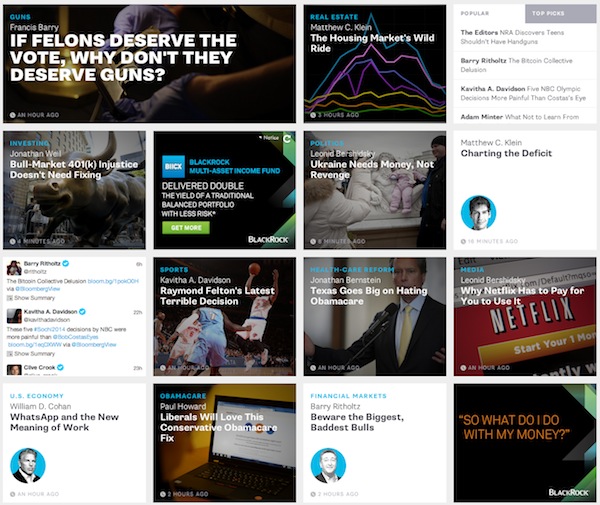
Today In The Continuing Conquest of The News Web By Uniform Rectangular Images With Text Overlays: http://t.co/b8X5odH4rq
— Joshua Benton (@jbenton) February 25, 2014
Someday soon, we’ll all be turned into rectangled photos with white text and a black semi-translucent box over it http://t.co/uaabauONkY
— Joshua Benton (@jbenton) February 24, 2014
It’s not that boxes are new or anything — the entire web is literally built on them. But it’s a clear trend and, I think at least, a slightly dispiriting one. At the same time we’re seeing increased creativity in article page design, we’re seeing a sort of clotted sameness descend upon front pages and section fronts. It encourages the reader to see everything as just another identical widget of content, I fear. And it, in some cases, limits how much text or other cues one can add to tease a story to the reader. Personally, I find them too scannable and too easily ignorable.
Rob suggests responsive design may be a cause; Ethan Marcotte, the guy who, ya know, invented responsive design says no. Far be it from me to dispute Ethan, but I think responsive has generally led to a regularization of front page chunks in order for them to reflow well on phones. And it fits with the cards metaphor we’re seeing everywhere. (Thanks, Pinterest.) But I think the bigger culprit here is the rise of tablets — both because web designers are taking cues from tablet apps and because tablet traffic is growing as a share of total traffic. What does tablet design prize? Big, tappable areas. It’s a kind of buttonization.


16 comments:
It’s also pretty much the entire design metaphor behind Windows 8’s look, a good argument for it being done to make responsiveness easy and smooth.
I also hate the trend of profile pictures/badges being cropped into circles by default. (Medium, the new About.com, Google). The badges-as-circles-by-default seems, to me, a perfect example of ‘just because you can do it, doesn’t mean you have to.’
Agreed. Tweetbot for iOS is like that by default — ruins some nice squarish avatars.
It’s sad that neither Rob nor I even thought of that. (Sad both for me and for Microsoft.)
I thought it was to get people to accidentally clicked on “native” ads.
Touch-friendly buttonization (nice) is definitely a factor but the simple explanation is that the image has supplanted the headline as the main content element. It’s hard to arrange a table top of polaroids and end up with anything other than a grid. Rectangles gonna rectangle.
I think the reason so many of us find these layouts awkward is that unlike Pinterest where the image *is* the thing, in news the image is still the accessory to the thing. So it creates dissonance and these UIs end up being tough to scan.
I think that’s all very true.
The cynic in me would add that, as in the Bloomberg View screenshot above, it makes stories and ad units look an awful lot alike.
I would blame the ‘user generated content’ mantra rather than responsive web design, mainly because I think it naturally leads to a lack of control in information hierarchy and visualization: every user is equal, so every content is equal, let the software decide and rearrange it. So we got Pinterest of news too.
Other critical trend, that in my opinion determine the layouts, are ads. Therefore
those formats (IAB) determine sizes for the grid. Cards design pattern works perfectly well in this sense.
These formats are more than an aesthetic/design issue. They are fundamental to providing equal access to the Internet for all users.
The reason: Text in overlay boxes (or in a PDF format that is the equivalent of a picture) often cannot be read by screen readers — leaving anyone with a sight impairment unable to use the web page at all.
There are supposed to be conventions about this that web designers honor, but many many don’t seem to know (or care?) about the issue. It will be increasingly important as people live longer and develop various sight-compromising diseases.
For a primer, see:
http://www.afb.org/info/accessibility/creating-accessible-websites/the-user's-technology/235
What happened to all the people who have attended Edward Tufte seminars? Did they leave the industry?
This post prompted me to simultaneously compare my desktop rendering of http://www.slate.com to my iphone rendering of http://www.slate.com. I rarely do this. Needless to say, it was interesting to note the differences and think of the possible reasoning behind them. I’m going to get my ipad now. I thoroughly enjoy Neiman Journalism Lab.
Haha. I think that it’s more that everyone in journalism and academia uses Apple products whenever possible. (At any given journalism event there’s a 50/50 chance I’m the only one in attendance with a PC.) Win8’s sales haven’t been spectacular, but it is doing ok.
I’m a pretty big fan of Win8 because of how that design both accommodates various screen formats and applies a significant level of information density without being overwhelming. I’m not sure that all of these journalism outlets’ designs fulfill the ‘not overwhelming’ part of the equation.
When well designed. I like them. What’s the usability issue? “Too scan-able?” Is that really a problem? Isn’t the whole point to let user’s find what they care about quickly so they can then read/consume it?
GLAPJuplaxmDcNU
olrtBLijzgF
Trackbacks:
Leave a comment