A brand guru. That’s what they called Baba Shetty when he was hired away from advertising agency Hill Holliday by The Daily Beast to be the new CEO of The Newsweek Daily Beast Company.
 Less than a month later, the company announced that Newsweek was putting an end to its print edition and going all-digital. Last week, Shetty released the beta version of the relaunched website, a simple, colorful, responsive, and easily navigable new home for the decades-old news brand.
Shetty began working with the magazine on a “Mad Men”-themed issue on retro advertising back in March 2012. So maybe it’s not surprising that the new site’s first feature article is an exploration of what makes contemporary television so addictive. Shetty has big plans for capitalizing on on the historically respected Newsweek name, blending a New York Times-like metered paywall approach with an ambitious sponsorship model that will see a lot of creative ad work coming off the Newsweek desk.
On Monday, Shetty and I spoke about how he sees that plan unfolding, as well as some of his favorite new design features, bringing classic Newsweek covers into the digital space, and why ad agencies should act more like newsrooms. Here’s our conversation:
O’Donovan: So let’s start with the redesign! Congrats, first of all — very exciting.
Shetty: Oh, thank you.
O’Donovan: I’m curious, first, who you were looking to for inspiration with the redesign and what your major goals were.
Shetty: The audience is a combination of the people who’ve always looked to Newsweek for its sense of authority, its sense of editorial authority and its stature — its ability to offer perspective on the happenings in the world. But we also wanted to really innovate around the narrative formats for longform publishing on the web.
The real story of the Newsweek relaunch is that it allowed us to think about innovation in a way that really hasn’t happened much for professional journalism. Actually, there’s been a ton of innovation in microblogging and other formats — look at the Tumblr news from the last couple days. Enormous value from thinking about beautiful user experience for content consumption.
But really, a lot of the professional editorial products kind of slavishly follow a set of conventions that are all about maximizing pageviews. You look at a long article that might require seven clicks and page reloads to get through — and then there’s a lot of display advertising that is competing for attention with the actual content. We thought there was an opportunity to do for professional journalism what Tumblr and Pinterest and Flipboard, so many of the other innovative new startups, have done for other kinds of content.
So what we see with Newsweek is the user first. I’ve been talking about it as user-first publishing. The idea is, let’s deconstruct the sense of magazineness — not as a physical thing, but as a concept. The sense of magazineness is about a beautiful user experience. You think about your favorite magazine and sitting in your favorite chair at home and reading it — there’s a sense of editorial coherence. You know — the cover communicates a sense of editorial priority, there’s a table of contents that lends a sense of coherence to the issue. It’s a beautiful package that results.
But when magazines go digital, so much of that’s lost because of the conventions I talked about before — you slice and dice content into the slivers that we call pageviews, and it’s not a very satisfying experience to read professional journalism on the web.
So we really wanted to take a leap forward with Newsweek. In addition to the idea of the editorial stature and credibility of Newsweek, also creating a radically creative user experience around that content. I can talk about a few of the features if you think that would be useful.
O’Donovan: Yes, but I’m still curious about other projects, other sites, other redesigns, that you might have taken something from, or tried to emulate at all. Or maybe this is a ground zero thing. But for example, The New Republic’s redesign, or maybe Quartz — is there a trend?
Shetty: There really weren’t — we didn’t really emulate anything. What we were trying to do was stay true to Newsweek and what the ideal user experience would be.
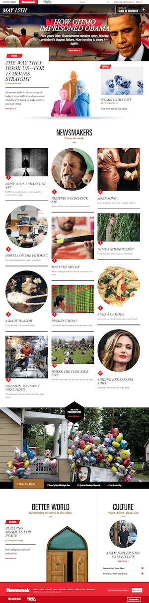
The cover — there actually is a cover, and it was static in the first issue, and in future issues it will be interactive, video-based multimedia. It’s this idea of drawing a reader in to something that has great editorial to prominence and priority, and we’re going to explore what the cover could be in the digital age. There is a persistent table of contents which is available to you at any part of the experience, and that lends a sense of completeness and coherence to this experience.
O’Donovan: Yeah, the table of contents gives an element of navigability — it helps you understand the fullness of the product.
Shetty: Exactly. It’s persistent. No matter where you are, in an article or on a page, when you mouse over the window, the table of contents dissolves into view, and you can access it. So there’s a sense of, again, an ideal concept of magazineness, and part of it is this sense of complete control over the content consumption experience. So we thought, we’d love to make that real in a natively digital format.
Of course, we took account of all the devices that people read on now, so the site is fully responsive and looks beautiful on a handset or tablet screen or — you should really try it on a 23-inch monitor. It’s gorgeous in large format screens. It gracefully apportions itself to whatever the screen happens to be.
O’Donovan: What would you say, right now, the focus is on in mobile, in building apps? I feel like there’s this turn back towards building cross-platform websites and away from apps. Where did apps fall into your priorities when you started compared to where you are now?
Shetty: Yes, you’re exactly right. I think 18 months ago, everybody was talking about native apps as absolutely the way to go. But there’s a lot of friction in the app experience, and what I mean by that is apps have to be downloaded, apps have to be used and accessed on a regular basis, apps sometimes make it a little more difficult to share content. People are sometimes not as adept at sharing content via apps as they are across the open web. So for us, it’s about giving consumers a choice. We’re going to parallel-path for a while — we’ll also have a Newsweek app available. But the open web launch we did last week we think is actually a beautiful experience across devices. It’s friction-free — there’s nothing to download, there’s nothing that prevents easy sharing. So it’s designed to kind of be — I don’t want to say post-app, but it’s post- the initial way of publishing thinking, that native apps are the only way to go. I think a well designed, thoughtfully engineered open web experience can be terrific for the user.
O’Donovan: You mentioned building an interactive cover page earlier — I’d be interested in knowing what other kinds of engagement you’re interested in building across the site. How did you think about structuring comments? How do you want people to respond to the site?
Shetty: We thought a lot about socially driven content, and if you actually look at an article called
“The Way They Hook Us — For 13 Hours Straight,” which is about longform, binge-viewing, addictive TV shows — you know, “Breaking Bad,” “Game of Thrones,” et cetera — if you look at that story, you can see how we handle social. Instead of having commentary being a thing that is relegated to the bottom of the page, there’s a set of functionality on the left side margin that moves along with the story. Right now, there’s 2,100 opinions listed — it’s a way to kind of over time have the idea that engagement opportunities are persistently available, no matter where you are reading these stories — it’s not just a thing that’s relegated ot the boot of a page. There’s a tray that actually slides out to reveal the social features. And there’s a lot of innovation we have planned in that area as well.
And while we’re talking about a long article page, you can kind of see the ability to use multimedia photography, video, infographics to help the journalistic storytelling of a longform piece. That’s another, I think, terrific step forward. It’s not the tyranny of the pageview, it’s not the conventions that are going to deliver more advertising properties — it’s thinking about he user first. What’s going to make for a great reading experience? in that way, I think it differs from a lot of the conventions that are in play across the web.
O’Donovan: So this is my understanding having read a couple things, so correct me if I’m wrong — but your strategy is first to build this product that people are going to want, and then slowly to introduce a paywall, and then later this sponsored content component. Can you explain how you see that unfolding and over what kind of timeline?
Shetty: I can talk a little bit about it — I probably can’t talk about all of our plans right now.
The metered access is going to be rolled out fairly soon, and that’s just the simple idea that, look, anybody can read any article on Newsweek, and initially that’s completely open and completely free. But only subscribers will be able to consume content over a certain number of articles. So it’s very similar to what The New York Times and others have done. Open access — we want a lot of social sharing, we want a lot of visibility of the content across the open web. But what we’re asking is, if people consume over a certain amount of content, that they subscribe. And that’s going to take place fairly soon.
The second question is how brands can participate. We have the same principles we’ve been talking about — thinking about the user first — applied to brand participation. What we’re going to do is limit the clutter — relatively few units, but really high impact — but stay with the design aesthetic of the site overall. They’re going to be beautiful, unignorable, but the value exchange with the reader is going to be very appropriate.
When you listen to a program on NPR, and there’s a sponsorship message before the program starts, you can kind of say, okay, well, I get that. I get how that works. It’s a reasonable exchange between the audience and the brand that sponsors the content. That’s really the model. It’s not as much about the standards of display advertising that have dominated the discussion on the web. It’s a sponsorship model — a different direction.
O’Donovan: From a structural standpoint, in terms of building the sponsorship and how closely married they may be to the content you have, I’m curious if it’s going to be an internal team and how closely they’ll work with the editorial team, or if it’s someone from outside. How does that all work?
Shetty: Oh, it’s all part of one organization in our company, and it’s a close partnership between the editorial and business sides.
O’Donovan: I was just reading earlier, you wrote, along with someone else,
a piece for the Harvard Business Review about how advertising companies should act more like newsrooms. I was hoping you could explain that theory and maybe, I’d be curious to know if that was an idea that started to percolate for you having been in a newsroom for a little while.
Shetty: It actually started percolating for me well before I came into a newsroom. I think it actually a pretty clear direction that has been well represented by a lot of people. There’s a real opportunity for smart brands to publish content that’s useful, interesting, engaging, and helpful to their audience. It’s not a new idea — in fact I always talk about the fact that it’s an idea that’s been around for a very long time.
But what’s changed is all the tools that are available for content creation, distribution, measurement and all the channels that are available to brands. I think it’s a very powerful idea. I don’t think it’s one of these trend-of-the-season ideas. I think it’s a dramatic industry shift that we’re going to be tracking for years to come, through various iterations.
That was something I did with Jerry Wind, head of the Future of Advertising Program at Wharton. It was really based on the Wharton 2020 Project, which was asking a lot of advertisers about what they think about the future of advertising, and it was such a consistent theme — that it’s going to be less and less about what we think of advertising today, and more content that is voluntarily consumed by people because they view it as in some way useful or interesting.
O’Donovan: As we continue to see this trend toward sponsored content and cooperation between advertisers and news brands, I’m curious what your advice might be to other people who are following a path similar to yours — coming from the ad side and moving into newsroom, operating as the person who is trying to bring those two things together. Are there any specific challenges or surprises there? How would you tell someone to pursue that?
Shetty: I would just say think about the user first, and by the way, think about editorial standards. It doesn’t serve anyone to have editorial standards compromised. Users don’t want that, the consumer doesn’t want that, and certainly it doesn’t benefit the editorial side of things either. Nobody wants that. I think full transparency and good judgment are critical here.
O’Donovan: How do you telegraph that to the reader?
Shetty: Well, we don’t really — we haven’t really had any issues with telegraphing that. It’s just kind of clearly indicating where, what the source of a particular piece of content is. I think as long as you maintain these kind of standards, there really aren’t issues.
O’Donovan: And in terms of the user-centric experience you’re trying to build — you’re talking about how modern newsrooms have so many different kinds of metrics available to them now — when I hear people talk about building new products like this, they talk about building something light and flexible, and prototyping it so you can really respond to the audience’s initial reaction to it. I’d be curious to know how you’re tracking that, how you’re listening to the reader, and what kind of flexibility you’ve been able to build into the product.
Shetty: Absolutely. The iterative nature of web design development — or I should say, digital design development — is a terrific kind of approach for designing something that users really love and respond to. For us, it’s tools like Chartbeat, which we love, and other kind of leading-edge ways of getting real moment-to-moment feedback from not only what people are reading, but how they’re spending time with it, where they’re coming from, what kind of engagement they have with it. It’s all fed right back to the design and development process.
It’s a long way from the days of just building it and they will come. It’s really paying such close attention to what people actually respond to.